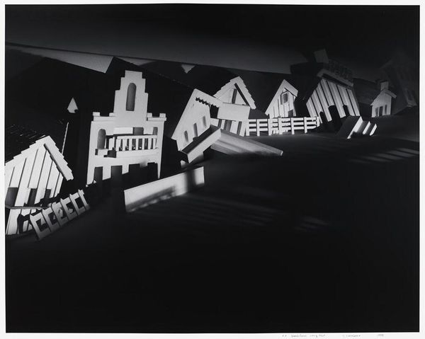
graphic-art, print, typography, woodcut
#
graphic-art
# print
#
typography
#
woodcut
#
modernism
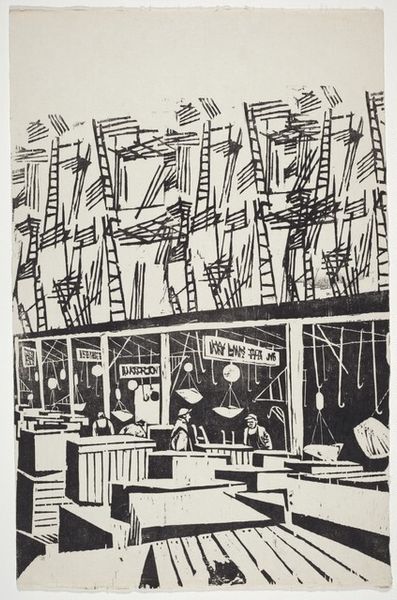
Dimensions: overall: 51 x 66.6 cm (20 1/16 x 26 1/4 in.)
Copyright: National Gallery of Art: CC0 1.0
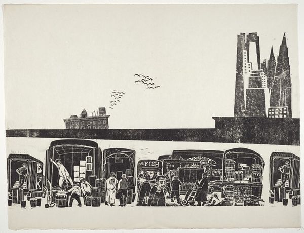
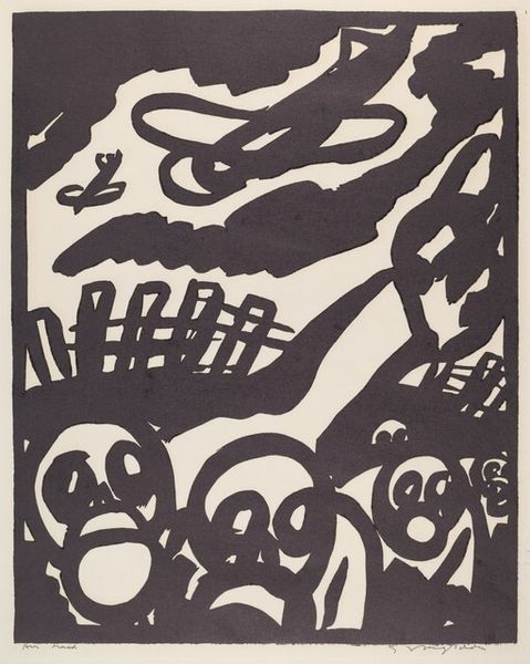
Curator: Antonio Frasconi's "Title Page for The Fulton Fish Market," created in 1953, immediately grabs you, doesn't it? The stark contrasts and slightly unsettling abstraction evoke a real sense of urgency. Editor: Absolutely. My first impression is this potent mix of bustling energy and the grim realities of commercial fishing. There's a rough beauty in the woodcut's texture, a rawness that seems perfect for the subject. Curator: It's interesting you say "grim realities." Frasconi was very aware of the social implications of labor. Consider how the composition places the bold title over the physical structure—a commentary, perhaps, on the capitalist framing of food production? Editor: That makes sense. The title, aggressively red, almost seems to bleed into the depiction of the market below. What do you make of the sun or… is it a stylized fish?... at the top? It looms over the scene with this almost menacing stare, like surveillance. Curator: Ah, surveillance… an excellent reading. This piece emerges during the rise of abstract expressionism, a period when artists like Frasconi are consciously engaging with representing post-war realities and reflecting anxieties about increasing state and corporate power through more graphic means. Editor: Precisely. This artwork goes beyond mere depiction; it feels like a pointed statement about class, labor, and perhaps environmental concerns—even back in the 50s. We must also contextualize this work in terms of Frasconi’s personal history as an immigrant. Curator: His personal narrative deeply shaped his lens; he focused so sharply on working-class environments. We might consider how this woodcut both celebrates the market's vitality and critiques the system underpinning it. The graphic style enhances a sense of populist appeal but also aligns with Italian modernist engagement in politics. Editor: I completely agree. Frasconi uses the accessibility of printmaking, particularly the woodcut, to convey such heavy messaging, democratizing, in some respects, both its production and consumption. I am particularly taken by how this simple two color graphic achieves a powerful resonance with current sociopolitical discourses surrounding food and work. Curator: Exactly, prompting new dialogues between then and now. Frasconi’s vision reminds us that the conversation continues and we continue to find relevant truths about societal challenges through artwork. Editor: Indeed, its rough-hewn style and bold message ensure it continues to provoke and inform future considerations of how structures and systems shape all of us.
Comments
No comments
Be the first to comment and join the conversation on the ultimate creative platform.
More like this