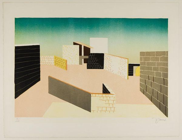
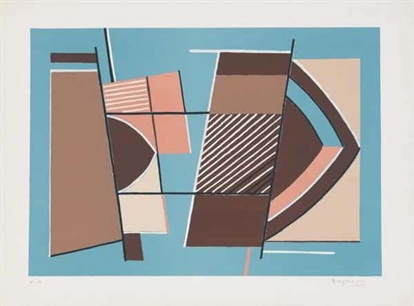
![[Design drawing for Manhattan House Longchamps Restaurant, corner of 3rd Avenue and 65th Street, New York, NY.] [Study for mosaic front by Winold Reiss](/_next/image?url=https%3A%2F%2Fd2w8kbdekdi1gv.cloudfront.net%2FeyJidWNrZXQiOiAiYXJ0ZXJhLWltYWdlcy1idWNrZXQiLCAia2V5IjogImFydHdvcmtzL2JjNDA0YmM2LWVhY2ItNDFiYi05NmYzLTVmM2E1MzY3ZjdlZC9iYzQwNGJjNi1lYWNiLTQxYmItOTZmMy01ZjNhNTM2N2Y3ZWRfZnVsbC5qcGciLCAiZWRpdHMiOiB7InJlc2l6ZSI6IHsid2lkdGgiOiAxOTIwLCAiaGVpZ2h0IjogMTkyMCwgImZpdCI6ICJpbnNpZGUifX19&w=3840&q=75)
[Design drawing for Manhattan House Longchamps Restaurant, corner of 3rd Avenue and 65th Street, New York, NY.] [Study for mosaic front 1950
0:00
0:00
drawing, acrylic-paint
#
art-deco
#
drawing
#
acrylic-paint
#
geometric
#
cityscape
Copyright: Public Domain: Artvee
Curator: Immediately, I'm struck by how this piece captures the essence of early modern cool! Editor: Indeed! What we have here is Winold Reiss's design drawing from 1950, a study for the mosaic front of the Longchamps Restaurant at Manhattan House in New York. Curator: I love the use of color blocking, particularly the striking contrast of the red canopy against the cool grays and blues. It’s undeniably Art Deco, all sharp lines and stylized geometry. Editor: Absolutely. Reiss’s piece embodies that machine-age aesthetic through simplified forms and industrial materials. What was accessible at the time to convey the opulence of this scene? Look at the signage incorporated directly into the architectural design and its bold declaration. What do the repetitive patterns suggest about standardized visual vocabularies during the mid-century boom? Curator: It's interesting you mention that, because I read the patterns more as an attempt to soften the hard edges. That lush backdrop hints at paradise, promising a tranquil experience for its patrons. The patterns, colors, materials… all are part of its symbolic language. Editor: Symbolism, of course, but more importantly the economic and material conditions that led to it. How did available materials shape these design decisions? How did technological advances in production influence not just the style, but also its accessibility and implementation in public spaces? It makes me question the commodification of experience. Was dining then, and is it still, performative consumption? Curator: Perhaps. But I'd also say the drawing captures the optimism of the time, and what it projects: a faith in design and modernity as a way to improve our lived environment. The color palette itself sings optimism! Editor: But such faith must come into consideration of the conditions of its labor! I cannot separate aesthetics from its production—its makers, and means of creation! Curator: It seems we both find value in approaching an artwork, be it as a material document or an aesthetic experience. Editor: Precisely. And this Winold Reiss piece provides a remarkable case study for both points of view.
Comments
No comments
Be the first to comment and join the conversation on the ultimate creative platform.
