acrylic-paint
#
abstract-expressionism
#
abstract expressionism
#
acrylic
#
acrylic-paint
#
form
#
acrylic on canvas
#
geometric-abstraction
#
abstraction
#
abstract art
#
modernism
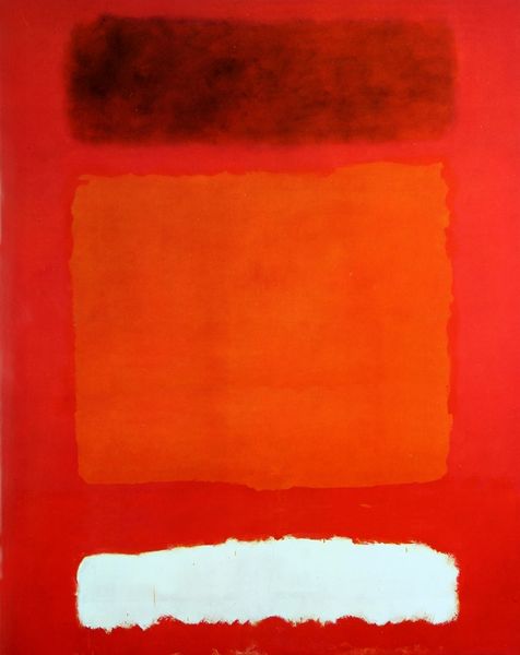
Copyright: Perle Fine,Fair Use
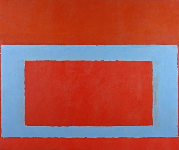
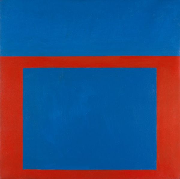
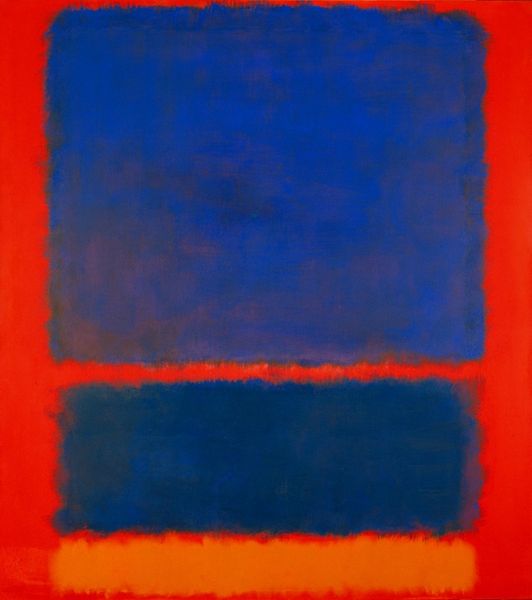
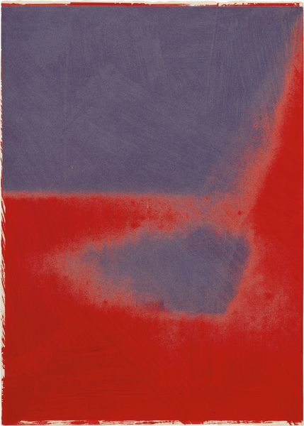
Perle Fine made this painting, "Cool" Series (Blue over Red), with what looks like oil on canvas. You know, the way the colours are laid down, they're not trying to hide the brushstrokes. You can see the hand in it, the way the paint is dragged and layered, like she's working *with* the messiness of painting itself. Looking closer, I'm drawn to the edges of that blue rectangle. How it sort of bleeds into the red around it? It's not a clean, crisp line. There's a softness, an ambiguity there. It reminds me of how boundaries in life are never really fixed, they're always shifting and changing. The texture is really interesting too, isn't it? You can almost feel the grain of the canvas beneath the paint. It's like the painting is inviting you to touch it, to connect with it on a physical level. I can't help but think of Rothko when I look at this painting. There's a similar interest in colour and form, but Fine brings her own sensibility to it. Like a conversation, responding to the ideas of her peers while charting her own course.
Comments
No comments
Be the first to comment and join the conversation on the ultimate creative platform.
More like this