Apollo's nieuwe-jaers-gift. Aen het bekoorlyke Hollandsche jufferschap, 1742 1742
0:00
0:00
anonymous
Rijksmuseum
graphic-art, print, typography, engraving
#
graphic-art
#
baroque
#
dutch-golden-age
# print
#
typography
#
engraving
Dimensions: height 151 mm, width 91 mm
Copyright: Rijks Museum: Open Domain
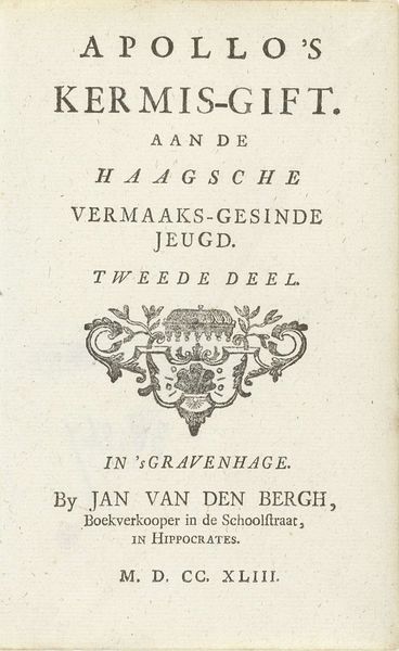
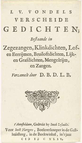
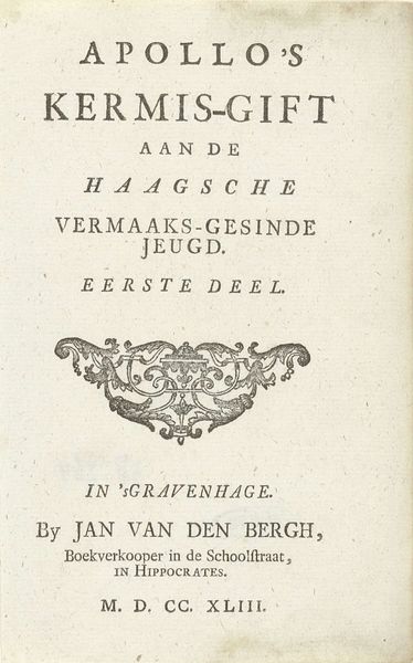
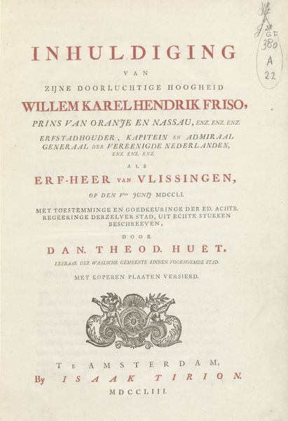
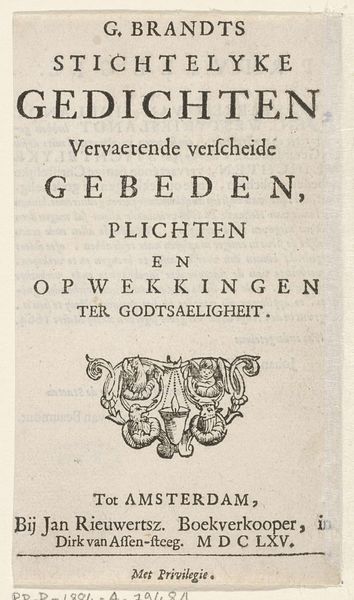
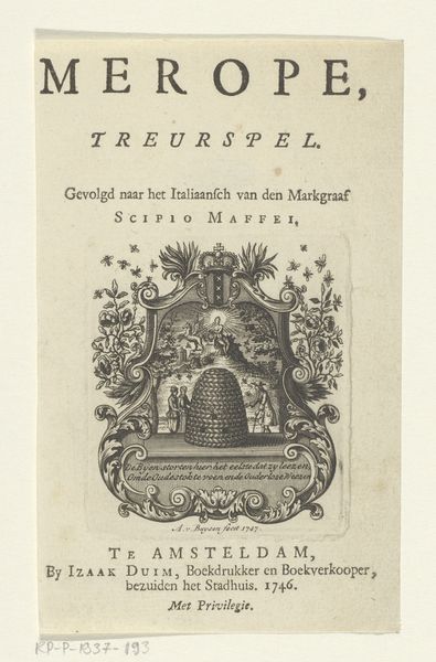
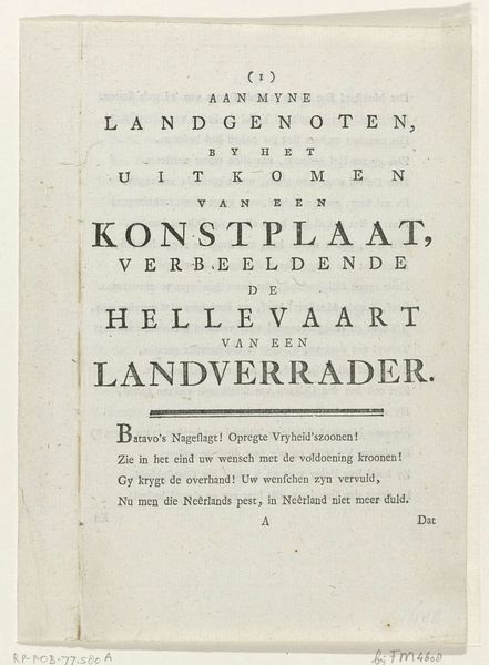
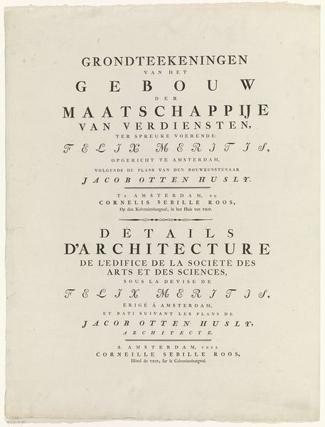
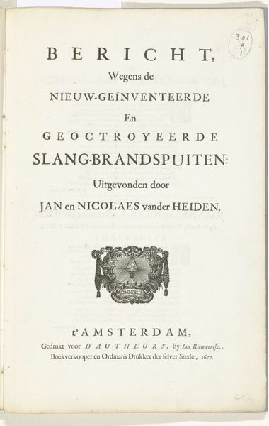
Curator: Let's examine this intriguing print, "Apollo's nieuwe-jaers-gift. Aen het bekoorlyke Hollandsche jufferschap," which translates to "Apollo's New Year's Gift to the Charming Dutch Maidens," created in 1742. Editor: Charmingly quaint! I must say, my initial thought is how orderly and crisp everything appears. The typography has a pleasant, old-world feel to it. Curator: Indeed. The print relies heavily on typography, and the careful arrangement of text creates a visually hierarchical structure. Observe how different fonts and sizes are employed to emphasize key phrases, drawing the viewer's eye systematically down the page. Editor: Right! I mean, “Apollo’s” up top gets the spotlight, followed by “NIEUWE-JAERS-GIFT.” Like an overture, a little announcement of merriment! Then the eye dips to the Dutch Maidens. The typeface alone carries the weight. What sort of printmaking technique would have accomplished such exacting lines? Curator: This would most likely be an engraving, a process where the design is cut into a metal plate, allowing for the fine, precise lines that you are admiring. It’s one of the distinctive methods employed during the Dutch Golden Age and into the Baroque. Editor: You can practically feel the burin skating over the copperplate. It’s a quiet dance with light itself. Even the floral vignette gives this sensation, sitting neatly centered, like a garland presented with due consideration. But, really, a gift to maidens via typeface…how intriguing! Curator: It suggests the power of the printed word, and typography in general, as a conveyor of culture and compliment. Furthermore, notice the imprint information at the very bottom identifying Jan van den Bergh, a bookseller in "s Gravenhage" – The Hague today. This wasn't just art; it was commerce, connecting the divine Apollo, or some human invocation of him, to a readership through the trade of printed ephemera. Editor: A slice of social exchange through paper, ink and clever font choices. And now a tiny portal into a bygone time, two centuries later. Lovely, a truly compelling and artful artifact. Curator: A sentiment echoed! This was both artistically composed and cleverly devised to celebrate the spirit of its occasion.
Comments
No comments
Be the first to comment and join the conversation on the ultimate creative platform.
