Curatorial notes
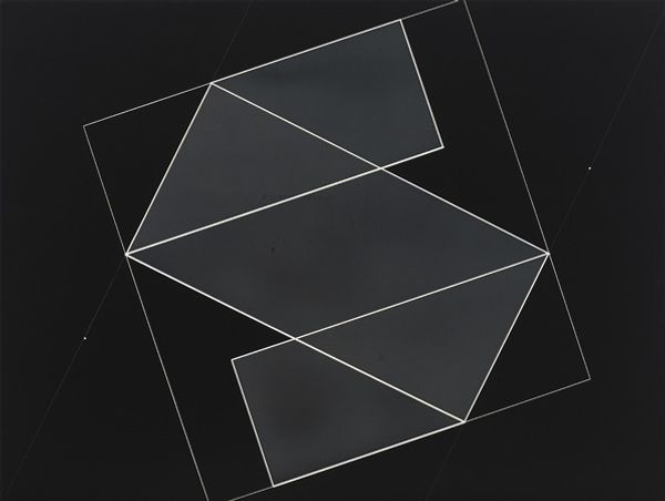
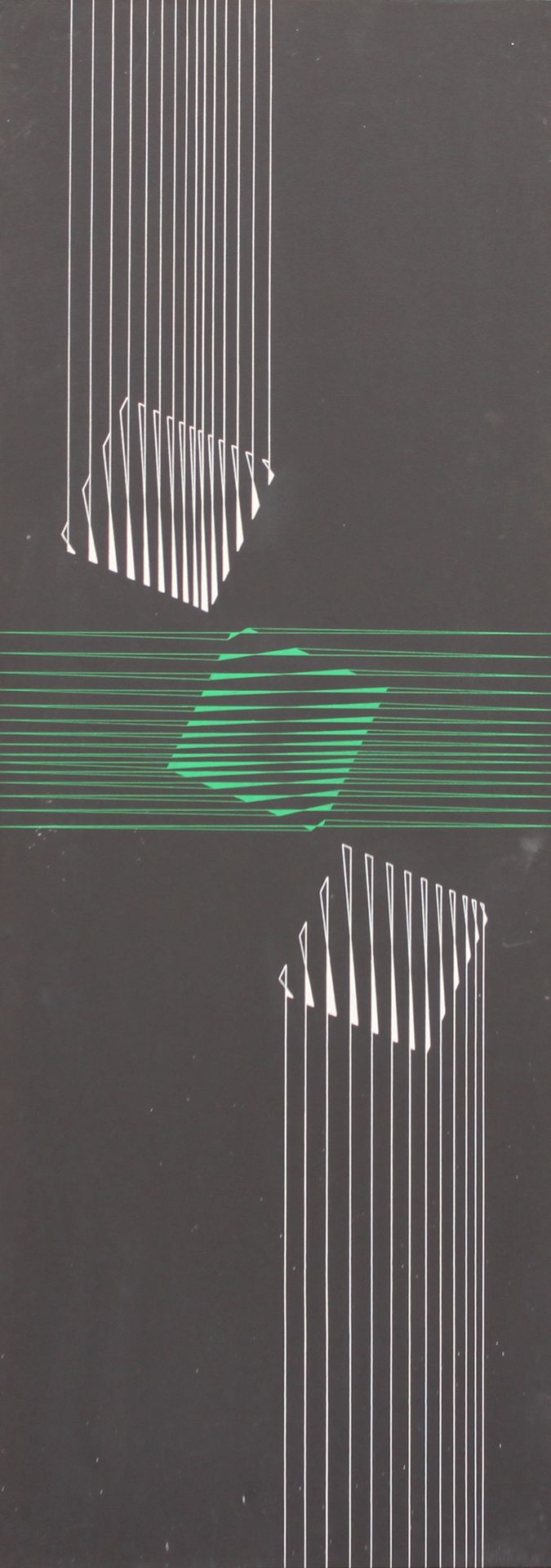
Editor: This is "Três quadrados" by Lothar Charoux. I don’t have the date or materials information. I'm struck by the simplicity, just a few geometric shapes and lines. It feels very calculated and precise. What elements of design stand out to you? Curator: I appreciate your observations regarding its simplicity and precision. Formally, I note the stark contrast between the dark ground and the bright lines. Consider the vertical lines. Do you see how they interact with the fragmented squares? It is quite intriguing. Editor: Yes, the contrast really makes those lines pop! They almost seem to be dissolving the shapes. It's like they are creating and destroying simultaneously. Why use only squares? Curator: Observe the middle square – its horizontal lines diverge significantly from the vertical ones. What effect does this variation create? Is there visual harmony here or a calculated dissonance? This is something that invites contemplation about surface versus depth, perhaps even reality versus perception. The artist offers us only lines; we must construct meaning from their arrangement. Editor: That's fascinating. It seems like Charoux is interested in how our minds perceive basic forms, and how a slight change can alter that perception. The squares may be representative of order or conformity but maybe he distorts this view? I wonder, did Charoux provide his own meaning for the piece, or is the interpretation entirely up to the viewer? Curator: The absence of explicit meaning from the artist encourages precisely that kind of interpretative work. Ultimately, the beauty of abstract formalism lies within its capacity to invite individual and independent investigation. Editor: It's been enlightening to unpack the different parts and shapes. It pushes me to reconsider what I originally thought was so minimal. Curator: Indeed. Close visual analysis reveals layers of complexity within apparent simplicity. This exemplifies how formalist principles can enhance one's comprehension.