graphic-art, print, linocut
#
graphic-art
#
ink paper printed
# print
#
linocut
#
abstract
#
linocut print
#
geometric
Dimensions: height 363 mm, width 214 mm
Copyright: Rijks Museum: Open Domain
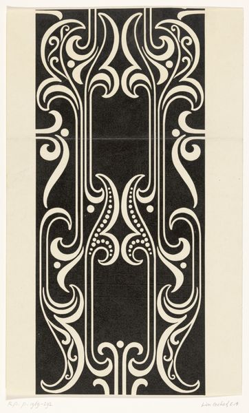
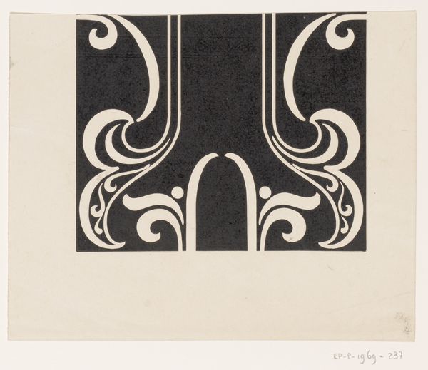
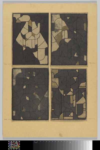
This page with a monogram by Reinier Willem Petrus de Vries uses broad dark lines and solid shapes to create something that feels bold and playful. I love the colour palette, it’s really simple, just that cool dark blue with the pale, fleshy yellow. Thinking about how he's arranged these shapes, there's a constant push and pull between the positive and negative space. Like, where does the figure end and the ground begin? It feels like a game, trying to work out what's solid and what's just the bit in between. Looking at the top right, the dark line swoops and curls, it’s almost like the artist is playing with the idea of a letterform, maybe hinting at the V, D, or M in the title. This reminds me a little of Patrick Caulfield, the way he uses those flat, bold colours and thick outlines to make something really graphic and punchy. It shows that art's like a big conversation, artists picking up on each other's ideas, messing around with them, and pushing them in new directions. Ultimately, what does it mean? Well, that’s up to you, isn't it?
Comments
No comments
Be the first to comment and join the conversation on the ultimate creative platform.
More like this