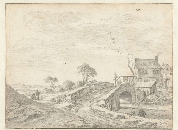
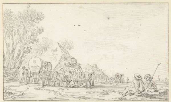
drawing, pencil
#
drawing
#
dutch-golden-age
#
pencil sketch
#
landscape
#
pencil
Dimensions: height 190 mm, width 294 mm
Copyright: Rijks Museum: Open Domain
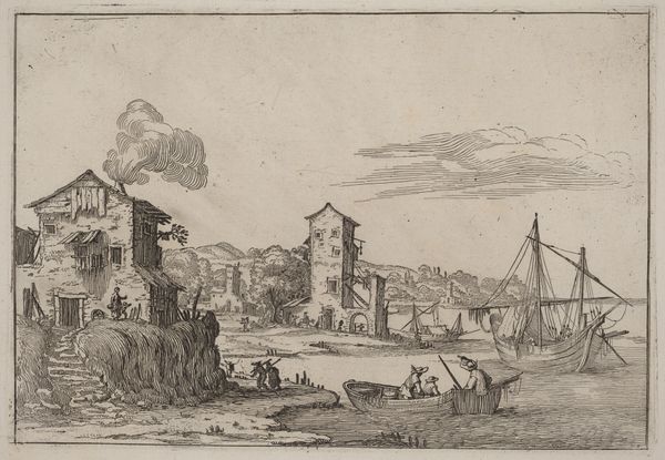
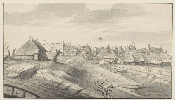
Editor: This is *Kustdorpje*, a pencil drawing from 1627 by Esaias van de Velde, housed in the Rijksmuseum. The muted tones and the artist's delicate touch give it a tranquil, almost melancholic feel. How do you interpret this work from a formal perspective? Curator: The power of this piece lies within its composition. Van de Velde masterfully uses line to create depth and recession. Notice how the buildings are placed, their geometric forms softened by the shading to define the spatial relationships. The textural contrast achieved solely through pencil strokes, differentiates the thatch from the brick, the water from the land. Do you see how he builds layers of meaning solely through manipulating his medium? Editor: Yes, now that you point it out, it's remarkable how much texture he achieves with just a pencil. I guess I was drawn to the figures in the foreground, I almost overlooked how they relate to everything else in the image. Curator: Indeed. Note that van de Velde organizes human form according to simple, volumetric rendering. Even those distant figures contribute to the implied sense of vast space, anchoring the visual perspective. How does the scale contrast work here to you? Editor: Now, I see that the figures are secondary to the landscape, highlighting a particular view of man and nature from that period. I can almost feel the breeze through those tiny pencil strokes. Thank you, I'll never look at landscapes the same way again! Curator: Likewise! Noticing van de Velde’s careful application of lines enriches my perspective of his method, helping me to discover ever greater technical complexity.
Comments
No comments
Be the first to comment and join the conversation on the ultimate creative platform.
More like this