drawing, paper, ink
#
drawing
#
landscape
#
paper
#
ink
#
line
#
symbolism
Copyright: Public domain
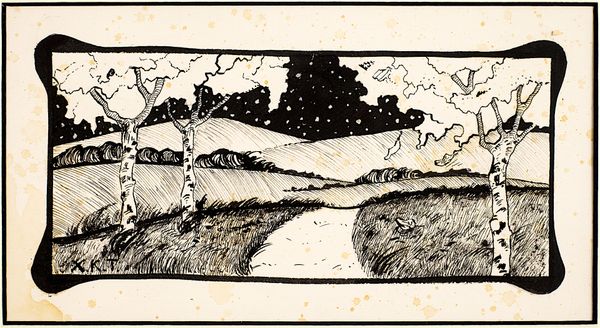
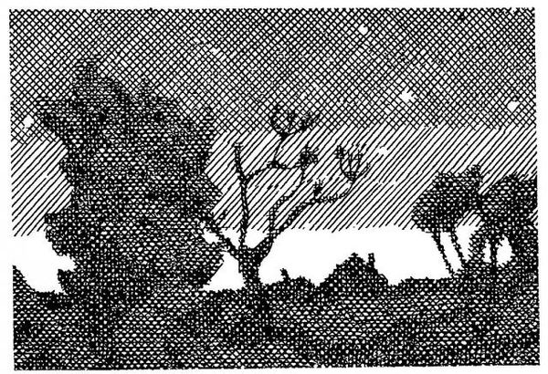
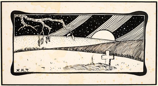
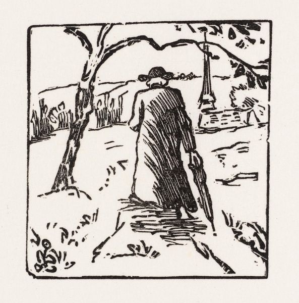
Harry Clarke made this illustration called 'The Year's at the Spring' at some point in his short lifetime, probably with ink on paper. I love how Clarke used a relatively simple medium to create such a dreamy image. The stark contrast between black and white defines the whole work, allowing the linear quality to stand out. Just look at the lines that form the slope! They converge and diverge, creating a sense of movement. The tiny silhouette of a figure on the slope adds a human element, making you wonder about their journey. The lines that make up the sky add this feeling of depth and atmospheric perspective in an otherwise flattened image. I am reminded of the work of Aubrey Beardsley in this piece, perhaps because of the similar use of illustration and high contrast to create impactful imagery. With art, it's never really about saying one thing. It’s about keeping the conversation going.
Comments
No comments
Be the first to comment and join the conversation on the ultimate creative platform.
More like this