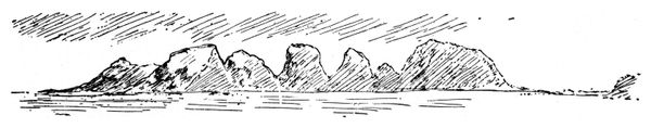
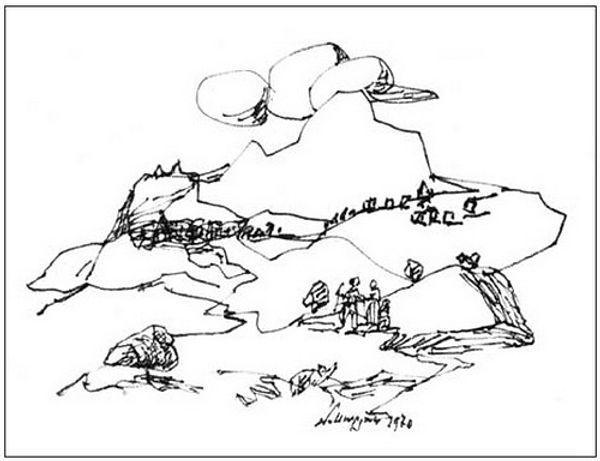
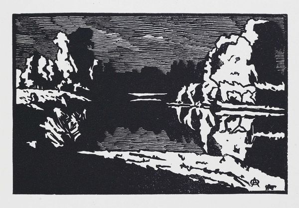
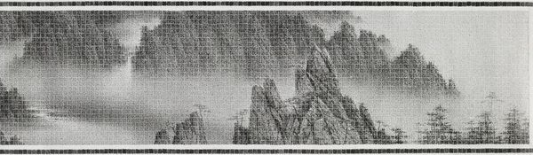
drawing, print, paper, ink
#
drawing
# print
#
landscape
#
figuration
#
paper
#
ink
#
line
Copyright: Public domain
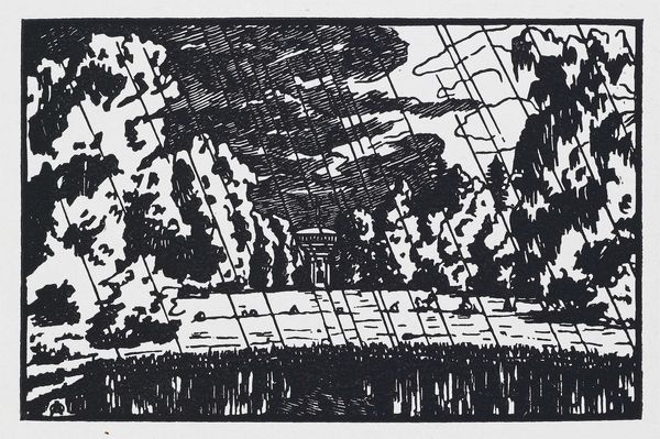
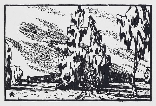
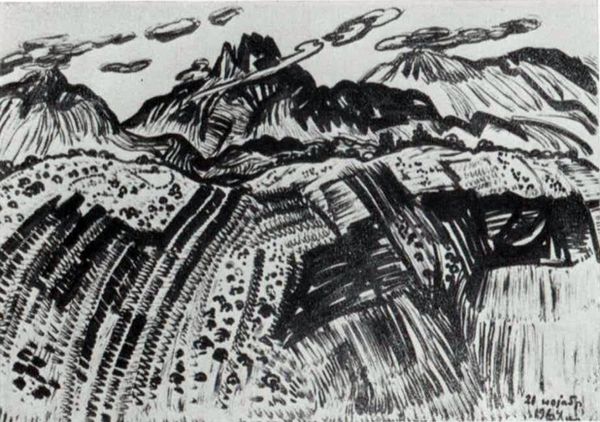
Harry Clarke made 'The Year's at the Spring' in black and white, and wow, what a study in contrast, right? You see how Clarke uses solid blacks against stark whites to create this dramatic scene? It feels almost theatrical, like a stage set. Look at the mountain on the left, a big, solid wedge of ink, and then your eye dances over to the delicate lines of the sunrise peeking out behind it. The texture in the foliage is really interesting. Clarke doesn't try to mimic nature, instead he is making a pattern that is his own language. See the little white gaps that suggests light flickering through leaves. It reminds me a bit of Aubrey Beardsley, that same love for intricate detail and a slightly spooky vibe. I love how art can be both a window and a mirror, reflecting the artist's inner world while inviting us to dream up our own stories. It’s not just about what you see, but what it makes you feel.
Comments
No comments
Be the first to comment and join the conversation on the ultimate creative platform.
More like this