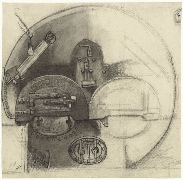
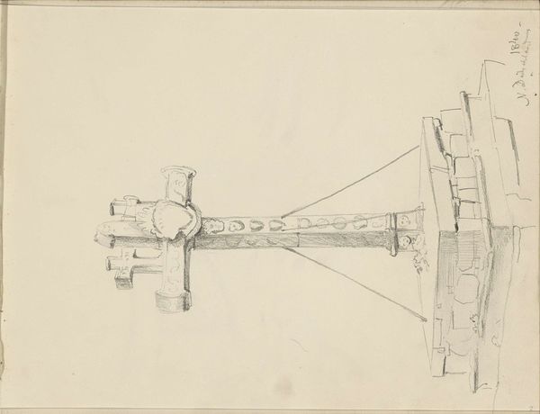
#
pencil drawn
#
amateur sketch
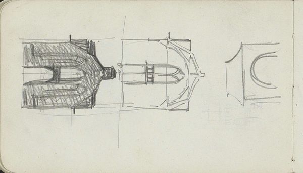
#
toned paper
#
light pencil work
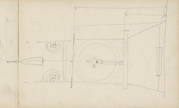
#
quirky sketch
#
pencil sketch
#
personal sketchbook
#
pencil drawing
#
sketchbook drawing
#
pencil work
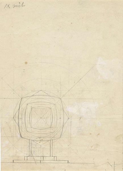
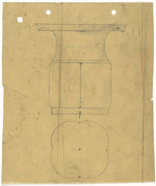
Dimensions: height 540 mm, width 630 mm
Copyright: Rijks Museum: Open Domain
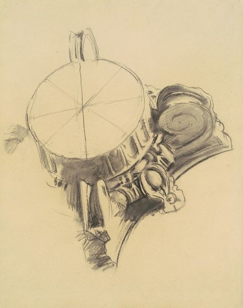
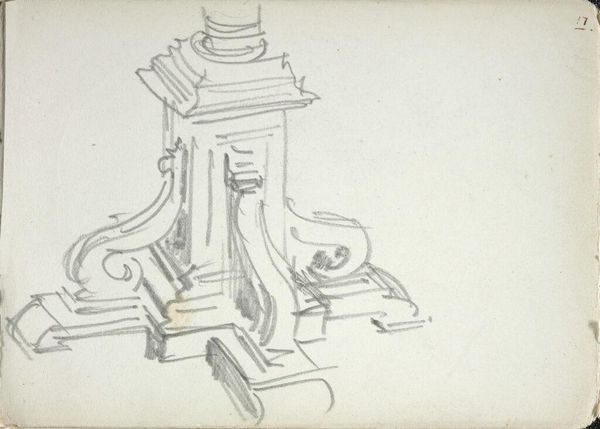
Editor: Here we have Mathieu Lauweriks’ “Ontwerp voor een zilveren tafelstuk”, created sometime between 1874 and 1932. It seems to be a design for a silver centerpiece, rendered in pencil. It's very symmetrical and geometric... almost cold. What do you see in this piece? Curator: Immediately, the orthogonal grid underpinning the entire composition commands attention. It's a pure assertion of structure, a framework upon which Lauweriks meticulously builds. Notice how the circles and rectangles, the primary formal elements, interact with this grid. It is not merely a background; it actively shapes the design's internal logic. Editor: So the grid dictates the form? It feels rigid... Curator: Precisely. The inherent tension between the organic potential of a "tafelstuk," a table centerpiece implying ornamentation and festivity, and the unyielding geometric framework is key. Consider the interplay of light and shadow, subtly suggested by the pencil work. How do these tonal variations reinforce, or perhaps undermine, the two-dimensional design's sense of depth and volume? Editor: I guess they emphasize the different planes, making it more three-dimensional even though it's a flat drawing. Curator: Indeed. Reflect upon Lauweriks' use of basic shapes and their calculated placement. The very absence of superfluous detail compels us to confront the fundamental structure. Editor: That makes sense. Focusing on the underlying shapes highlights the clean structure that might have been missed initially. I see how the tension between geometric form and the idea of an ornamental table piece makes it compelling. Curator: Precisely. And through this very process, the art itself speaks, revealing its hidden grammar.
Comments
No comments
Be the first to comment and join the conversation on the ultimate creative platform.
More like this