graphic-art, typography, poster
#
de-stijl
#
graphic-art
#
dutch-golden-age
#
typography
#
text
#
typography
#
geometric
#
abstraction
#
poster
Copyright: Public domain
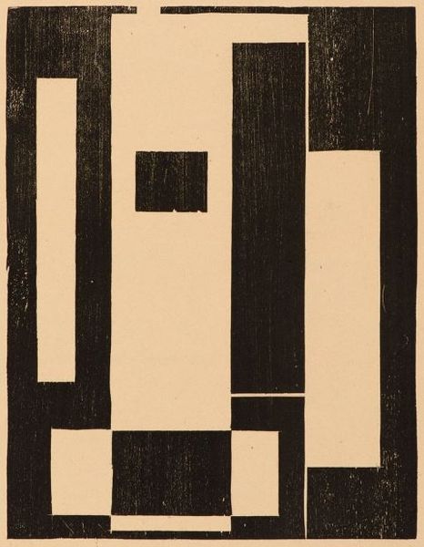
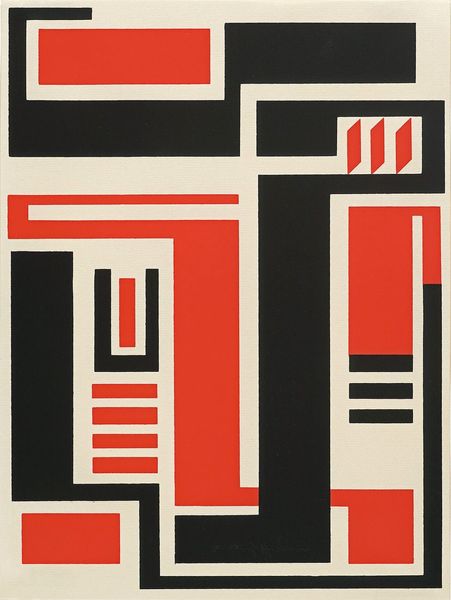
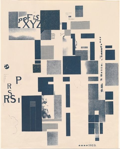
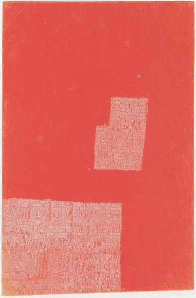
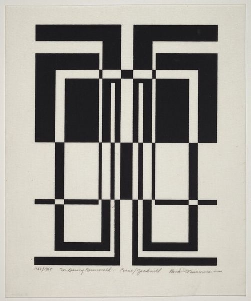
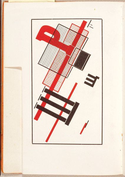
Curator: Here we have Theo van Doesburg's cover design for the magazine "Klei", created around 1920. It's a powerful example of De Stijl aesthetics using graphic art and typography. Editor: Striking! The stark black lettering against that pale ground feels incredibly assertive, almost like a declaration. It really embodies the radical spirit of early 20th-century modernism. Curator: The limited palette and geometric arrangement are hallmarks of De Stijl. Doesburg was aiming for a universal visual language, stripping away any subjective emotion. The title "Klei", Dutch for 'clay', hints at the earthy origins, perhaps symbolizing foundation and material, contrasting the abstraction. Editor: True, and that tension between the raw, material world and the pure abstraction is fascinating. There’s also something about the blocky, almost monumental, quality of the letters that makes me think about labor and the industrial landscape. "Klei" was a publication for brick and tile manufacturers. How do you think this geometric and mechanical lettering aesthetic speaks to these workers? Curator: I see these forms embodying that sense of industry and precision, also signaling the move to mechanization after WWI. The black, geometric forms symbolize progress, efficiency, but they do retain older roots. Geometric and structural shapes represent both human ingenuity and inherent universal order. Editor: Yes, I think its embrace of universal aesthetics also reflected the interwar drive for efficiency through management and technology; and that embrace wasn't without controversy. Did this simplification democratize art by making it more accessible, or was it ultimately dehumanizing, flattening out regional variations in culture and labor through visual means? Curator: I see it less as dehumanizing and more as a redefinition of beauty. It connects back to ancient traditions where geometric forms are venerated as representing harmony and cosmic order. This is why the geometric, almost austere simplicity of this image would have held so much symbolic resonance, conveying strength and resilience. Editor: Still, I am reminded how much of the clean functional style aesthetic also served rising national sentiments as well. The journal seems very forward-thinking but simultaneously very practical and bound up in its specific geographic location and profession. Curator: A vital point! Context always enriches our experience, and how powerful to view those interlocking viewpoints in a singular composition. Editor: It certainly is. Examining how material realities are shaped through aesthetics illuminates the powerful messages even minimalist art can transmit.
Comments
No comments
Be the first to comment and join the conversation on the ultimate creative platform.
