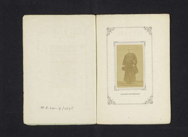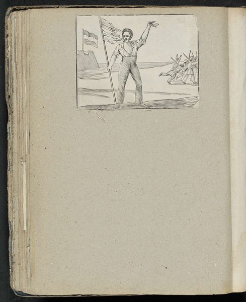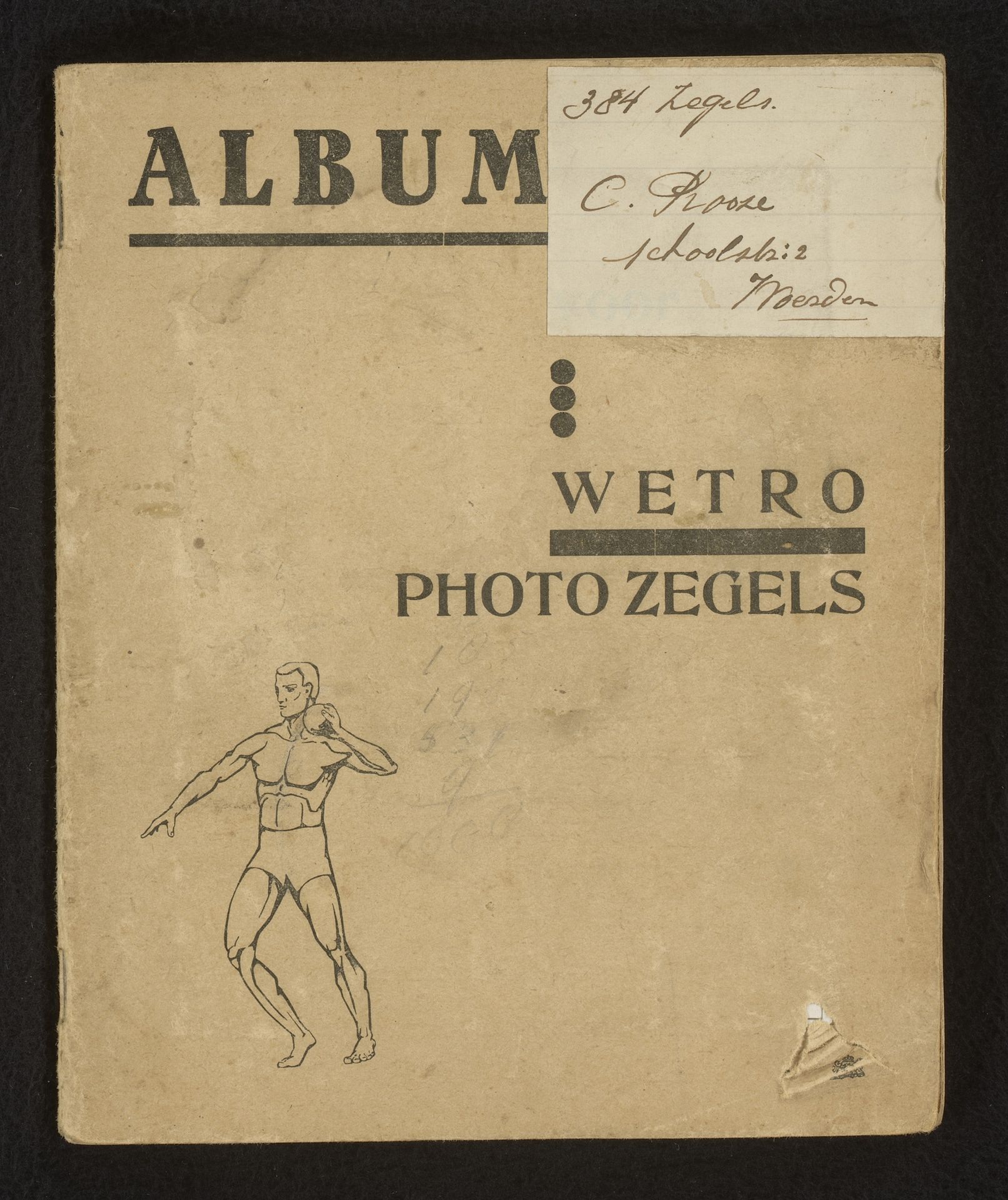
1937
Plakboek met spaarzegels van sporters en het Koninklijk Huis
Listen to curator's interpretation
Curatorial notes
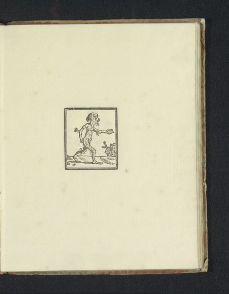
Editor: This is “Plakboek met spaarzegels van sporters en het Koninklijk Huis,” or Album of Savings Stamps of Athletes and the Royal House. It was made in 1937, probably by C. Rooze. It’s some kind of graphic art, perhaps a print or drawing. I'm struck by how aged it looks. What compositional elements stand out to you? Curator: The interplay between text and image establishes a stark visual hierarchy. Observe the calculated arrangement of geometric forms and contrasting typography against the organic figuration of the athlete. How does this tension shape your understanding of the work's intended function? Editor: I guess the text is supposed to draw your eye in before you notice the image, but I still feel like they’re competing for attention. Is that intentional? Curator: One might argue the visual discord mirrors the cultural climate of the time. The fragmented composition invites contemplation on the evolving role of graphic design. Consider the tonal variations within the aged paper and the line work itself – does this visual evidence contribute to a reading of the piece's significance? Editor: Definitely! It really highlights how old this booklet is and emphasizes the Art Deco style. I noticed how they only used black ink as a practical choice for printing. Thanks, I'm leaving with a fresh perspective on this aged graphic. Curator: Indeed. These aesthetic considerations allow us to appreciate how an artifact of commerce attains the status of a culturally significant relic.