Dimensions: 126 x 100 cm
Copyright: Public domain
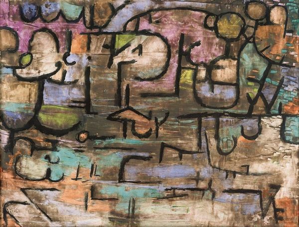
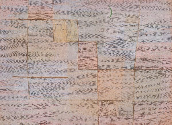
Editor: Here we have Paul Klee's 1932 painting, *Ad Parnassum*, rendered in oil paint. The intricate detail almost resembles mosaic tiles. What is most striking to me is the complex relationship between line, shape and color. What do you see in this piece? Curator: Its structural complexity is certainly its defining feature. Observe how Klee creates spatial depth not through traditional perspective, but through overlapping geometric planes and a network of individual points. It’s crucial to consider Klee's integration of both planned composition and seemingly improvisational markings. Note the pyramid at the top, subtly referencing classical architecture. Editor: The title also suggests classical references with its use of 'Parnassum'. Does this suggest that Klee wants us to think of it as a kind of 'sacred' or 'ideal' space? Curator: Perhaps. Klee seems to be synthesizing different traditions and pictorial languages. Ask yourself: How do the colors contribute to the overall harmony, or perhaps discord, within the composition? Does the carefully planned geometric structure unify, or clash with, the intuitive application of colour? Editor: I see! So it is the tension between the structural, almost rigid composition and the delicate application of colour that creates its unique feel. I now appreciate the geometric forms and diverse colour palettes. It feels far less rigid, and the movement feels much more alive. Curator: Indeed. By understanding the elements and composition of Klee’s language of art, you discover the subtleties within his deceptively simple aesthetic.
Comments
No comments
Be the first to comment and join the conversation on the ultimate creative platform.
More like this