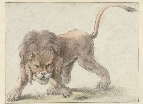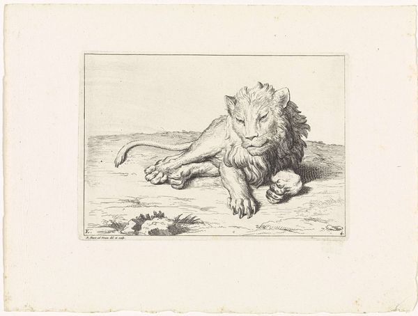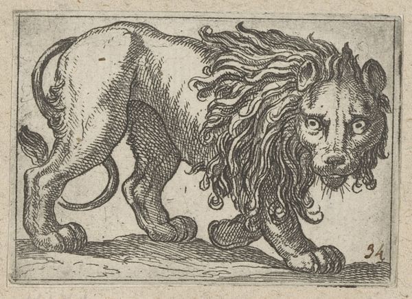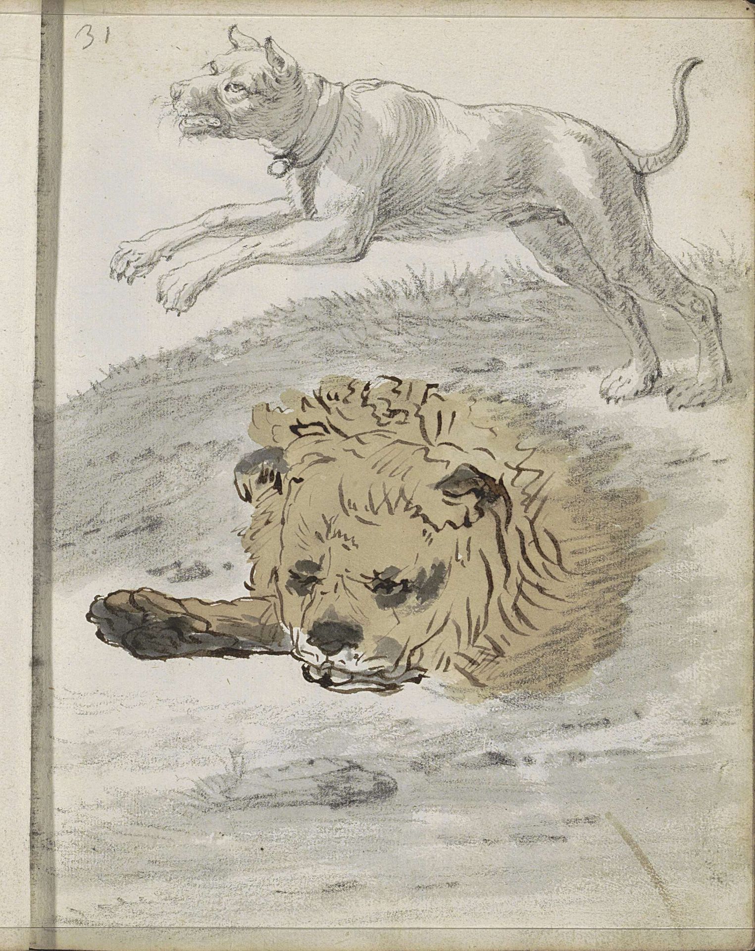
1666
Springende hond en de kop van een leeuw
Listen to curator's interpretation
Curatorial notes
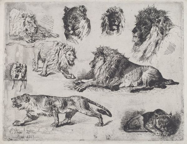
Editor: Here we have Cornelis Saftleven’s “Springende hond en de kop van een leeuw,” or “Leaping Dog and the Head of a Lion,” made around 1666. It’s a drawing done with pencil and watercolor. I’m immediately drawn to the contrast between the dynamic energy of the dog and the static, almost melancholic, pose of the lion. How do you read the relationship between these two figures, formally speaking? Curator: Notice how the artist positions the leaping dog above and the lion’s head below, creating a clear division within the composition. The dog is all lines and angles, a flurry of implied motion, while the lion’s head is heavier, more grounded through denser applications of wash. Consider the lines – do you see how the swift, almost frantic, lines used for the dog create a sense of lightness? Editor: Yes, definitely. The dog almost appears to be floating, whereas the lion feels heavy and still. The contrast in texture also amplifies the difference in mood. The dog's fur is barely suggested while the lion’s mane seems much denser. How does this all contribute to the artwork's overall meaning? Curator: Observe the way the blank space interacts with each form. It defines the contour of the dog's leap, lending a quality of openness. With the lion, the tighter clustering of lines confines the head and fur, intensifying the overall effect of confinement and closure. This opposition, rendered formally, can prompt varied interpretations. Editor: I see. So, the relationship isn't just about subject matter, but also about the visual language used to portray each animal. It’s a study of contrasts in form and line weight, emphasizing motion and stasis. Thank you; looking closely at those aspects gives me a deeper insight! Curator: Indeed. By understanding the syntax of forms, we perceive beyond representation into the inherent structure informing Saftleven's visual narrative.