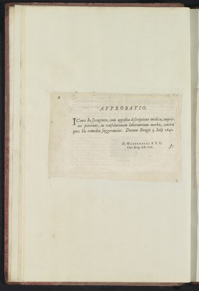
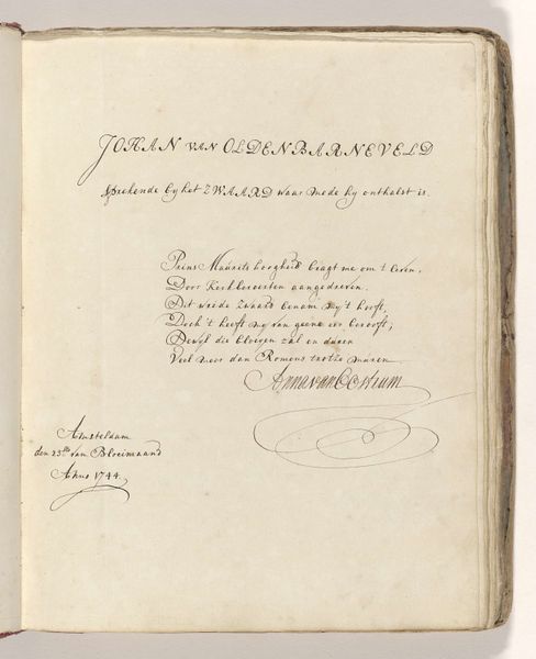
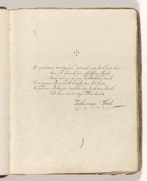
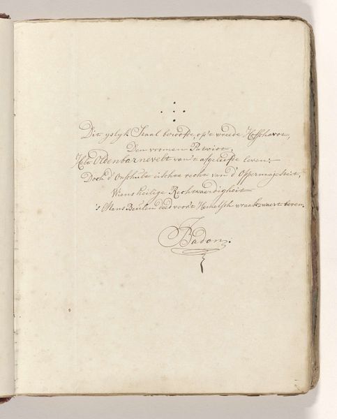
drawing, paper, ink, pen
#
portrait
#
drawing
#
toned paper
#
hand written
#
medieval
#
paper
#
personal sketchbook
#
ink
#
ink colored
#
pen
#
watercolor
#
calligraphy
Dimensions: height 308 mm, width 202 mm
Copyright: Rijks Museum: Open Domain
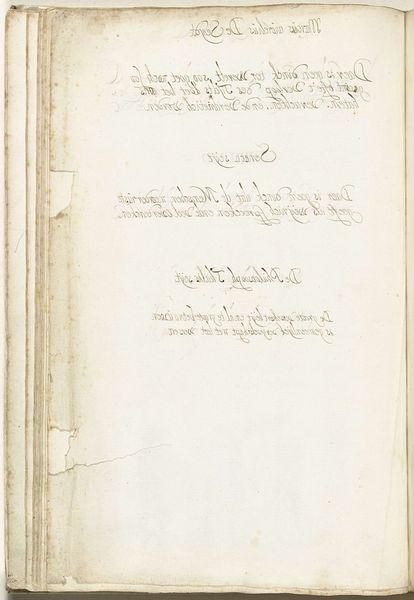
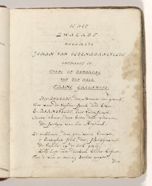
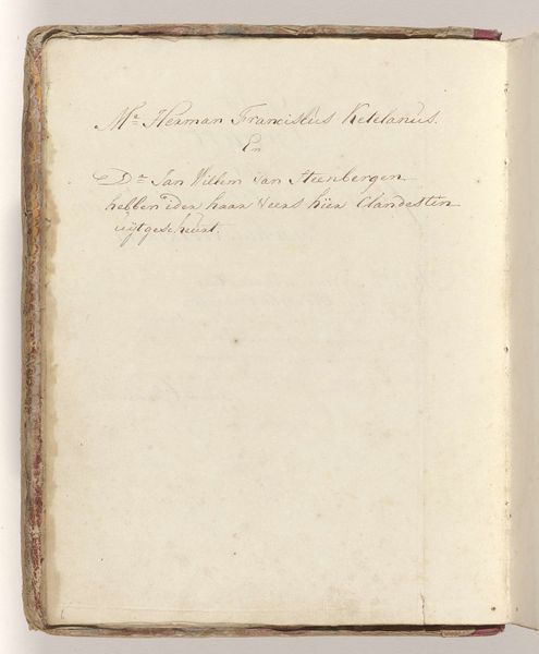
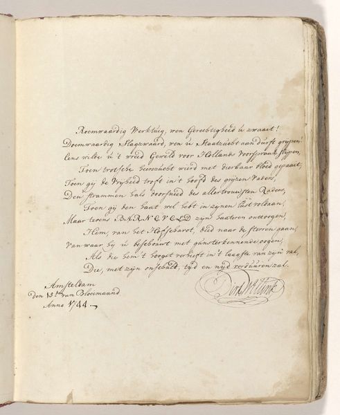
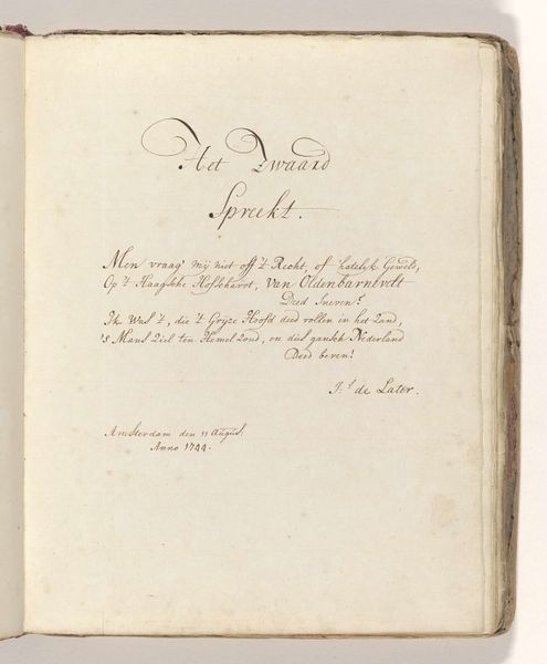
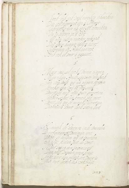
Editor: So, here we have Gesina ter Borch's "Classical Aphorisms in Mirror Image," from about 1652 to 1680. It's ink and watercolor on toned paper, and it almost feels like peering into someone’s secret diary. It gives me a peaceful, contemplative vibe. What jumps out at you when you look at this work? Curator: Well, it’s a looking glass into Ter Borch’s mind, isn’t it? What I love most about it is its inherent duality – these maxims, reflected as though staring back at you from another plane. Did she feel like the truest wisdom always contains its own reflection? Is that a bit heavy? Probably! The ink dances on the page, a mirrored performance… almost a duet between thought and reversed-thought. Do you think she actually wrote them looking in a mirror, or just rendered them afterward? Editor: I hadn't thought about that, but physically writing them backward, that's dedication! It makes the viewing experience so much more interactive too. Curator: Exactly! The challenge and reward are heightened! Imagine the control it must have taken to craft the flourishes backwards like that! To me, the toned paper itself breathes with time, whispering secrets from centuries past. How does the imperfection play into your sense of "peaceful vibe"? Editor: It makes it feel more human and intimate. Like she wasn't afraid to let us see the raw, unedited thoughts. It's oddly inspiring to realize these aren't perfect engravings. Curator: I agree completely, that raw quality! Imperfection embraced is so much more beautiful, isn't it? Well, I feel I know dear Gesina just a tiny bit better now! Editor: Me too! I'm definitely going to spend more time deciphering those mirror-image aphorisms.
Comments
No comments
Be the first to comment and join the conversation on the ultimate creative platform.
More like this