drawing, paper, ink
#
portrait
#
drawing
#
aged paper
#
dutch-golden-age
#
paper
#
personal sketchbook
#
ink
#
miniature
#
watercolor
#
calligraphy
Dimensions: height 313 mm, width 204 mm
Copyright: Rijks Museum: Open Domain
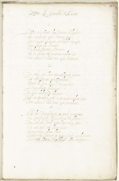
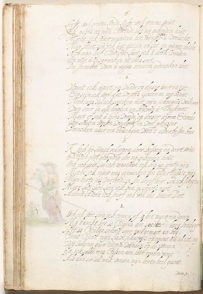
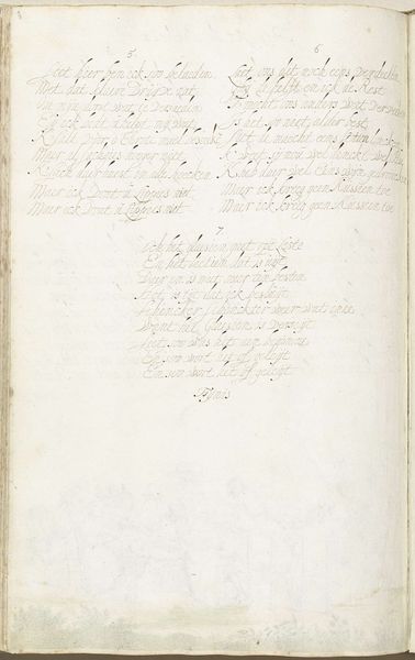
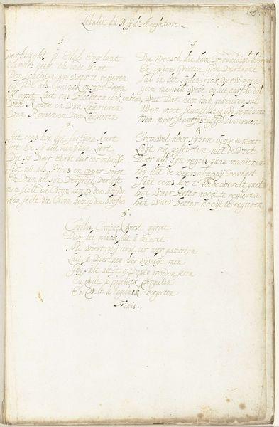
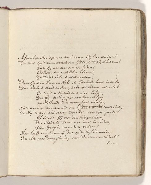
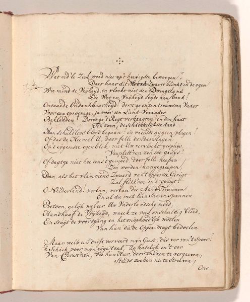
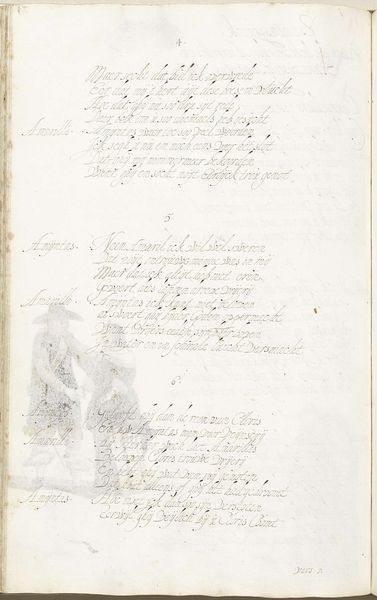
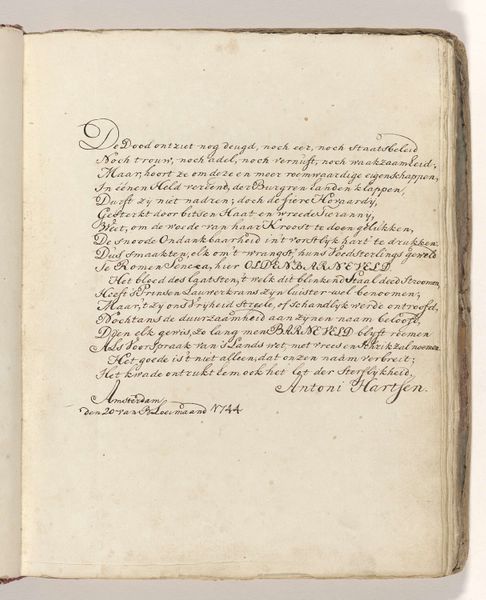
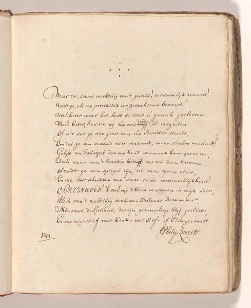
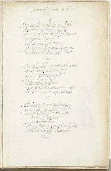
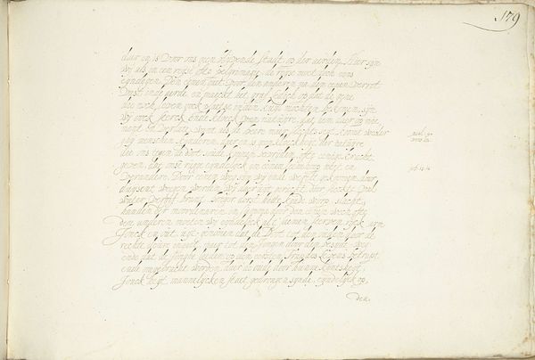
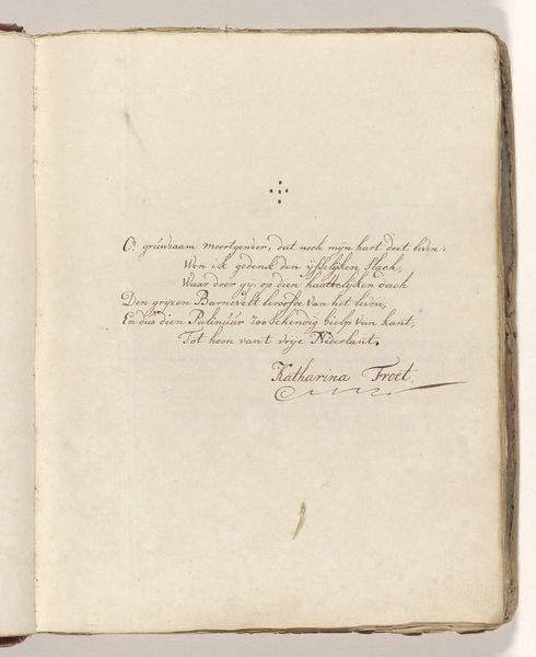
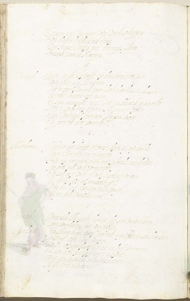
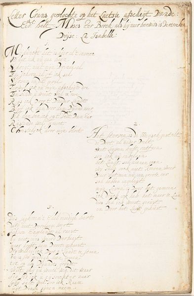
Editor: So, this is "Drinklied," possibly from 1653, by Gesina ter Borch. It's an ink and watercolour drawing on paper. It strikes me as very delicate, almost ephemeral because of the light ink. What visual elements stand out to you? Curator: The rhythmic quality of the script compels me. Note how the controlled flow of the ink creates a tapestry across the aged paper. Do you perceive how the artist uses subtle variations in line weight to define structure and delineate space? Editor: Yes, now that you mention it, there’s a certain elegance to how she varies the pressure. It creates a kind of visual hierarchy. What about the page itself, the aged paper? Does its condition influence how we should read it? Curator: Assuredly. The aged, slightly discolored paper provides contrast and serves as a textural ground, foregrounding the stark precision of the calligraphic line. One might consider the materiality of the work itself: paper and ink, ephemeral yet enduring, echoing the themes of memory and transmission inherent in the poem. What relationship might exist between form and content? Editor: I see, so the poem’s delicate presentation emphasizes its theme and historical background. Would you say that analyzing the line and material allows a deeper understanding of the art? Curator: Precisely. By centering formal properties such as the application of line, material, and structure, we understand a piece as a coherent whole and explore relationships that reflect its artistic qualities. Editor: I learned a lot about the power of formal analysis, especially in works where the materiality contributes so much to its meaning. Thanks! Curator: A worthwhile inquiry, demonstrating the interplay between form and substance.
Comments
No comments
Be the first to comment and join the conversation on the ultimate creative platform.
