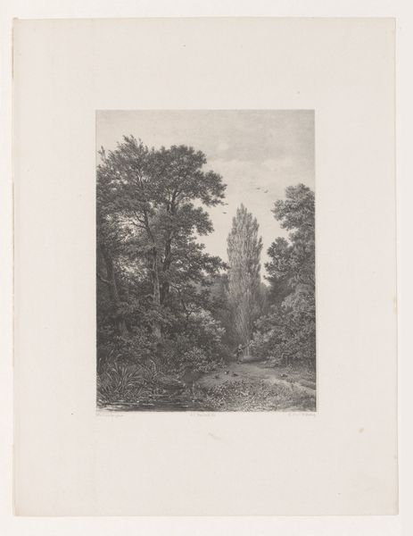
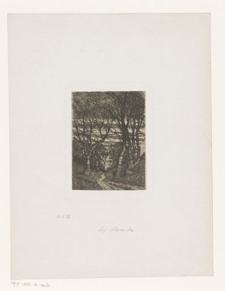
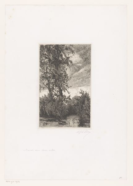
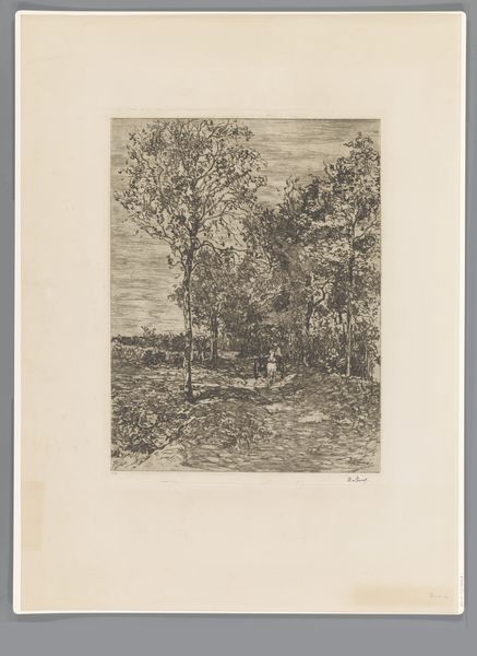
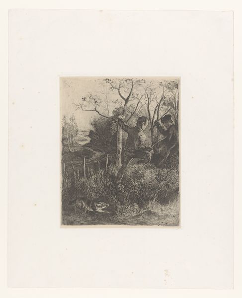
drawing, print, etching, paper
tree
drawing
etching
landscape
etching
paper
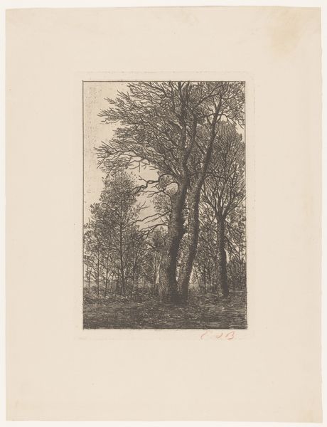
Dimensions: height 111 mm, width 57 mm
Copyright: Rijks Museum: Open Domain
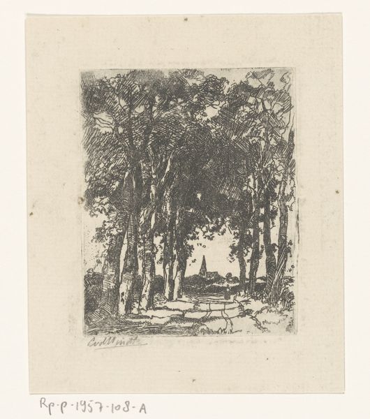
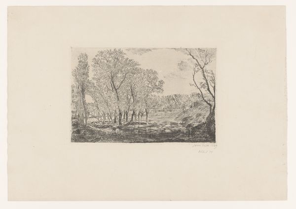
Editor: This is "Four Trees on a Slope," an etching made by Louise Van de Kerkhove in 1877. The scene feels sparse, almost skeletal in its presentation of these slender trees. The composition strikes me as quite stark. How do you see it, from your perspective? Curator: The etching technique itself is paramount here. Observe the deliberate contrast Van de Kerkhove achieves with the density of lines used to render the slope versus the relative airiness of the sky. Consider the deliberate, almost calligraphic quality of each line. Editor: Yes, I notice how the line work is much denser at the base, gradually thinning as your eye travels upwards, focusing the attention on the structure of the trees. Curator: Precisely. Note too, how the bare branches reaching toward the top subtly counteract the downward pull of the slope. It establishes a visual tension. Are you receptive to how such counter positioning influences our interaction with the overall piece? Editor: Absolutely. It keeps the eye moving, preventing the image from feeling static. Curator: Exactly. The negative space, often overlooked, is critical. It allows each element to breathe and emphasizes the linear quality. Could one even interpret this interplay as a dance of form, meticulously recorded with needle and acid? Editor: I see what you mean, now noticing how the tonal gradations make some branches push forward, and others receed, which makes a dance seem rather fitting. Curator: Thus, what appears to be a simple landscape reveals layers of complexity, accessible through close analysis of its formal elements and the language specific to the etching medium itself. It seems, at times, reductive – but its intentionality proves to be profoundly additive. Editor: I am struck by how a seemingly simple composition relies so heavily on contrasts in texture and carefully constructed balance to deliver such nuance. I’ve definitely gleaned more from this visual deconstruction!
Comments
No comments
Be the first to comment and join the conversation on the ultimate creative platform.