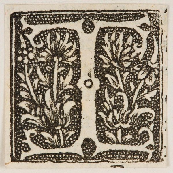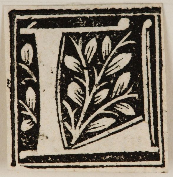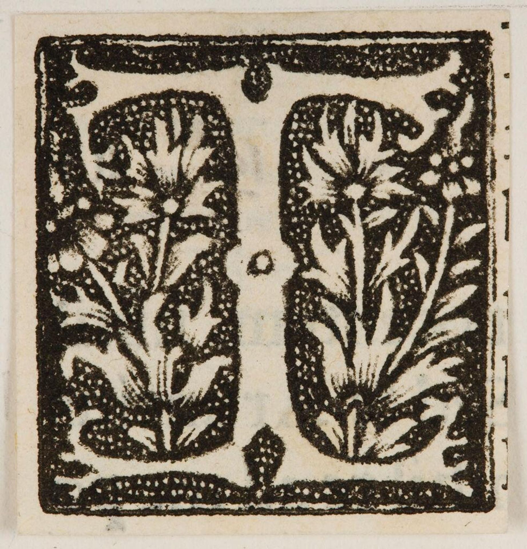
c. 16th century
Letter T
Listen to curator's interpretation
Curatorial notes
Curator: Here we have "Letter T," an anonymous piece from the Harvard Art Museums. I'm immediately drawn to its striking contrast. Editor: Yes, the black and white are quite bold. It has an austere quality, yet the floral details soften the rigid letterform. What more can you tell us about it? Curator: Considering its likely origin in printmaking, the labor involved in carving such detail into a block is significant. Imagine the skill and time required! Editor: True, and the positive and negative space interplay beautifully. The "T" itself is a strong, stable form, counterpointed by the organic, almost whimsical plant life. Curator: These initial letterforms often signified a new beginning for a text, which leads one to consider who made this and for what purpose. Editor: Perhaps an opening for a devotional text? Regardless, the design’s balanced tension is very satisfying. Curator: It's a reminder that even the smallest artistic act can reveal a whole history of labor and intention. Editor: Indeed, and a testament to how potent graphic simplicity can be.