Dimensions: height 496 mm, width 649 mm
Copyright: Rijks Museum: Open Domain
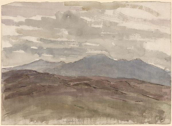
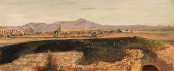
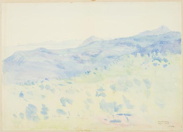
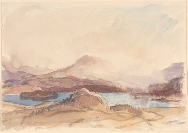
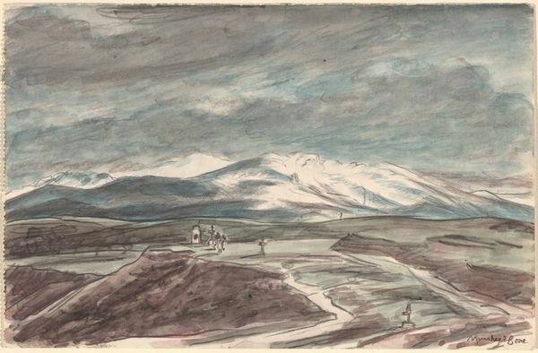
Editor: Here we have Bramine Hubrecht’s “Berglandschap te Taormina, Sicilië, Italië,” placing us somewhere between 1865 and 1913, rendered in watercolor and oil. It’s… atmospheric. Quite muted. What do you see in this piece? Curator: I note immediately the artist's compositional choices. The strong horizontal lines dividing the planes – the sky, the mountains, the foreground – give it a stratified feeling. There's a clear recession into depth, primarily achieved through tonal variation. Consider how the artist uses the watercolor medium: see the almost washy, translucent quality of the sky and distant mountains, contrasted with the thicker, more opaque oil paint used to define the architecture and the immediate foreground. Do you perceive how this tonal range creates a dynamic contrast? Editor: Yes, now that you mention it, there is definitely a push and pull, almost as if the foreground is looming over the background. How would you interpret the subdued palette? Curator: It speaks to a certain emotional tenor. Note the restrained use of colour; mostly greys, browns, and blues, which imbue the painting with a melancholic quality. The interplay between these colours is essential; there is very little by way of true bright tones here. Consider how this constrained palette serves the overall mood of the piece. Editor: It's interesting how focusing on the artistic components changes my reading of it. I initially saw it as just a muted landscape, but now I recognize how deliberate each decision seems to be. Curator: Precisely. The power of art lies in understanding the calculated effects of composition, materiality, and tone on the viewer's emotional and intellectual response.
Comments
No comments
Be the first to comment and join the conversation on the ultimate creative platform.
More like this