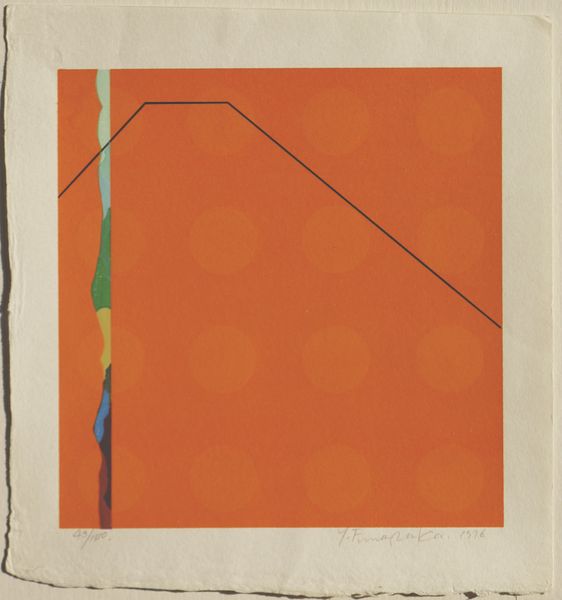
Copyright: Lothar Charoux,Fair Use
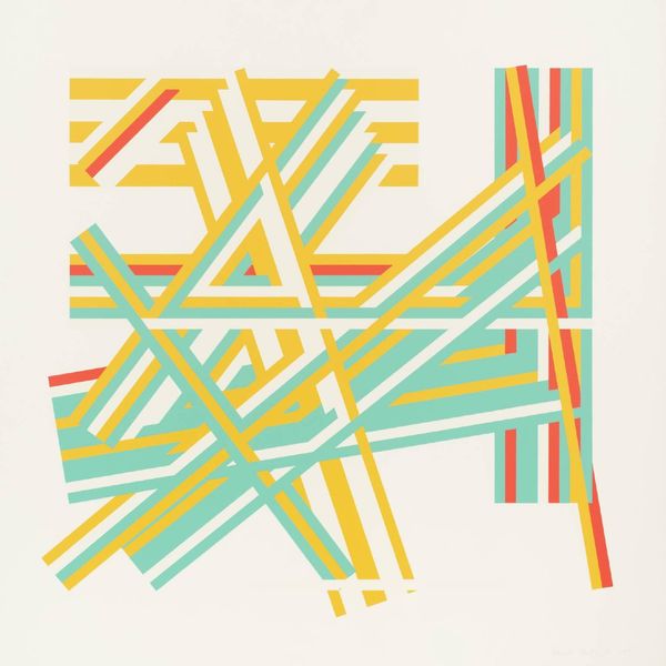
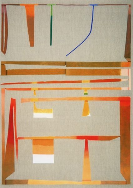
Lothar Charoux made this print, “Composição,” with graphic lines and a simple palette. I'm drawn to how these shapes and colours create a sense of movement and energy. Look at the way the lines converge and diverge, almost like musical notes on a staff. The texture of the paper and the slight imperfections in the printing process give it a human touch, as the surface isn’t too slick or perfect. Take, for instance, the orange lines, they're sharp, precise, and also kinda shaky. These subtle variations add depth and complexity to the overall composition. Charoux's work reminds me a little of Josef Albers' explorations of colour and form, but with a playful edge. Both artists share an interest in geometric abstraction, and both are committed to experimentation and innovation. To me, this piece feels like an invitation to embrace ambiguity and find joy in the unexpected.
Comments
No comments
Be the first to comment and join the conversation on the ultimate creative platform.
More like this