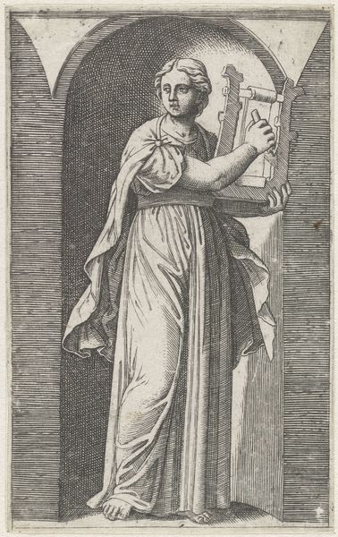
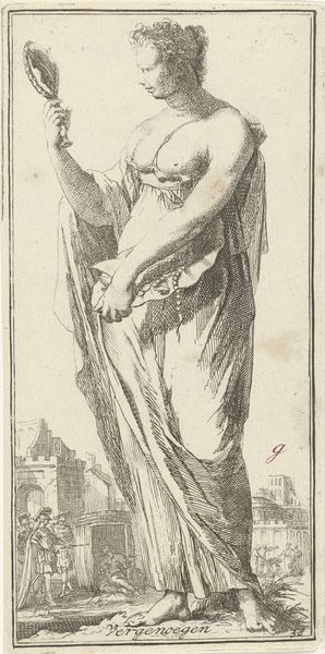
print, engraving
#
baroque
# print
#
old engraving style
#
figuration
#
history-painting
#
engraving
Dimensions: height 248 mm, width 137 mm
Copyright: Rijks Museum: Open Domain
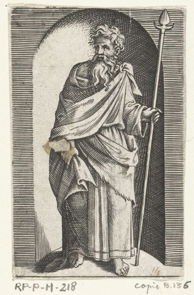
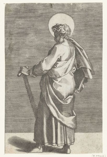
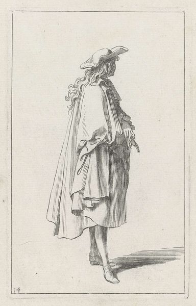
Editor: So, here we have "Apostel Tomas met hellebaard," or "Apostle Thomas with Halberd," by Pieter de Bailliu, created sometime between 1623 and 1660. It's an engraving, currently residing at the Rijksmuseum. I'm really drawn to the dynamism of the lines; they give the figure so much weight and movement, especially in the robe. What compositional elements stand out to you? Curator: The dynamism you observe is indeed generated by a skillful deployment of line. Note the contrasts between the tightly packed, almost chaotic, hatching of the drapery folds versus the more open, directional lines suggesting the background sky. These contrasting applications establish a clear figure/ground relationship. How do these linear relationships speak to you? Editor: I see how the density of the lines really anchors the figure of St. Thomas, setting him apart from that more ethereal background scene. It makes him feel much more present, almost looming, despite the smaller figures in the background actually enacting a scene. It is like the promise of violence is ever present. Curator: Precisely. Furthermore, examine how the artist uses line to delineate form and texture. Consider the roughness of the halberd compared to the smoothness implied in the saint’s cloak. The printmaker generates considerable dimensionality without recourse to color. In that regard, what are your thoughts on the implied lighting, considering the nature of light in Baroque period generally? Editor: The lighting seems quite directional, focusing attention on the apostle while casting everything else into shadow, highlighting a spiritual authority. The halberd contrasts with the Gospel in his hands. It introduces, perhaps, the idea of how that belief will be spread, defended. That all hinges, graphically, on this stark contrast in linework. Curator: Exactly. The strategic employment of light and shadow, the weighting of the figure through calculated compositional line: it is the orchestration of these elements that speaks to the artistry present in this piece. Editor: It’s incredible to consider how much can be conveyed through what seems like a relatively simple medium. I am definitely thinking about the power of line and tonal contrast in a new way. Curator: Indeed. Appreciating the formal components allows one to appreciate, perhaps, the historical context of the work itself.
Comments
No comments
Be the first to comment and join the conversation on the ultimate creative platform.
More like this