Dimensions: height 344 mm, width 405 mm
Copyright: Rijks Museum: Open Domain
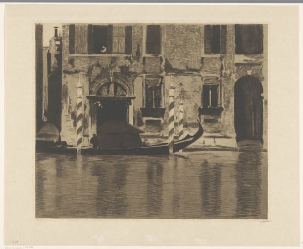
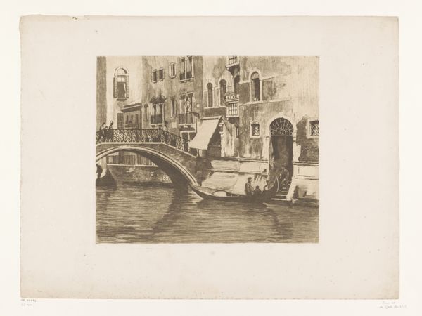
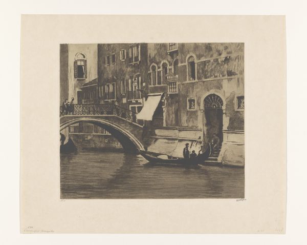
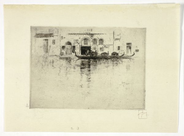
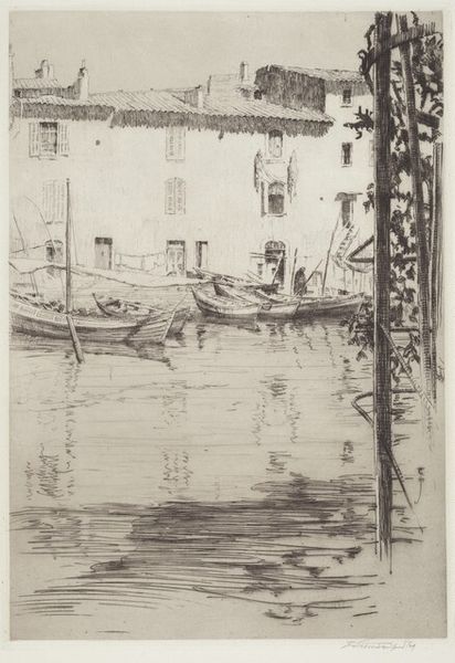
Editor: This is Willem Witsen's "Gondel in het Canal Grande in Venetië," made sometime between 1914 and 1919. It's an etching. The monochromatic palette lends it a slightly somber, dreamlike quality. How do you read this composition? Curator: The artist's focus lies primarily in the intricate network of lines that define the structures and the gondola. Note the emphasis on verticality, reinforced by the striped mooring poles and the facade. How do these formal choices affect the viewer’s perception of space? Editor: It almost flattens the scene. The details seem to fade into each other, as if prioritizing surface over depth. What would you say are the most crucial elements in the print? Curator: The etching's tonality establishes the atmospheric perspective, and there is a high level of tonal unity. Look closely: what is the visual effect when light is translated through the print-making technique of etching? Editor: I can see how the etching's hatching creates the texture. Are there more traditional artistic choices Witsen seems to deliberately avoid? Curator: Indeed. Witsen isn't aiming for photorealism, instead highlighting the medium itself through visible line work. The formal choices foreground texture and tone over spatial illusion, in spite of representing a cityscape of Venice. Editor: That makes sense. I initially viewed it as simply a scene of Venice, but seeing the focus on line, tone, and texture elevates it beyond a mere representation. Curator: Exactly. Through its structural elements, the work draws attention to its constructed nature, prompting us to consider the artifice inherent in representation itself. Thank you for your fresh insights!
Comments
No comments
Be the first to comment and join the conversation on the ultimate creative platform.
More like this