drawing, print, engraving
#
drawing
#
light pencil work
#
quirky sketch
#
dutch-golden-age
# print
#
hand drawn type
#
landscape
#
personal sketchbook
#
idea generation sketch
#
sketchwork
#
geometric
#
line
#
sketchbook drawing
#
storyboard and sketchbook work
#
academic-art
#
sketchbook art
#
engraving
#
initial sketch
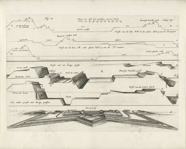
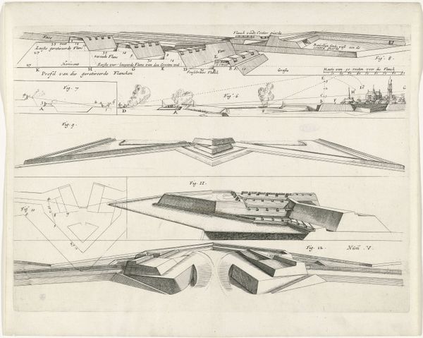
Dimensions: height 230 mm, width 340 mm
Copyright: Rijks Museum: Open Domain
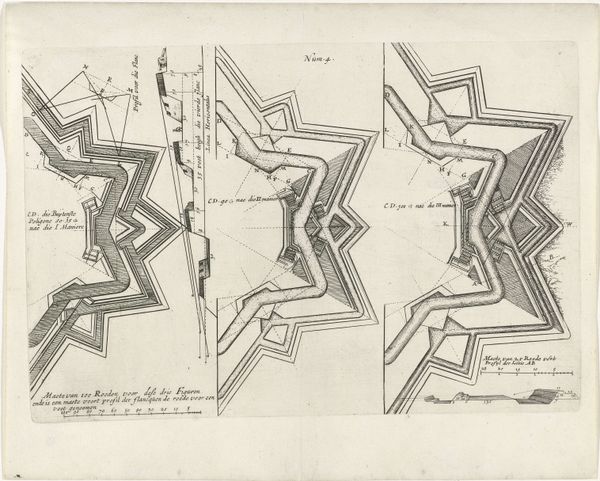
Curator: This is “Plattegrond van versterkte vestingmuur,” or “Plan of a fortified city wall,” dating to 1654, by Hendrick baron van Ruse van Rysensteen. It appears to be an engraving, part of a larger study. What’s your immediate response? Editor: Stark. Precise. It gives the sense of order and planning—cold comfort, perhaps, intended to create safety, though there’s something unnerving in the geometric rigidity. Curator: The line work is striking, isn’t it? Notice the use of dashed lines overlaid upon solid forms to give shape to implied structures. The starkness derives from a limited tonal palette, emphasizing line and shape as the dominant compositional elements. It really invites close visual study. Editor: Indeed. The linear construction, along with the angles forming the bastions…they evoke a sense of impenetrable defense, a response to conflict perhaps deeply rooted in collective anxiety of the 17th Century. There are, after all, so many historic images of sieges. What are your thoughts? Curator: Precisely! Semiotically, each line is significant: solid lines declare what is, while dashed lines indicate potential. The angles formed at each corner don’t merely represent physical space, they symbolize calculated military strategy. Editor: I see an aspiration towards invincibility, certainly. And these city walls, visually, were crucial. Cities project power, control...these zig-zagging walls, they physically embodied these ideals of protection for those inside and a clear, intimidating message to those outside. It’s like a psychological imprint, isn't it? Curator: Yes, as an aesthetic object it is quite intellectual, yet somewhat detached from everyday life. Consider how the use of negative space emphasizes the geometric perfection. Editor: Well, examining these symbols has given me a new understanding of 17th century society. A world constantly attempting to build defenses, both physical and psychological. Curator: For me, it has reinforced how the purely formal can still elicit strong emotional responses.
Comments
No comments
Be the first to comment and join the conversation on the ultimate creative platform.
More like this