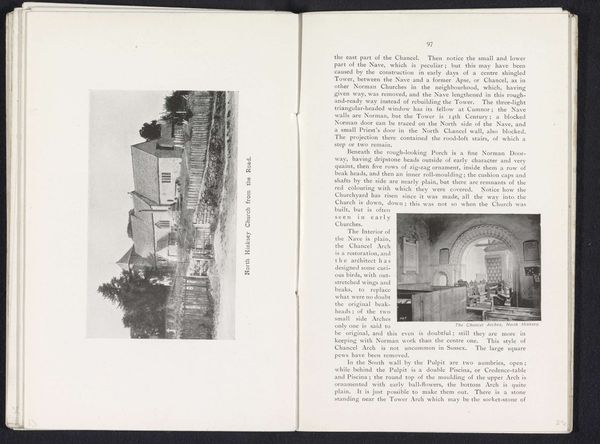
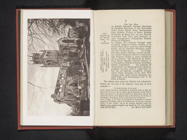
#
script typography
#
hand-lettering
#
hand drawn type
#
hand lettering
#
personal sketchbook
#
hand-drawn typeface
#
stylized text
#
thick font
#
handwritten font
#
historical font
Dimensions: height 80 mm, width 132 mm
Copyright: Rijks Museum: Open Domain
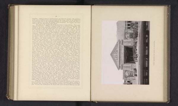
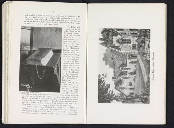
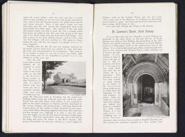
Curator: Let's have a look at "Piscina, South Hinksey Church" by Henry W. Taunt, captured before 1912. It depicts a page from what appears to be a historical journal. What’s your initial reaction to this composition? Editor: Oh, instantly cozy, almost like stumbling upon a well-loved family scrapbook. The page with the sketch – slightly off-center – gives this feeling of intimacy. The faded tones hint at tales softly aged, almost whispering secrets. Curator: Absolutely. Taunt was a prolific photographer and publisher, documenting Oxfordshire. This particular page features a hand-drawn illustration of a piscina, which is a shallow basin near the altar in a church. Editor: Right, a sort of spiritual sink! And the typography surrounding it… I'm quite taken with how each word seems hand-rendered, like a monk diligently illuminating manuscripts. It’s wonderfully archaic and evocative. Curator: Exactly. There’s a palpable sense of the handmade, emphasizing a connection to tradition and continuity. The stylized text enhances this, imbuing the ordinary object with a certain symbolic gravitas. Note how this particular feature, this Piscina, is emphasized over the rest of the text or image? Editor: The Piscina illustration anchors all the ornate script. It really contrasts the practical, functional object with this whole world of textual embellishment and even hints to stories untold. The sketch and typography speak to dedication, a meticulous artistry applied to even the humblest of church fixtures. There is a feeling the sacred here. Curator: Precisely. The text not only describes it materially—small size, quatrefoil shape—but implies the sacred, and offers function, too—for washing before communion. The authorial choice of highlighting with type hints at continuity through belief and historical use. Editor: Looking at it now, I appreciate that understated blend, it's like a whispered prayer etched in ink. Curator: Yes, the interplay between text and image invites us to consider not just what we see but the history of faith inscribed within these architectural details. Editor: What a quiet testament, then – blending reverence and utility, forever echoing through time!
Comments
No comments
Be the first to comment and join the conversation on the ultimate creative platform.
More like this