Curatorial notes
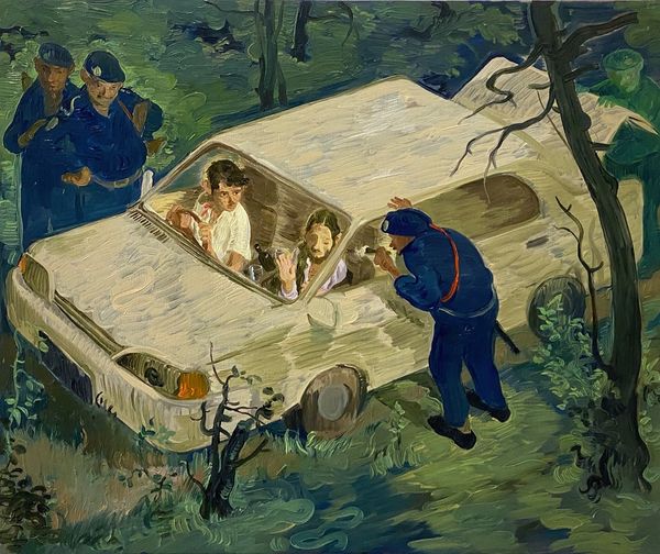
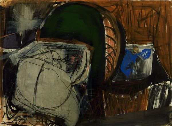
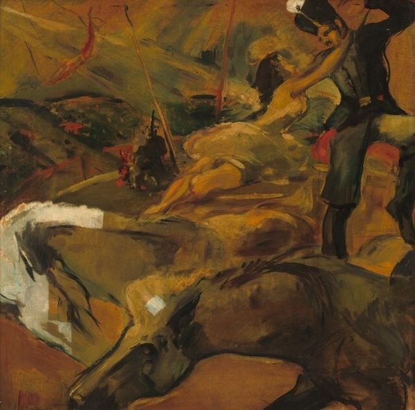
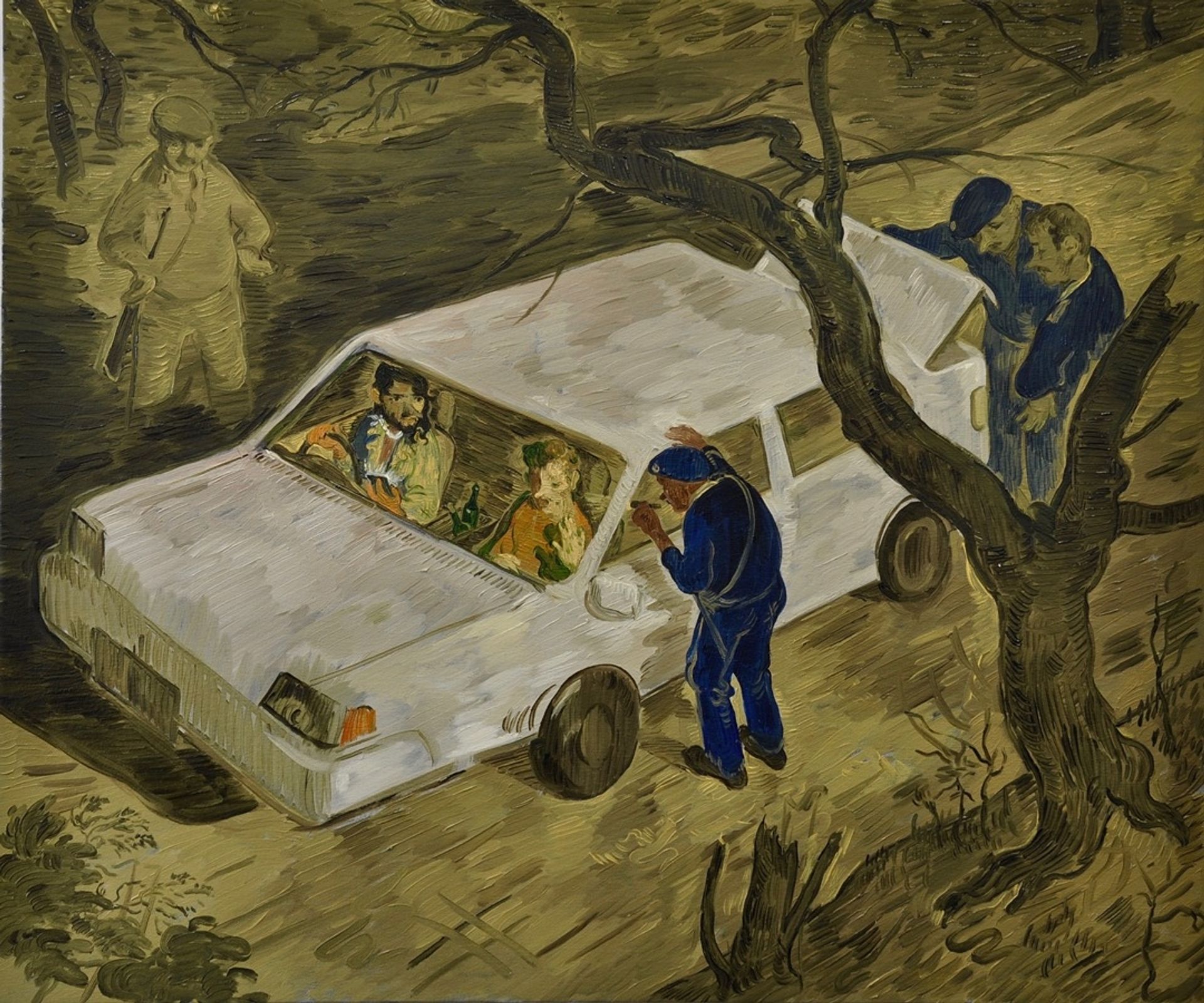
Editor: Salman Toor's mixed-media piece, "Ambush II" from 2019, is striking! The muted palette creates this eerie, almost dreamlike quality. What formal elements stand out to you most in this piece? Curator: The composition is indeed notable. Consider how Toor employs a high vantage point, almost bird's-eye, disrupting conventional perspective. How does this skewed perspective influence your reading of the painting? Editor: It makes me feel detached, like an observer rather than a participant. And the brushwork is so visible, adding to the unease. Curator: Precisely. The visible brushstrokes contribute to the painting's overall texture and rhythm. Look closely at the application of paint: short, broken strokes define forms and create a sense of movement. Note, for example, the thick impasto on the car. This draws attention to the materiality of the paint itself, wouldn't you agree? Editor: Definitely. It keeps pulling me back to the surface, reminding me that it's a painting, not just a scene. How does the limited color palette impact the composition? Curator: The artist is deliberately drawing your eyes using restrained earth tones as contrasted with a lighter-colored central focus. It directs attention but limits the chromatic harmony overall. By limiting the color range to earth tones and only three or four other hues, a kind of structure of tonality comes to light, which directs where you focus as a viewer, correct? Editor: Yes, I see that more clearly now. Focusing on the formal qualities gives it an entirely different meaning. Thanks for that breakdown! Curator: It reveals a fascinating orchestration of form and intention. By concentrating on the structural components and organization within its pictorial space, new and interesting information is given about "Ambush II".