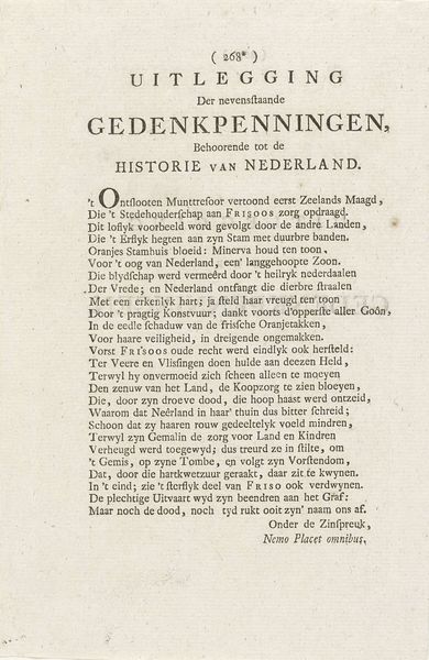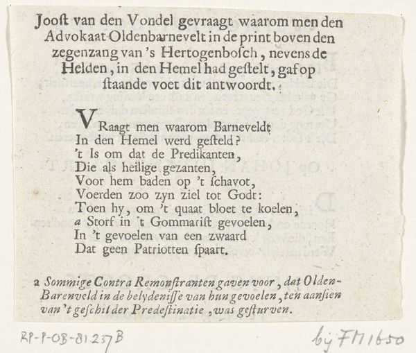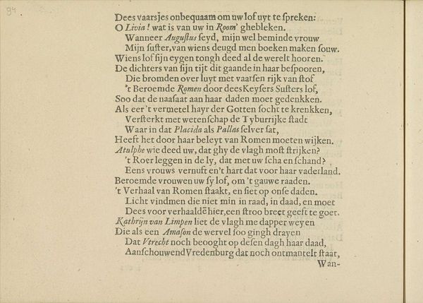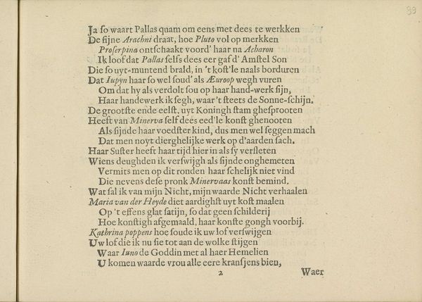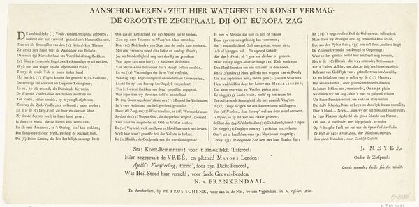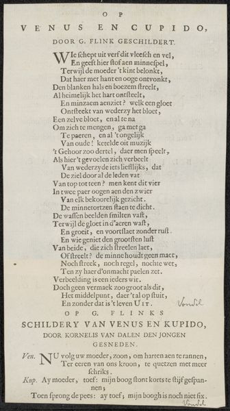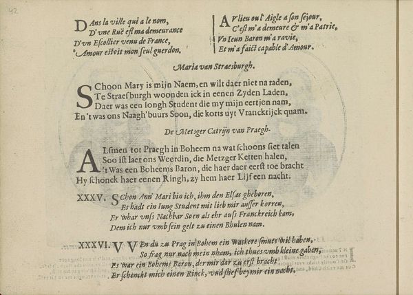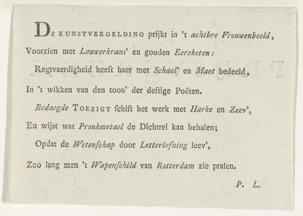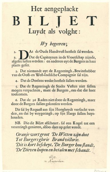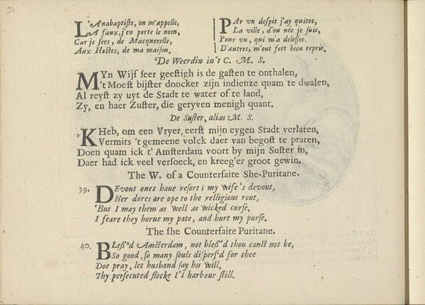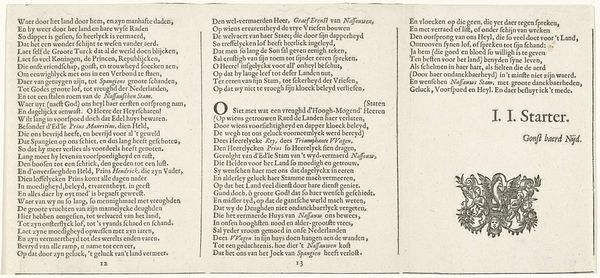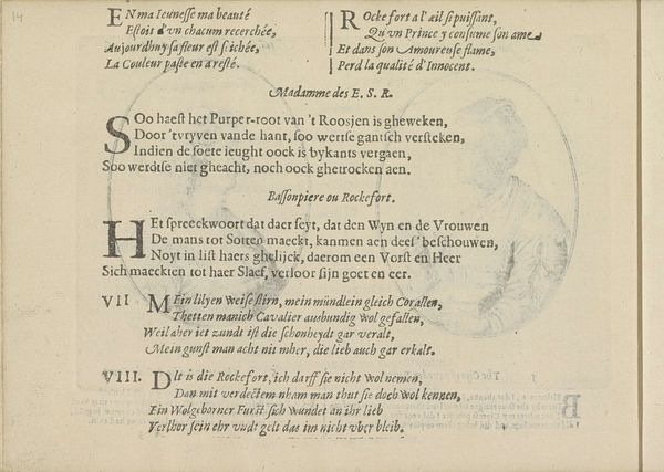
Rijm op de titelprent voor: Minnezangen kusjes drinkliederen, 1710 1710
0:00
0:00
arnoldhoubraken
Rijksmuseum
graphic-art, print, typography, engraving
#
portrait
#
graphic-art
#
baroque
# print
#
text
#
typography
#
engraving
Dimensions: height 134 mm, width 81 mm
Copyright: Rijks Museum: Open Domain
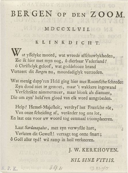
Editor: This engraving, “Rijm op de titelprent voor: Minnezangen kusjes drinkliederen, 1710,” by Arnold Houbraken, features mostly dense text. There's something almost claustrophobic about its composition; the words seem to box in the viewer. What do you see in this piece? Curator: Indeed, the text dominates, creating a kind of visual architecture. But consider this: the *placement* of text itself functions as a potent symbol. Here we find the evocation of power through words. Words can embody authority, passion, and beauty. Do you see in the capitalized words, their location in the composition, some meaning, something significant? Editor: Perhaps they emphasize particular ideas or feelings the poem intends to evoke. A hierarchy of meaning, almost? Curator: Precisely. And look closer at the phrases. They speak of youth, triumph, songs, desire, all central to the collection this print prefaces. Consider, too, the Baroque period's love of allegory and symbolism. This image isn’t merely text; it's a portal into a world of cultural ideals and artistic aspirations. Each element—font choice, spacing, even the ink—contributes to this meaning. It's cultural memory encoded in ink. Editor: So, it's less about what the text says literally, and more about what it represents culturally and symbolically? Curator: Exactly. This isn't just a title page; it’s an invocation. An encapsulation of the artistic and societal values of its time, and an intentional construction of cultural inheritance. Editor: I've definitely learned to look beyond just reading the text, to consider its role as a visual and cultural symbol. Curator: And to hear its echoes through time.
Comments
No comments
Be the first to comment and join the conversation on the ultimate creative platform.
