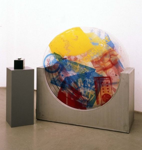
mixed-media, matter-painting, assemblage, sculpture, wood
#
mixed-media
#
abstract painting
#
matter-painting
#
water colours
#
conceptual-art
#
assemblage
#
furniture
#
painted
#
sculpture
#
abstraction
#
wood
#
mixed media
Copyright: Daniel Dezeuze,Fair Use
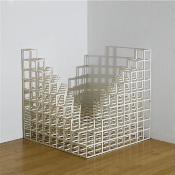
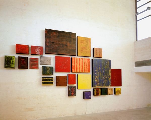
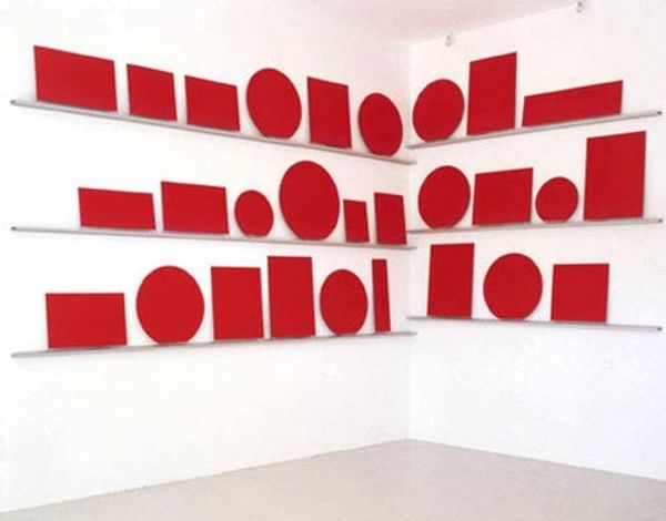
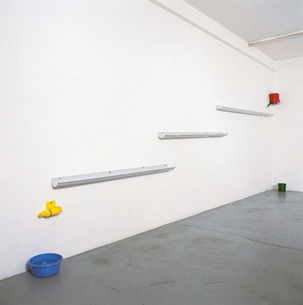
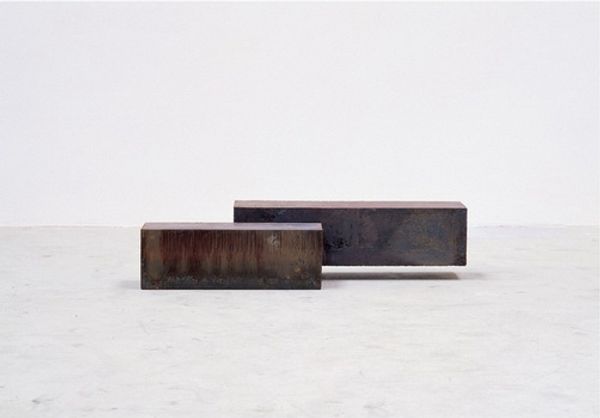
Curator: These "Untitled" mixed-media pieces, often described as both assemblage and sculpture, are the work of Daniel Dezeuze. Don't you find something primal about them? Editor: Primal, maybe. What strikes me first is their ambiguity. They mimic the forms of furniture—stools, perhaps—but obviously serve no practical function. I can't help but think about the tension between art and utility, especially in the context of conceptual art. Curator: Yes, utility stripped bare! I find them kind of comical in their redundancy, almost like a critique of consumerism, all these objects devoid of actual purpose... Do you think he intends some critique of the bourgeoisie, a class drowning in useless items? Editor: Critique is almost inescapable when examining Dezeuze. Considering conceptual art's broader context in the late 20th century, one could suggest the use of common materials reflects a dematerialization of the art object, challenging notions of value under capitalism. I think it encourages reflection upon societal structures. Curator: Dematerialization, sure, but there’s also an intense physicality. That stacked-up wood, so rough hewn and painted! It’s almost aggressively…earthy. And the watercolor bleeding into the wood, the textures melding, does this reference the earth, and environmentalism? Editor: Potentially, though environmentalism as a widespread socio-political movement gained traction slightly later. However, the Arte Povera movement, contemporary to Dezeuze, readily embraced raw, natural materials as a form of artistic resistance to industrialization. Curator: The choice of colour has to mean something too, does it relate to flags? A sort of rejection of the nation state, what is it that they stand for and is this supposed to be a subversion of power structures through shape, abstraction and medium? Editor: Colour, naturally, signifies so much. It's possible there is reference to other visual tropes from our recent political history and the intersectional issues and politics within that history, gender, race etc, especially around this period when artists were creating the pieces in response to social unrest and inequalities. The choice of the red could relate to violence or passion. The greens a more pastoral notion linked to peace. There's such nuance and richness in them, really. Curator: Well, for me, the enduring impact lies in their defiant ordinariness. And how the humbleness almost disguises deeper philosophical questions around the notion of waste... Perhaps that is naive but sometimes that is how it hits me! Editor: It's the simplicity, or rather, deceptive simplicity that allows it to ask some extremely complex questions in a playful but cutting-edge manner, without taking itself too seriously. It certainly invites discourse.
Comments
No comments
Be the first to comment and join the conversation on the ultimate creative platform.
More like this