drawing, paper, pen
#
portrait
#
drawing
#
hand-lettering
#
hand drawn type
#
hand lettering
#
paper
#
personal sketchbook
#
hand-drawn typeface
#
fading type
#
sketchbook drawing
#
pen
#
handwritten font
#
sketchbook art
#
small lettering
Copyright: National Gallery of Art: CC0 1.0
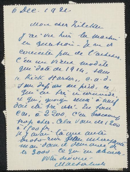
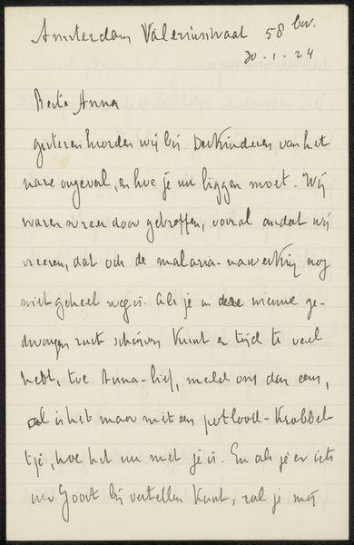
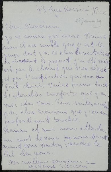
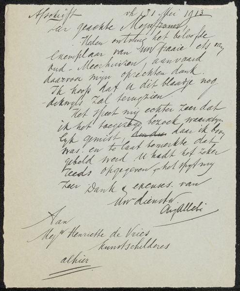
Curator: Today we are looking at "Peru, page 3," a drawing on paper from 1948 by Robert Frank. Editor: My first thought is how delicate the lettering appears. There is a certain formality mixed with obvious personal warmth. Curator: Yes, it's actually a page from Frank's personal sketchbook, featuring his own handwriting. One immediately reads the image through its handwritten content and personal address: he is writing to his mother in German! And according to what he says on this draft from his sketchbook he sends her hugs, and a kiss for his father! Editor: Absolutely. Structurally, it’s all about the handwritten text against the plain paper. The lines create a rhythm, almost like musical notation, with the slightly fading ink giving a texture and depth beyond just words. We should consider the deliberate spatial relations in the sketchbook design, too: what it might mean in terms of semiotics or the theories of Structuralism in practice? Curator: What fascinates me here is the intimacy offered. The handwriting feels incredibly vulnerable and yet confident. Frank’s cultural background – his Swiss-German upbringing – deeply informed his artistic sensibilities as an outsider later in America and his photojournalistic aesthetic: he often explored alienation, belonging, and the immigrant experience through his work. It feels especially intimate for someone whose major legacy are in his photographic oeuvres! Editor: His lettering does contain its own aesthetic; he uses a type of handwriting style or handwritten font. But ultimately the artist must bring to it an appreciation for compositional organization as the skeleton, so to speak, that gives the letter form its structure! And it all balances within the spatial confines of a simple page from his personal sketchbook... Curator: It's as if through this note, we glimpse the human behind the lens, struggling to express his personal affection from a distance, his Swiss roots providing solace in moments of displacement. He is working out identity issues as much in photography as through a personal letter of affect. Editor: Ultimately, it’s fascinating to consider how such an intimate personal message, crafted through careful mark-making, could be elevated through formal strategies. Curator: A simple message to a mother holds so much depth when understood in light of the social context, as a bridge between cultural and artistic legacies, revealing Frank's intricate negotiations with identity and place.
Comments
No comments
Be the first to comment and join the conversation on the ultimate creative platform.
More like this