About this artwork
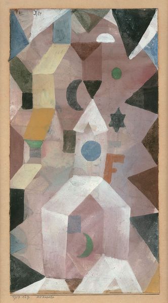
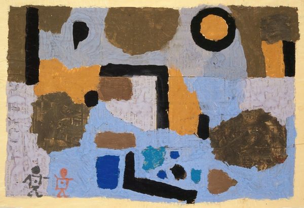
Paul Klee made this colorful architecture out of watercolor and ink on paper. Klee’s color palette is just so restrained and unexpected, and that’s part of what makes it so good, right? I love how the textures in this work feel so raw. Like, you can almost feel the grain of the paper, as if the colors were just breathed onto its surface. It’s interesting to think about the watercolor, it is laid down in transparent washes. If you look close, the surface is full of tiny marks, all these little hatches and strokes that build up the image layer by layer. There's a kind of drawing with color, that reminds me of some of the architectural follies of the Bauhaus - where Klee taught, but it also brings to mind some of the work of Philip Guston, with its naive forms and muted palette. Isn't it amazing how artists can riff off each other across time, creating this crazy conversation that never really ends?
Artwork details
- Medium
- painting, watercolor, architecture
- Copyright
- Public Domain: Artvee
Tags
Comments
Share your thoughts
About this artwork
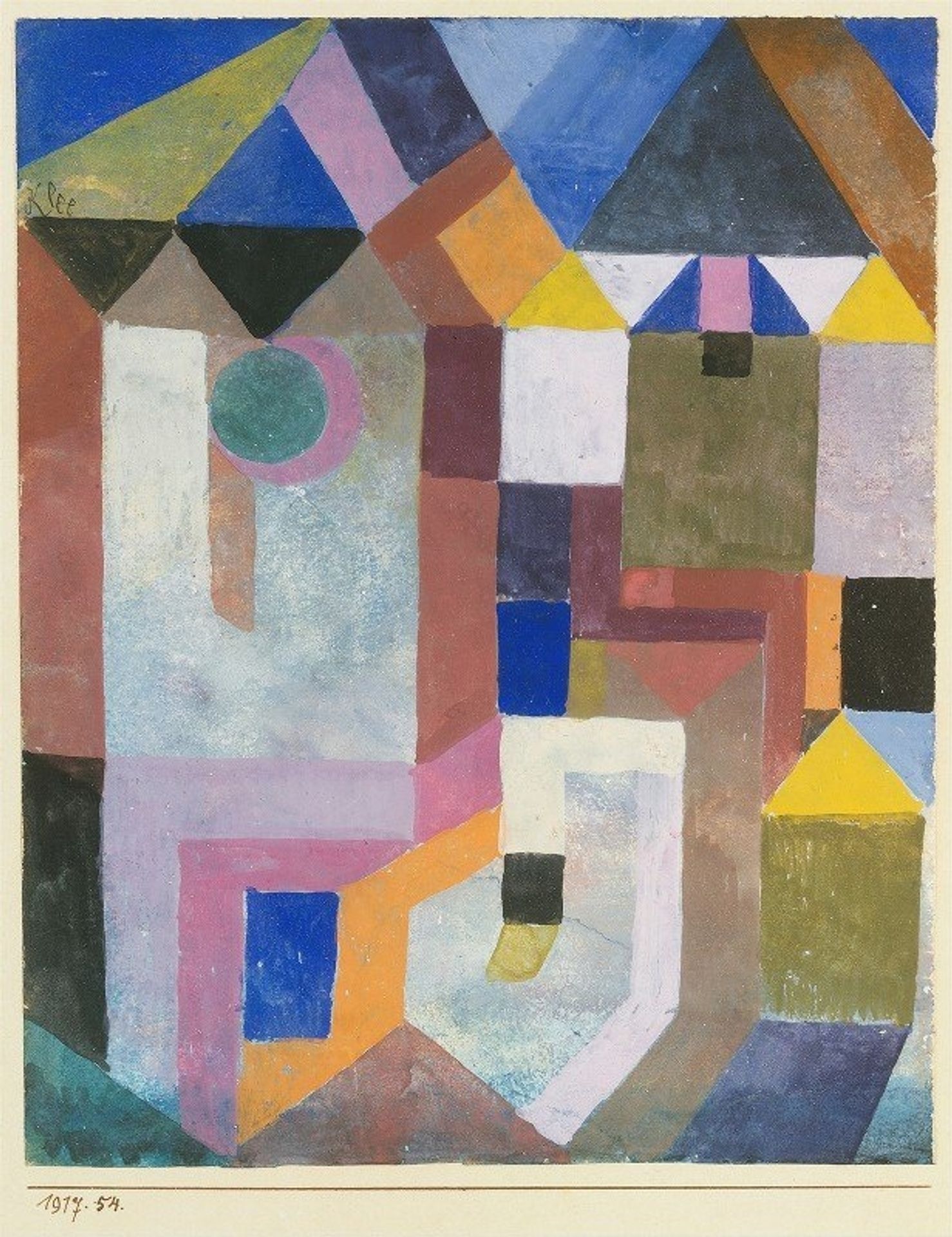
Paul Klee made this colorful architecture out of watercolor and ink on paper. Klee’s color palette is just so restrained and unexpected, and that’s part of what makes it so good, right? I love how the textures in this work feel so raw. Like, you can almost feel the grain of the paper, as if the colors were just breathed onto its surface. It’s interesting to think about the watercolor, it is laid down in transparent washes. If you look close, the surface is full of tiny marks, all these little hatches and strokes that build up the image layer by layer. There's a kind of drawing with color, that reminds me of some of the architectural follies of the Bauhaus - where Klee taught, but it also brings to mind some of the work of Philip Guston, with its naive forms and muted palette. Isn't it amazing how artists can riff off each other across time, creating this crazy conversation that never really ends?
Comments
Share your thoughts