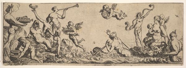
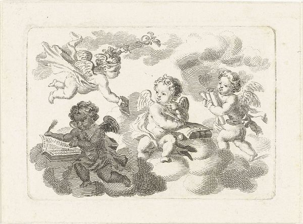
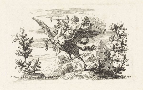
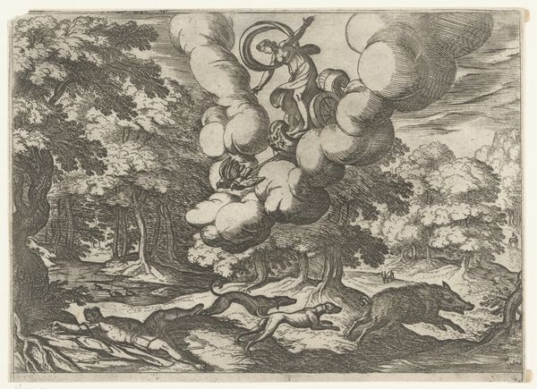
drawing, print, ink, engraving
#
drawing
#
allegory
#
baroque
# print
#
ink
#
history-painting
#
engraving
Dimensions: height 130 mm, width 185 mm
Copyright: Rijks Museum: Open Domain
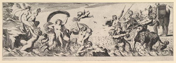
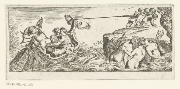
Editor: Here we have "Fama met twee bazuinen," made between 1573 and 1610 by Christoph Jamnitzer. It's an engraving in ink. I am struck by the composition, this symmetrical arrangement of figures set against what appears to be water and foliage. What do you see in this piece? Curator: The composition intrigues. Observe the central figure of Fame, precariously balanced upon a winged globe, itself perched above a pile of implements, including what appear to be weapons. This vertical arrangement introduces a dynamic tension, a precariousness that destabilizes the image. How do these structural elements function within the broader semantic field? Editor: I hadn't really considered the implications of that precariousness! What do you make of the figures on either side? The one blowing bubbles and the other writing. Curator: The ancillary figures create a narrative balance. One seemingly ephemeral, engaged in the act of creation, the other documenting or disseminating. Note the contrasting textures – the smoothness of the bubbles versus the precise lines that define the figure holding a writing implement. Consider the distribution of light and shadow and its role in defining form and space within the pictorial field. Does this variance contribute to the overall allegorical effect, perhaps suggesting the fleeting nature of fame? Editor: Yes, it does! Fame, floating, supported by material objects, while also contrasted by transient bubbles and permanent text. The tools lying below Fame now strike me as very intentional and symbolic. Curator: Precisely. Reflect upon the use of line in the engraver’s technique. The density and direction of the lines not only model form but also contribute to the expressive quality of the work. Note, for instance, the differing treatment of the skin textures versus the drapery. These artistic choices enhance the symbolic depth of the work and establish hierarchical relationships between its components. Editor: I see. It's much more than just illustrating a concept; it's how the engraving is designed to work that really emphasizes it's symbolic intent. Curator: Indeed. By isolating and analyzing these formal qualities, we uncover the intricate web of meanings embedded within the artwork. Editor: Thank you for opening my eyes to seeing that in the composition itself.
Comments
No comments
Be the first to comment and join the conversation on the ultimate creative platform.
More like this