print, paper, engraving
#
baroque
# print
#
paper
#
cityscape
#
history-painting
#
engraving
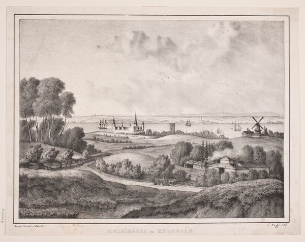
Dimensions: 152 mm (height) x 195 mm (width) (plademaal)
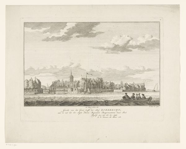
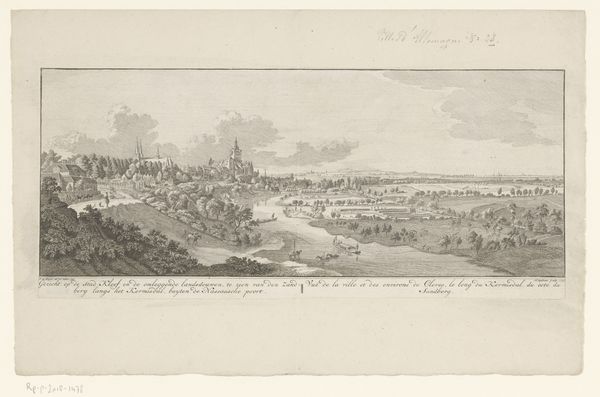
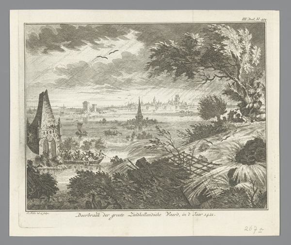
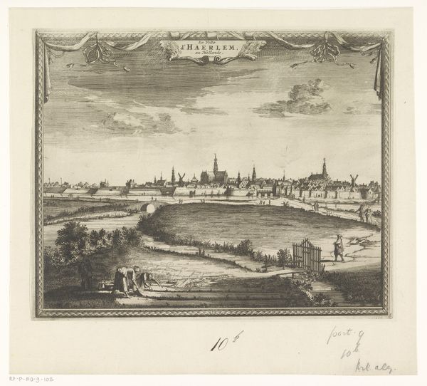
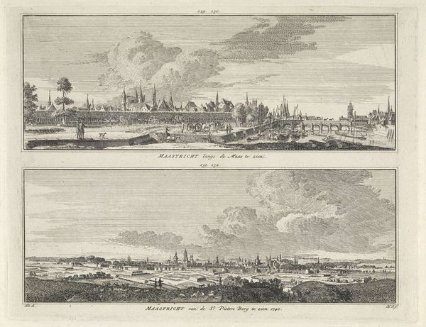
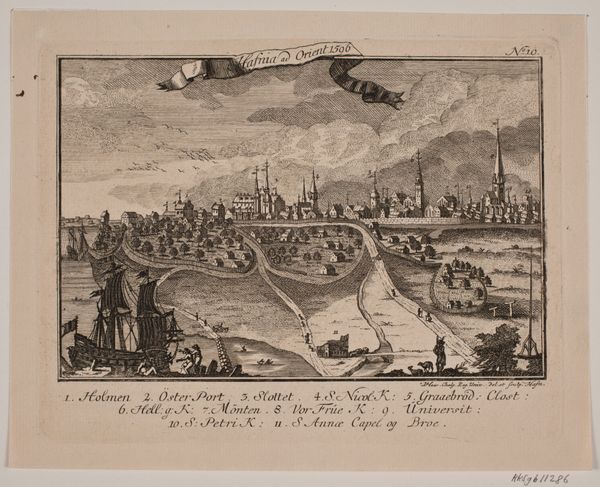
Curator: Jonas Haas's "Prospekt af København," created around 1760, offers a fascinating view of Copenhagen through the lens of Baroque printmaking. The engraving on paper meticulously depicts the cityscape. Editor: The first thing I notice is the clarity and almost clinical detachment. It's black and white, which gives it a certain authority. It’s almost like looking at an architect's plan, yet framed by this fanciful, almost decorative foliage. Curator: I find that tension intriguing. Consider Haas's positionality as a printmaker in that period; these prints functioned as both aesthetic objects and practical commodities. Think about who was commissioning them. Likely wealthy merchants, or municipal entities, desiring to propagate an image of prosperity and order. The baroque flourish you see isn't merely decorative—it underscores Copenhagen's elevated status, placing its urban achievements in conversation with power. Editor: Interesting, but look at how meticulously rendered each individual building is within the city limits, against the more generalised landscapes on each side, where nature feels like ornamentation. Is it symbolic, with humans and industry controlling and bordering the uncontrolled landscape? Curator: Exactly! The cityscape dominating the center is clearly not accidental. Also consider the medium; the labour involved in such detailed engraving, the distribution networks for the prints themselves – they were helping construct a shared identity of place, fostering civic pride, even shaping trade relations. Think about who would want to possess, display, or circulate this kind of image, and what it signified to them in terms of commercial or political power. Editor: It brings to mind the way that cities can sometimes re-brand in response to their history. Are they also creating a mythology of control and purpose here, in how people understand the town’s layout and how citizens can engage with the urban setting? Curator: I agree; seeing the city so clearly ordered must have been reassuring during what would have otherwise been experienced as a world beyond comprehension for some of the less mobile residents. The artist also emphasizes specific buildings with those number keys beneath the artwork and so, at least in theory, citizens might familiarize themselves with a growing city that may once have felt alien. Editor: So, ultimately it is the formal, balanced composition, underpinned by the materials used in mass production that speaks to us, illustrating that image and availability would have created tangible urban ideals at that time. Curator: Precisely. When we analyze "Prospekt af København" it is so enlightening when we focus on both Haas’ technique and the societal contexts informing its creation.
Comments
No comments
Be the first to comment and join the conversation on the ultimate creative platform.
More like this