Copyright: Public domain
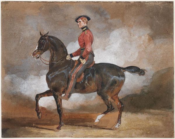
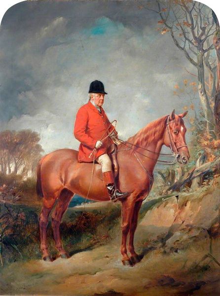
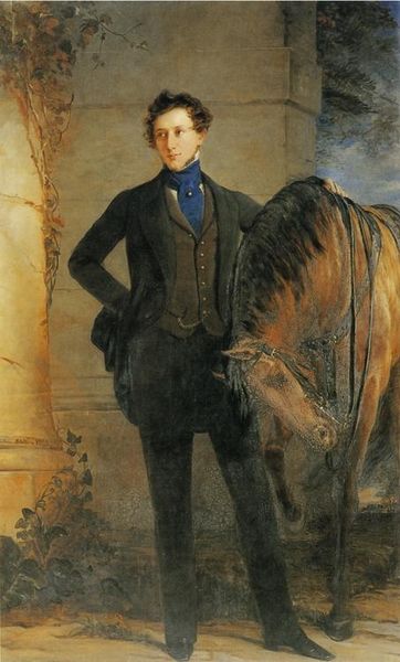
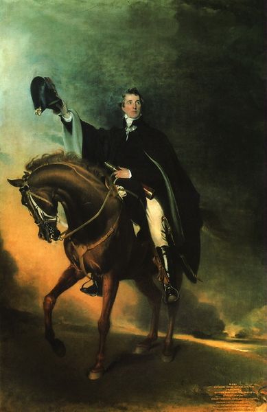
Editor: Here we have Franz Xaver Winterhalter's "Equestrian Portrait of François Adolphe Akermann," created around 1870 using oil paint. I find the subdued palette quite striking; it evokes a sense of calm and perhaps even understated authority. What stands out to you compositionally? Curator: Immediately, the tonal gradation establishes a clear hierarchy. Note how Winterhalter uses a restricted range of earth tones, punctuated by the glints of light on the horse's coat and Akermann’s slightly illuminated face. This directs our gaze through calculated focal points within the composition. Observe the diagonal created by the horse's body, its line reinforced by Akermann’s posture, bisecting the canvas and generating a dynamic tension against the static background. What purpose does this tension achieve, do you think? Editor: Perhaps to bring the viewer's eye towards the portrait? What can you tell me about that background? Curator: Precisely. The background, loosely defined, serves merely as a foil. Its lack of detail and hazy atmospheric perspective ensures that Akermann and his horse remain the primary subjects, devoid of distractions. However, it is crucial in establishing depth. Consider how the values shift as we move further back in space, creating an illusion of recession and thus anchoring the equestrian figure firmly within a three-dimensional plane. The background lacks clarity and clear color distinction which ultimately leads to greater emphasis of the subjects of the portrait. Editor: That’s fascinating. I had initially seen it as merely background scenery, but I understand the importance to create a coherent overall design. I now notice how it functions in relation to the foreground elements. Thanks! Curator: Indeed. Focusing on formal elements unveils the considered compositional choices underpinning even seemingly straightforward portraiture.
Comments
No comments
Be the first to comment and join the conversation on the ultimate creative platform.
More like this