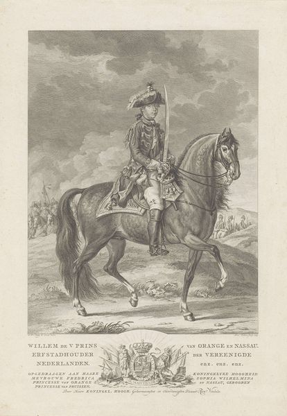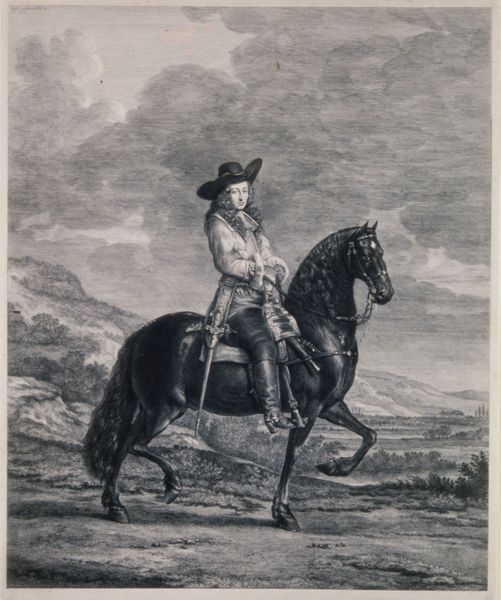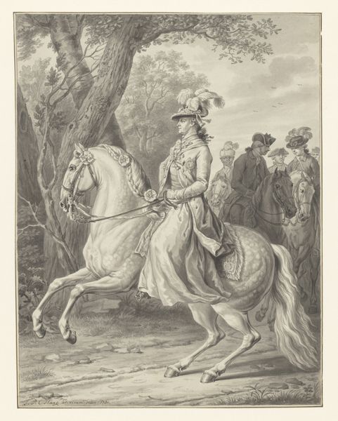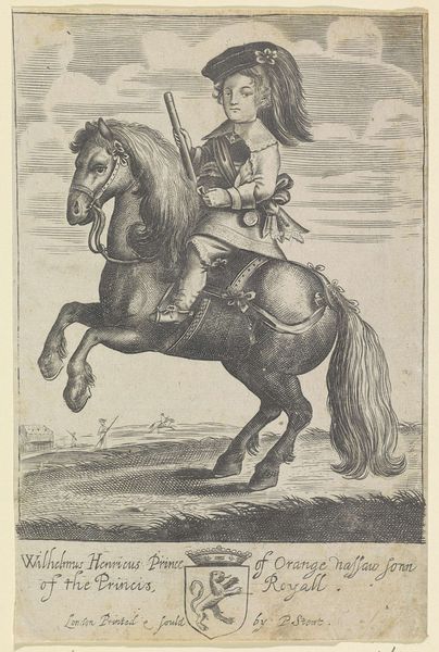
1779
Portret van Willem V, prins van Oranje-Nassau te paard
Reinier Vinkeles
1741 - 1816Location
RijksmuseumListen to curator's interpretation
Curatorial notes
Curator: Here we have Reinier Vinkeles’ 1779 engraving, "Portret van Willem V, prins van Oranje-Nassau te paard," housed here at the Rijksmuseum. Editor: Goodness, it’s all rather... linear, isn't it? Intricate, but with a severity I wasn't quite anticipating. A tad stiff, maybe. Like a fancy drawing out of a manual of arms. Curator: Well, consider the stylistic tendencies of the late Baroque period, notably reflected here in Vinkeles’ meticulous deployment of line and detail. The sheer volume of information conveyed through engraving is compelling. Notice how line defines form and creates gradations of light, describing every nuance of textile and equine musculature. Editor: I can't help feeling a slight distance, though. All the hatching and precise rendering of princely attire somehow leave me a little cold. It’s impeccably executed, sure, but does it actually evoke Willem V's presence, or is it mostly a celebration of surface details? Curator: I interpret this as a considered strategic effect. The linear exactness allows for a clear transmission of power and status. The composition adheres to the traditions of equestrian portraiture; consider the figure’s confident posture, or even the subtle tilt of the horse's head, reflecting the prince's control. Editor: It makes me wonder what Prince William himself felt looking at this! Did he chuckle, thinking "Spot on!" Or maybe wince slightly at how official it made him seem? I’m tickled by the fluffy little plume on his hat. Almost subversive! Curator: The plume, while seemingly frivolous, participates in a wider language of symbolism: a signifier of prestige. Likewise, observe how Vinkeles uses varied line weights to denote depth within the background landscape, further accentuating the Prince as the visual and narrative focus. Editor: Yes, the way the artist has used those really thin lines creates a feeling of atmosphere as well as depicting recession in space, it gives some volume to that patch of sky, I suppose. This portrait makes me realize how fashion could also operate like armor. Not to deflect arrows, but to broadcast an image—austere, grand, and, undeniably, rather serious. It works well, I’ll admit. Curator: Indeed. I find Vinkeles' strategic deployment of line within a Baroque framework undeniably powerful and demonstrative of not only artistic skill, but clear visual language. Editor: For me, it's a dance of lines across time, whispers of power softened just a smidge by a sense of artistry! A historical document masquerading as art... or maybe art bravely impersonating history. Food for thought, definitely!