Trade Card for Swinford Brothers, Chromo Lithographers & Engravers 1800 - 1900
0:00
0:00
Dimensions: Sheet: 3 1/4 × 4 1/2 in. (8.3 × 11.5 cm)
Copyright: Public Domain
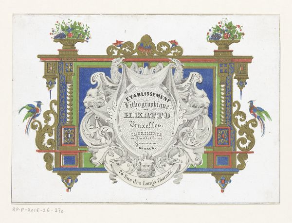
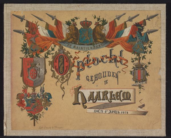
This trade card for Swinford Brothers, Chromo Lithographers & Engravers, was printed using chromolithography. It presents a dense interplay of typography and decorative motifs. The composition is immediately striking because of its asymmetrical balance, with each element vying for attention yet contributing to a unified whole. The card plays with layers of signs and symbols, each contributing to the card’s commercial message. Look closely at the stylized floral patterns that intertwine with bold typography. Note how it draws on an almost medieval aesthetic with elaborate ornamentation. The lettering, rendered in various styles and colors, showcases the firm’s printing capabilities. The strategic use of color here underscores the card's primary purpose: to communicate the firm’s identity and expertise in chromolithography. The card’s design can be read as a commentary on the intersection of art, commerce, and craftsmanship in the late 19th century. It’s a testament to the firm’s mastery of their medium, and a complex negotiation between artistic expression and commercial communication.
Comments
No comments
Be the first to comment and join the conversation on the ultimate creative platform.
More like this