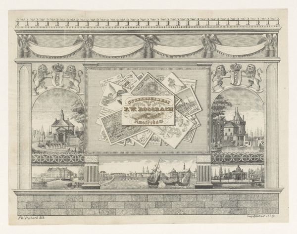
graphic-art, lithograph, print, intaglio, engraving
#
graphic-art
#
lithograph
# print
#
intaglio
#
decorative-art
#
engraving
Dimensions: height 128 mm, width 182 mm
Copyright: Rijks Museum: Open Domain
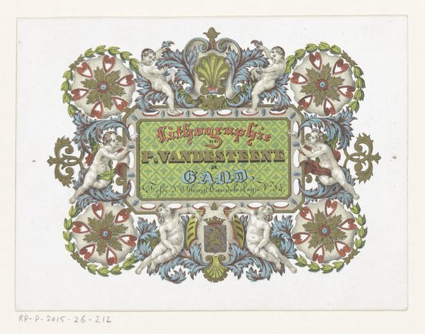
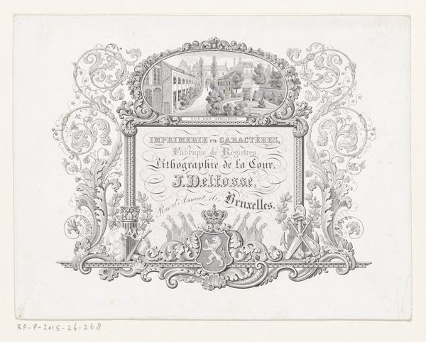
Curator: Here we have a trade card, a calling card in fact, produced by the printing firm of H. Katto in Brussels sometime between 1840 and 1875. The media include lithography, engraving, and other intaglio printmaking techniques. Editor: It strikes me as meticulously overwrought. The density of the visual elements and the symmetrical arrangement, coupled with the limited palette, give it a formal and, frankly, slightly claustrophobic air. Curator: Yes, and observe how the design, while intending to convey precision and quality, heavily relies on established symbolic language. Consider the lions—guardians of strength and prominence—flanking what appears to be a heraldic shield bearing the firm’s name. This taps into cultural ideals of enterprise. Editor: Absolutely. The symmetry locks it down visually, giving it a static, monumental presence—an architectural statement shrunk down to fit in your pocket. I’m also noting the strategic use of color. The blues and greens are very precise. How do you interpret the botanical elements at the top, or even those peculiar birds at either side? Curator: The flora speaks to growth and abundance, qualities any business would wish to project. The birds are intriguing—they signal not just a global reach for the business, through a variety of natural species, but also a potential connection to literary symbolic languages of this time, that of travel and faraway lands, and knowledge. Editor: Interesting! I initially read them as purely decorative, adding visual flair but structurally echoing the opposing symmetry. But the global reach idea does chime harmoniously with what printing and lithography are capable of, when done well. Curator: Trade cards like this one aren’t just about conveying information; they aim to implant a company’s image, often quite literally. It demonstrates how symbolism and advertising merged in the 19th century to shape economic behaviors. Editor: The structural framework of this design really does feel inseparable from the embedded symbolic meanings. A tight, unified message, both literally and figuratively. Curator: Precisely, the intertwining is a critical aspect of the piece. Editor: It’s been fascinating to untangle those layers together, thank you.
Comments
No comments
Be the first to comment and join the conversation on the ultimate creative platform.
More like this