print, photography, albumen-print
# print
#
landscape
#
photography
#
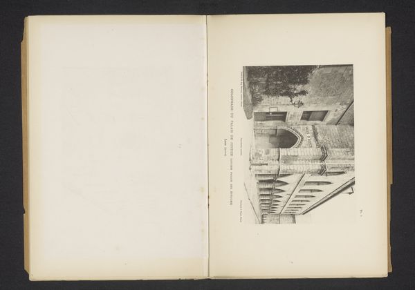
cityscape
#
albumen-print
#
realism
Dimensions: height 162 mm, width 110 mm
Copyright: Rijks Museum: Open Domain
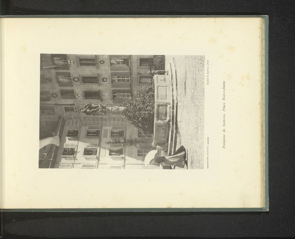
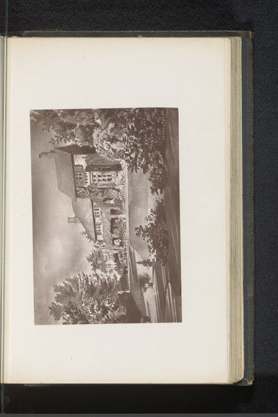
Editor: This albumen print, “Gezicht op een fontein in Fribourg” by Ernest Lorson, was created in 1897. It has this wonderfully old-fashioned feel to it, capturing a European cityscape. What strikes me most is the contrast between the stark architecture and the organic forms of the trees. How do you interpret the relationship between those elements in the image? Curator: I see a calculated manipulation of tonal values and forms that create a powerful tension. Notice how the artist uses the sharp geometric lines of the buildings and the rigid structure of the stairs in juxtaposition to the cascading branches of the lush tree. That compositional dichotomy highlights the difference between man and nature. Editor: It does create an interesting push and pull. So, the formal elements almost serve to underscore a kind of environmental commentary? Curator: Perhaps. Or, more specifically, a commentary on the orderliness that humans attempt to impose upon the natural world. Note also how the subtle shifts in the gray scale of the albumen print further this relationship, making the architecture seem even more fixed. The very materiality of the photographic print reinforces this idea of structured form, no? Editor: I see that now. The greyscale highlights the architectural geometry. I hadn’t considered how the technical aspects, like the print type itself, contribute to the overall message. Curator: Indeed. Considering the artist’s technique provides deeper insights. We might ask, how would our interpretation shift if this were a watercolor rather than an albumen print? Editor: That's true; the realism brought out in photography wasn't as easy to capture at the time, say, in watercolors. I’ve definitely gained a greater appreciation for how formal aspects interplay to deliver a very specific statement. Curator: Precisely. It all begins with observation.
Comments
No comments
Be the first to comment and join the conversation on the ultimate creative platform.
More like this