#
pencil drawn
#
amateur sketch
#
light pencil work
#
shading to add clarity
#
pencil sketch
#
old engraving style
#
personal sketchbook
#
pencil drawing
#
limited contrast and shading
#
pencil work
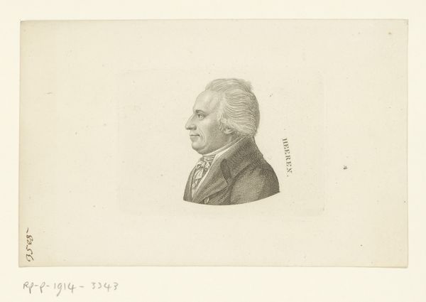
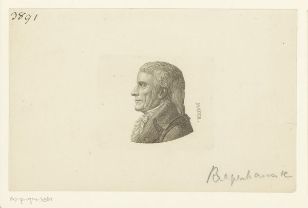
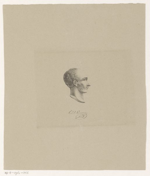
Dimensions: height 74 mm, width 62 mm
Copyright: Rijks Museum: Open Domain
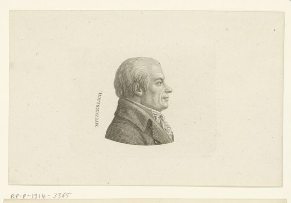
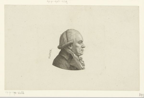
Curator: Let's turn our attention to "Portret van Georg Jacob Friedrich Meister," a pencil drawing created sometime between 1775 and 1840 by Ernst Ludwig Riepenhausen. Editor: It strikes me as rather severe. The tight focus on the subject's profile, the somewhat rigid posture—it gives the impression of a man very conscious of his position. Curator: Precisely. The profile view itself carries considerable symbolic weight. Consider its connection to coinage and official portraiture of the period; it evokes notions of authority and the public face. But even in its simplicity, it gives rise to a particular visual lineage; the portrait’s rendering is of the so-called Neoclassical fashion, inspired by ancient Greece and Rome, indicating a revival of specific ideals, which are expressed with simple tools and lines. Editor: Absolutely. I'm also curious about the artist's choice of pencil. While not inherently rare, it certainly shifts the emphasis away from grand pronouncements toward something more immediate, even intimate. Was Riepenhausen perhaps interested in a more democratic or at least accessible form of portraiture? Or was he limited by what was available, like cheaper print production to sell at large? Curator: That's a valid point. The medium’s unpretentious nature may hint at a departure from the ornate court portraits of previous eras, reflecting changing societal values and art audiences at the time. Even the level of finish suggests the availability of the item for different price-points on the art market; you get what you pay for in art sometimes, especially when more drawings were made than sales allowed. I might add that while this could very well signal an amateur-level work, there is still plenty of character displayed in this man's face and gaze; notice that there is much more depth within him than on the exterior. Editor: Indeed. The lines are indeed fairly straightforward but considered and very clean, not chaotic at all, even if there seems to be not so much shading; despite the simplicity, a personality clearly emerges. You see an intelligent gaze behind those sharp features. The rendering emphasizes strength, or perhaps stubbornness! Curator: And there you find the true beauty. Perhaps Riepenhausen aimed to distill something essential about the sitter—qualities beyond mere physical resemblance—something that the drawing delivers. This piece resonates as an authentic study of character within form. Editor: Agreed. By highlighting both the humbleness and intention of the production and the inner dimensions, that give the piece its true power. Thank you!
Comments
No comments
Be the first to comment and join the conversation on the ultimate creative platform.
More like this