print, paper, typography, poster
# print
#
paper
#
typography
#
thick font
#
poster
#
historical font
#
calligraphy
Copyright: Rijks Museum: Open Domain
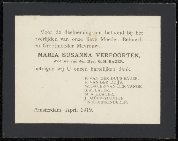
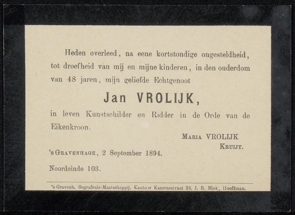
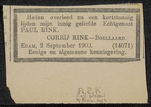
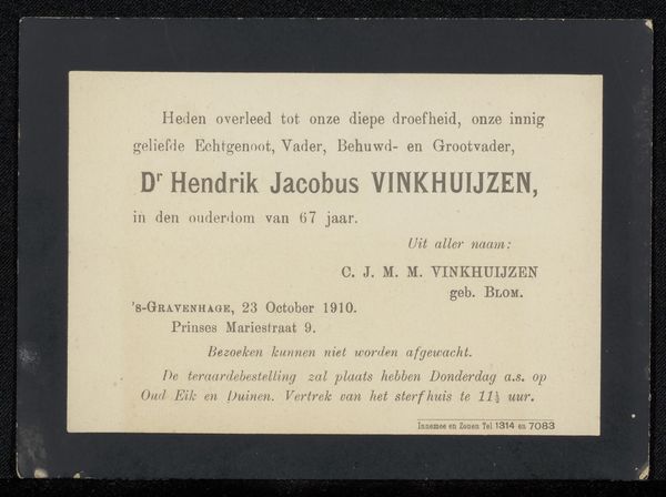
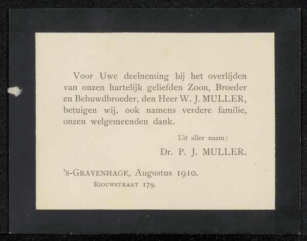
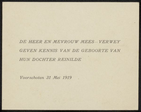
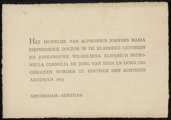
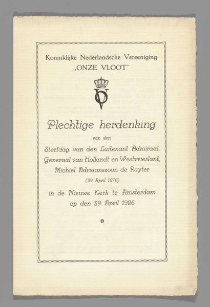
This announcement, likely printed in 1899, presents a study in contrasts through its stark design. At first glance, the composition is strikingly simple: a light card framed by a dark border, creating a clear separation between the message and its surroundings. The text, rendered in a straightforward serif typeface, is meticulously arranged, with the name "M. J. Stucki" given prominence through capitalization. This emphasis on typography as form elevates the announcement beyond mere communication. The deliberate choice of font, the spacing between letters, and the overall layout contribute to a feeling of solemnity and respect. Semiotically, the black border and formal typeface function as signs of mourning, deeply embedded within cultural codes of the time. The visual austerity conveys loss without ornamentation. Notice how the rigid structure and balanced composition offer a sense of closure and order in the face of mortality, suggesting an attempt to control the chaos of death through aesthetic means. The announcement invites us to consider how even the simplest design choices can carry profound emotional and cultural weight.
Comments
No comments
Be the first to comment and join the conversation on the ultimate creative platform.
