drawing, print, ink, engraving
#
drawing
#
pen drawing
# print
#
11_renaissance
#
ink
#
linocut print
#
line
#
decorative-art
#
engraving
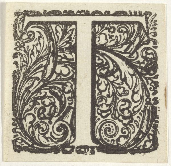
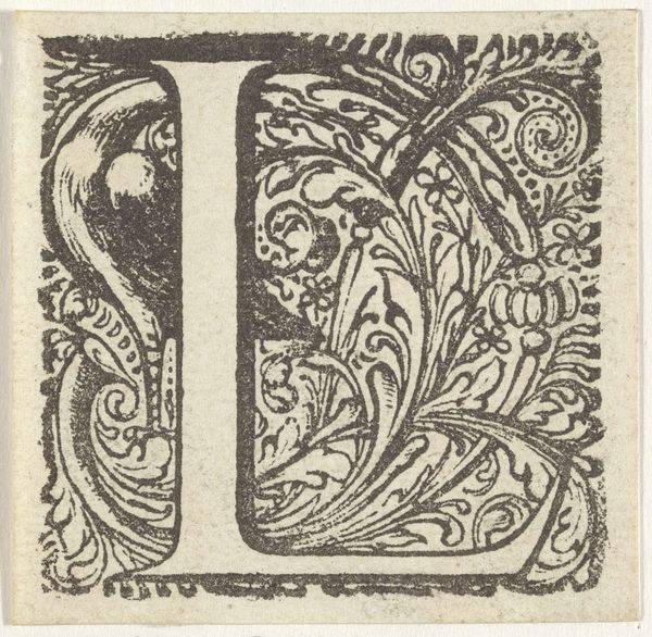
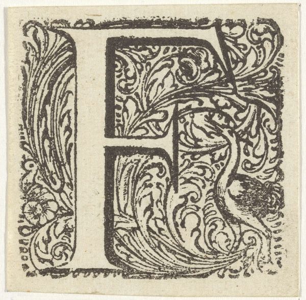
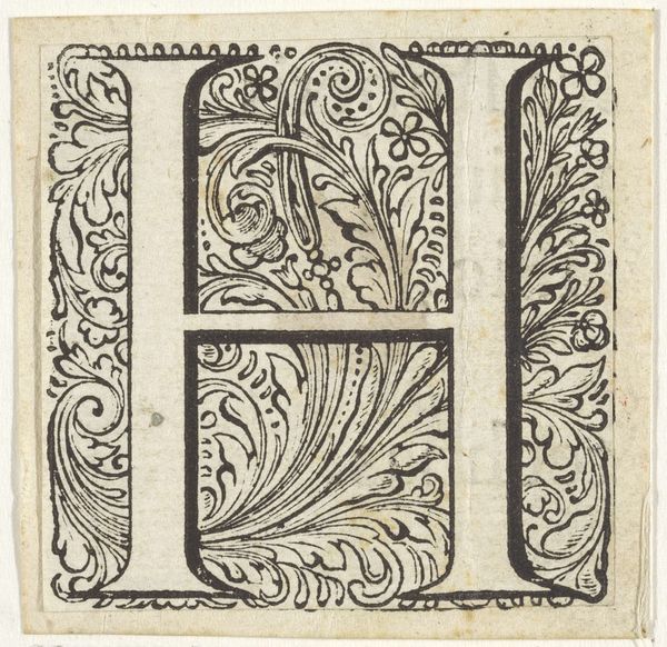
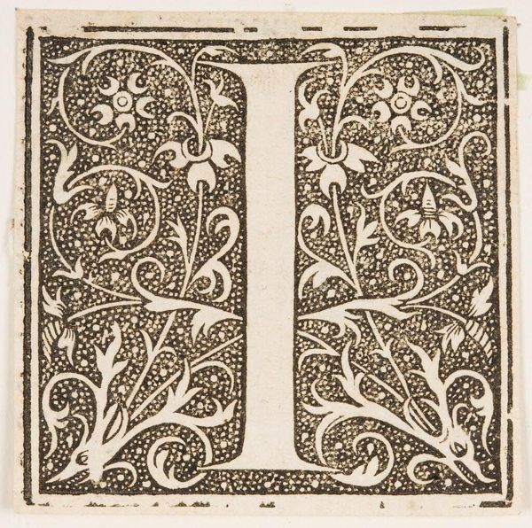
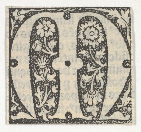
Dimensions: height 53 mm, width 52 mm
Copyright: Rijks Museum: Open Domain
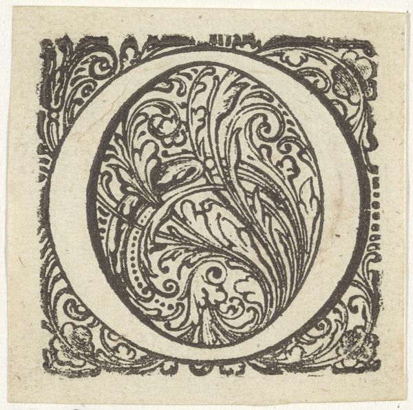
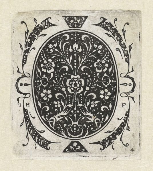
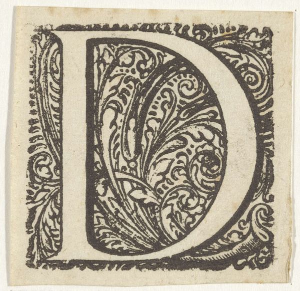
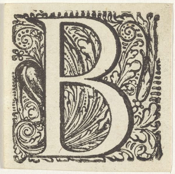
Editor: This is an engraving of the letter "I" in an ornate frame, dating back to the 17th century and created by an anonymous artist. It feels so formal and decorative. What stands out to you most about this piece? Curator: Well, I immediately consider the context in which this "I" would have existed. During the 17th century, typography was intrinsically linked to power and knowledge. The decorative nature isn't just aesthetic; it signifies the importance of literacy and access to information, something inherently tied to class and privilege. The swirls and botanical elements—where do you think those come from? Editor: Maybe from illuminated manuscripts, which I imagine were extremely expensive at the time? Curator: Precisely! And who commissioned those manuscripts? Powerful figures. So, in a way, this relatively simple print is echoing that history, democratizing it to an extent but also subtly reinforcing existing power structures. Consider how many people were denied access to literacy, and thus to the 'I', to identity and expression. Does the decoration itself become a sort of barrier? Editor: That’s a really interesting point. It's beautiful, but also a reminder of inequality. The "I" isn't just a letter; it represents something much bigger. Curator: Exactly. The very act of ornamentation transforms a simple letter into a loaded symbol. Understanding its function within its historical context allows us to unpack its social implications. What can art reveal about social disparities, both then and now? Editor: I never thought about a single letter holding so much weight! I’ll definitely look at typography differently from now on.
Comments
No comments
Be the first to comment and join the conversation on the ultimate creative platform.
More like this