graphic-art, print, textile, typography
#
portrait
#
graphic-art
# print
#
textile
#
typography
#
history-painting
Dimensions: height 55.2 cm, width 38.3 cm
Copyright: Rijks Museum: Open Domain
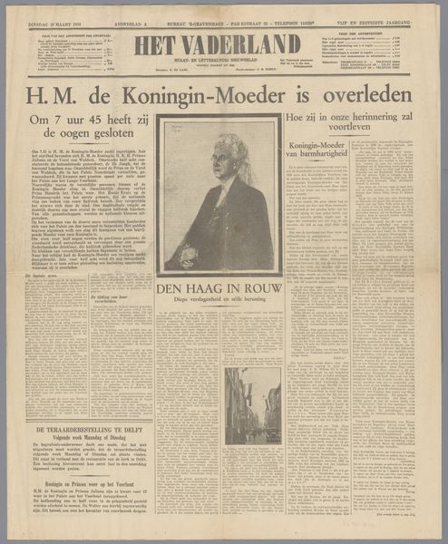
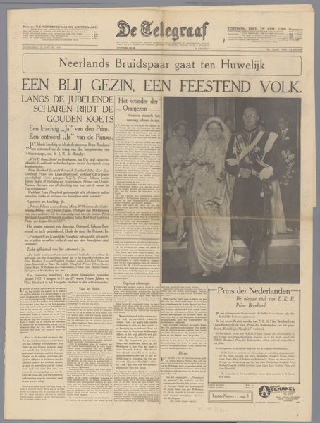
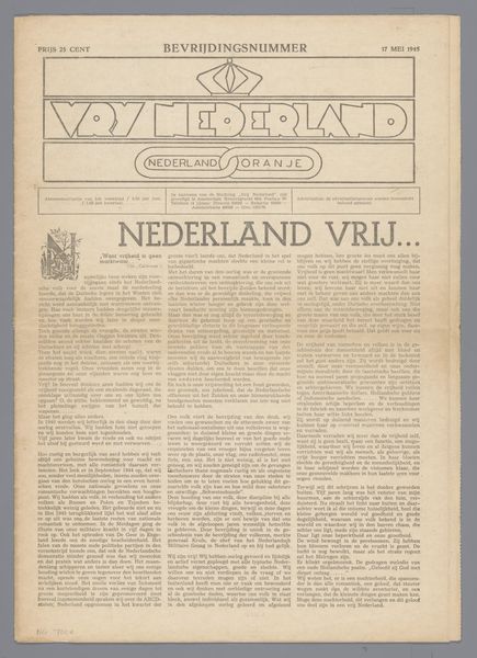
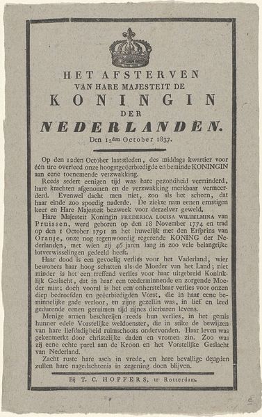
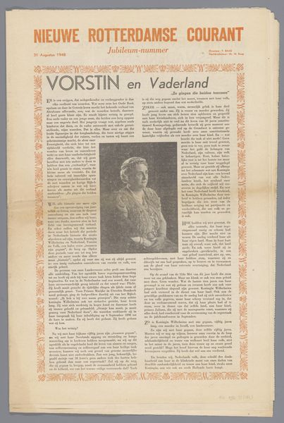
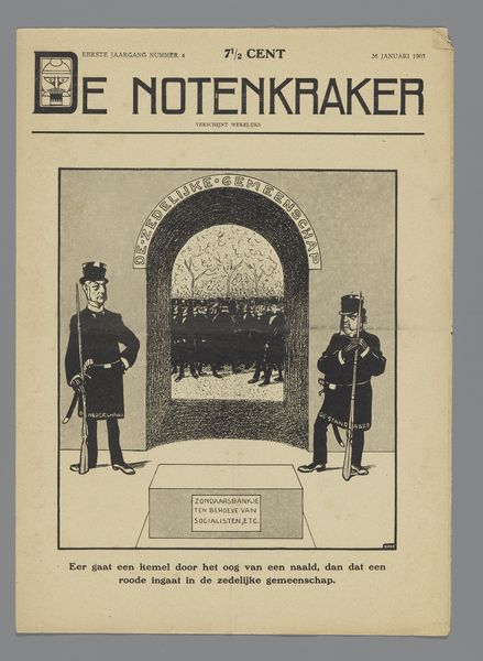
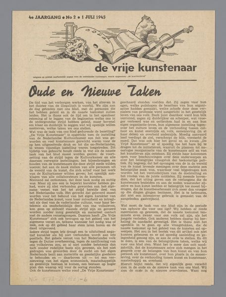
This newspaper, titled "National Recovery," was published by the "Association for National Recovery," and includes a photograph of Queen Wilhelmina. It’s fascinating how the layout creates this strong, almost brutalist feel. The stark black and white is so direct, like a punch to the gut. See how the type is stacked and layered? It’s not elegant, but it's forceful. The lion motif at the top, so bold and graphic, feels almost like a woodcut, yet it's probably printed. Look closely at the lion; the lines are clean and sharp, giving it a sense of power. It reminds me of Russian constructivist posters, where the message is everything and the design is just a tool to convey it. This isn't about beauty; it's about making a statement. The whole thing is like a call to action, a demand for attention. It echoes the bold aesthetics of artists like John Heartfield, who used photomontage and graphic design as a weapon. It’s a reminder that art, even in its most functional form, can be a powerful tool for shaping ideas.
Comments
No comments
Be the first to comment and join the conversation on the ultimate creative platform.
