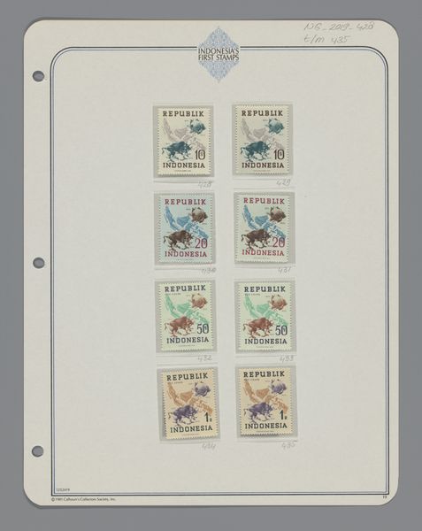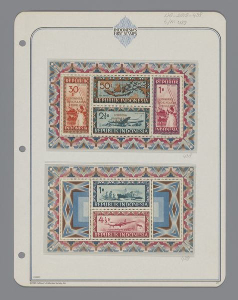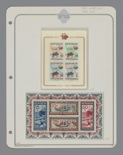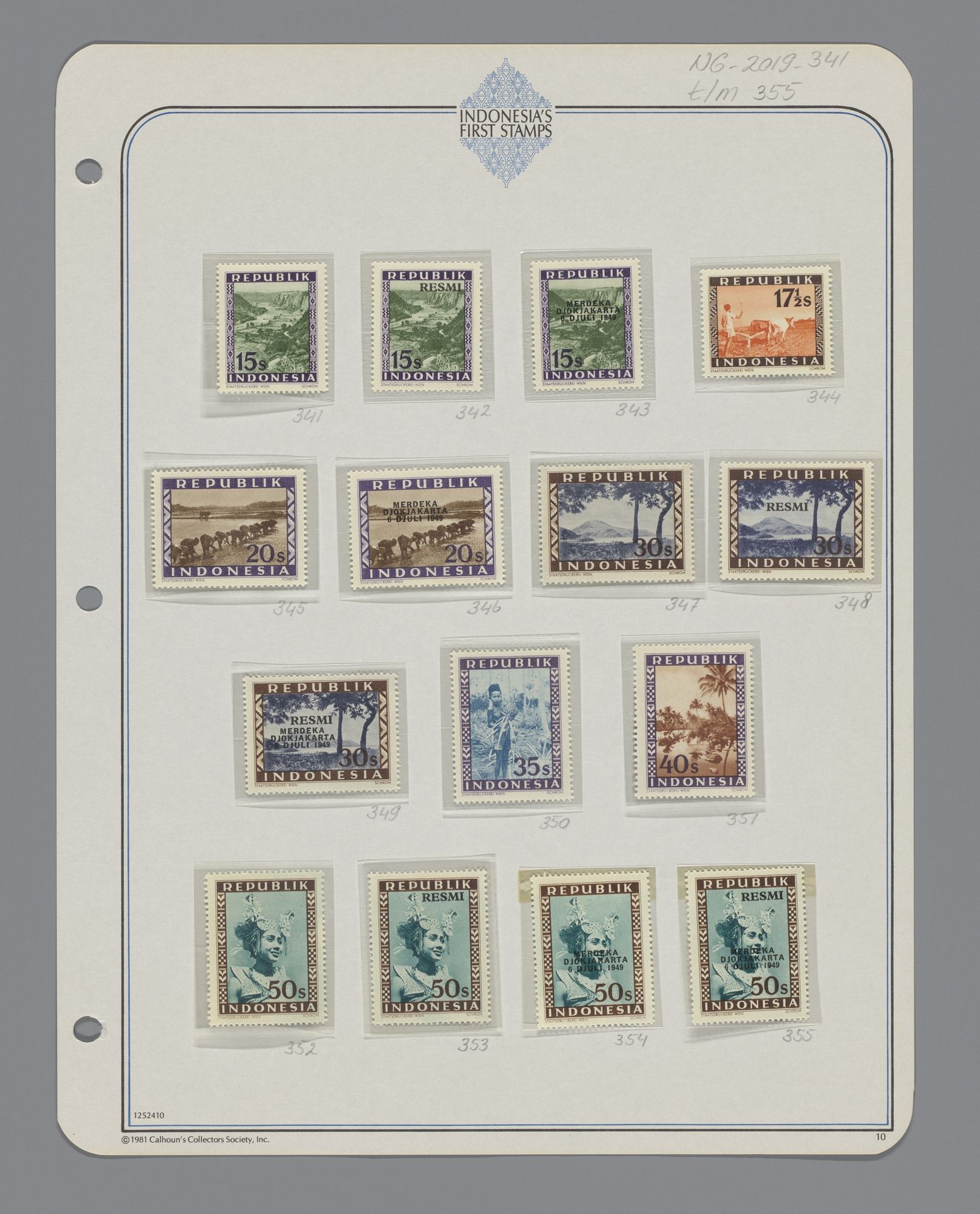
1949
Postzegel Republik Indonesia
Listen to curator's interpretation
Curatorial notes
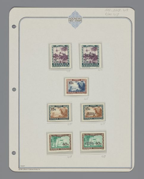
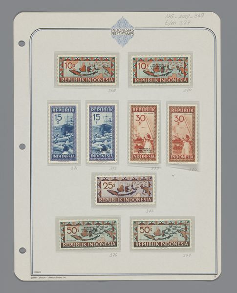
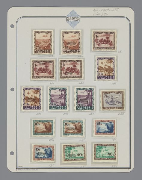
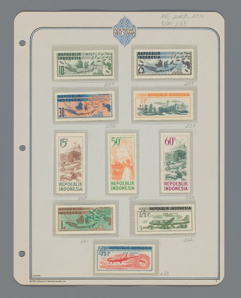
These Indonesian stamps, made by Staatsdruckerei Wien, present a fascinating glimpse into a nation's visual identity. The stamps use simple graphic techniques to portray diverse images, from landscapes to portraits. Looking closely, the materiality of these miniature artworks strikes me. The colour palette is subdued, almost muted, creating a sense of nostalgia. The linework, especially in the portraits, is precise yet economical, suggesting both the skill of the engraver and the limitations of the medium. I like the way that the edges of the stamps are clean and precise, each like a tiny window onto the world. These stamps remind me a little of Corita Kent's screenprints. Kent also embraced bold graphic designs and text and like these stamps, aimed to communicate directly and accessibly with a broad audience. Art is always a conversation, a passing of ideas, filtered through individual experience. I think that fixed meanings are overrated!