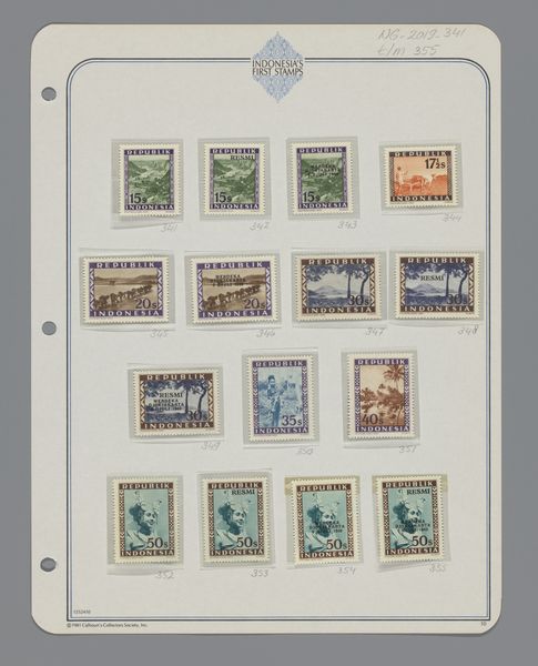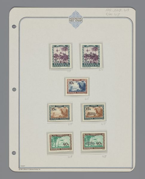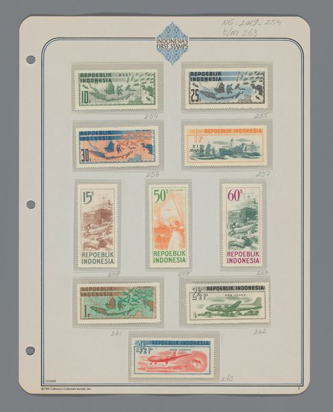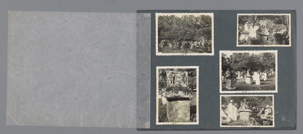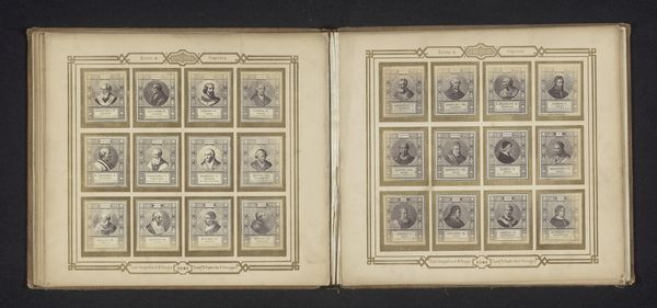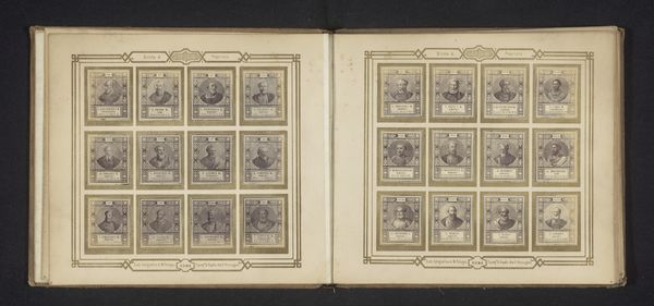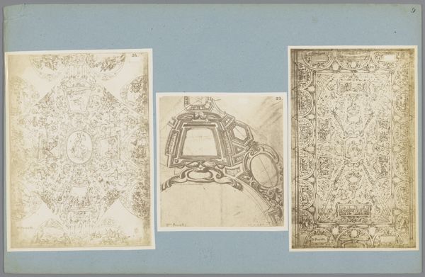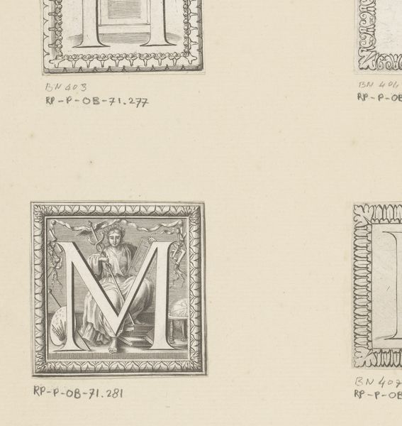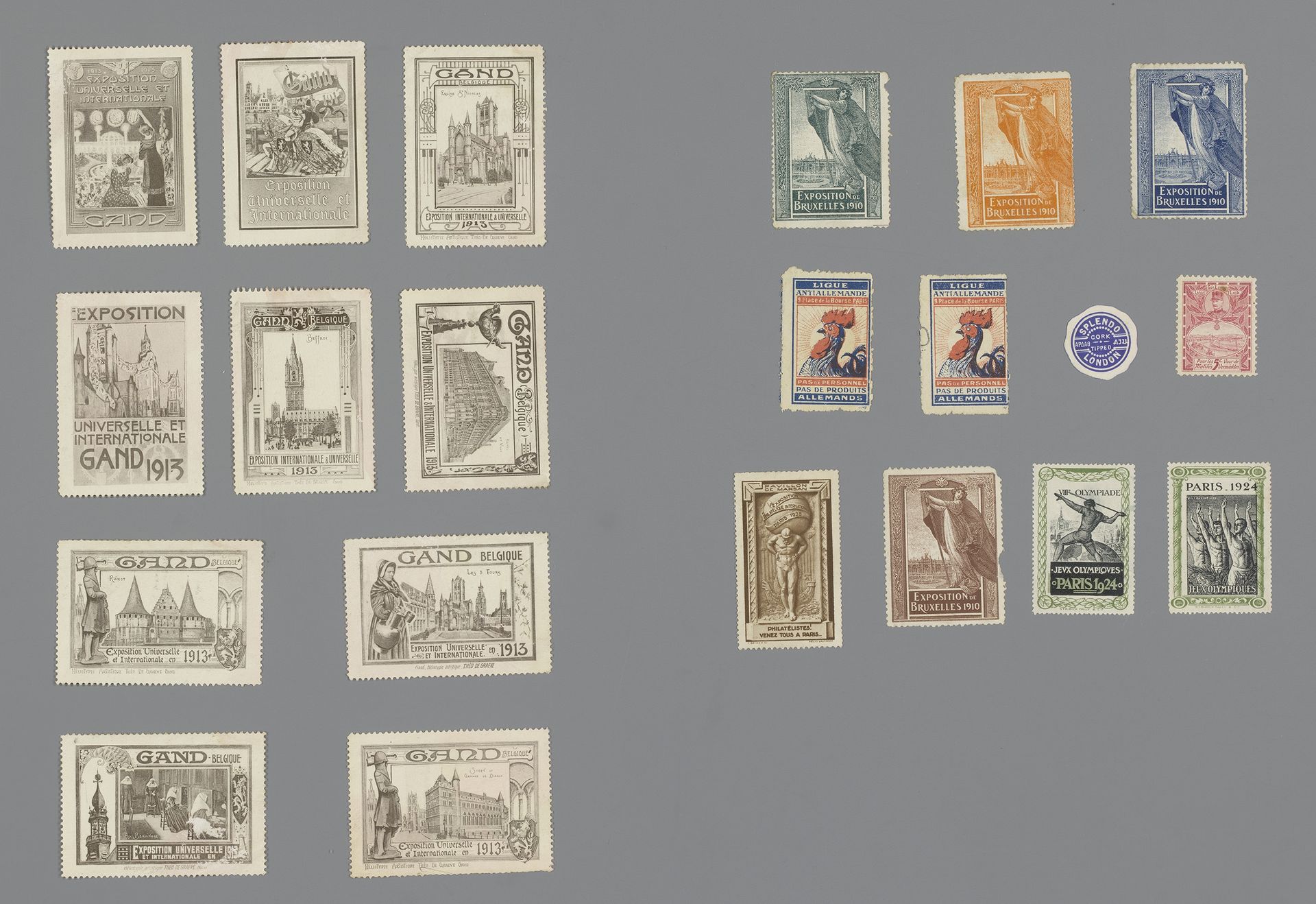
1910 - 1925
Franse en Belgische (sluit)zegels
Listen to curator's interpretation
Curatorial notes
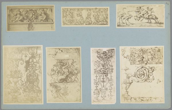
Curator: This intriguing assortment is titled "Franse en Belgische (sluit)zegels," or French and Belgian seals, dating from approximately 1910 to 1925. I find myself drawn to their surprising level of detail. What are your first impressions? Editor: The immediate appeal for me is in the minute narratives contained within each frame. They are tiny windows, rendered in crisp lines and restrained colour, begging to be examined up close. Curator: Absolutely. The series offers us insight into the values promoted at the time—national pride, progress through industry, even celebrating cultural events like expositions and, note the ones commemorating the Olympics. Editor: Tell me more about the symbolism employed, and the compositional decisions within each. For example, the stark figure of Atlas weighed down seems ripe with commentary, a microcosm of broader socio-political burdens. Curator: Yes, the symbolic language is compelling. The Atlas references resonate deeply, given the historical backdrop of a Europe shouldering immense political and social change. Similarly, observe how civic buildings become statements of local progress and cultural importance. They stand as bold proclamations in times of immense cultural and industrial achievements, acting almost as mini propaganda pieces. Editor: From a design standpoint, these little works utilize crisp, precise lines that emphasize the messages, the clear architectural elements give a strong focal point while creating a very ordered rhythm. It seems there's an appeal for structure during what must have been chaotic periods. Curator: Indeed, art nouveau design plays with expectations by blending organic flow with the rigidity required by function—the seals legitimized documents and propagated civic pride! Even the rooster image evokes national identities. Editor: And that muted colour palette. The restrained use of tones is remarkably effective, considering each tiny piece fights for attention! It speaks volumes about intention and the balance being aimed for. Curator: I concur. The collection creates an intriguing socio-aesthetic snapshot, reflecting the collective aspirations and concerns of a transformative era. They remind us how political power and graphic precision intersect and the ability to distribute the message broadly. Editor: Seeing them now, isolated as art pieces, encourages us to read for symbolism we perhaps otherwise wouldn't, these stamps create not only aesthetic satisfaction, but also the pleasure of discovery.