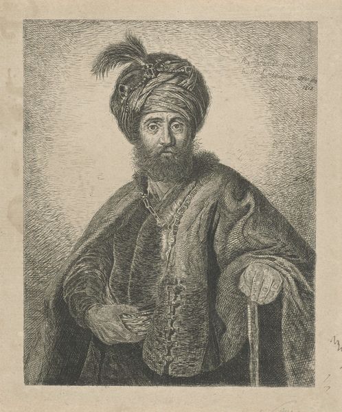
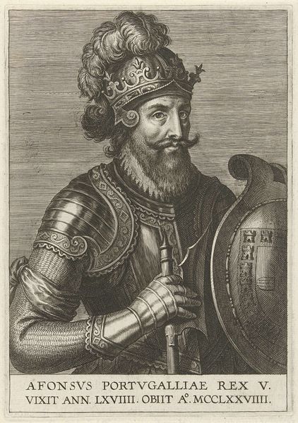
print, engraving
#
portrait
#
baroque
# print
#
asian-art
#
old engraving style
#
portrait drawing
#
history-painting
#
engraving
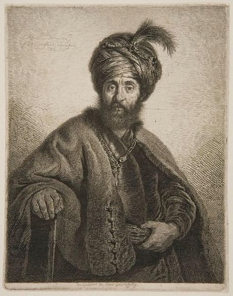
Dimensions: height 242 mm, width 176 mm
Copyright: Rijks Museum: Open Domain
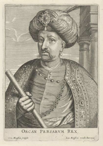
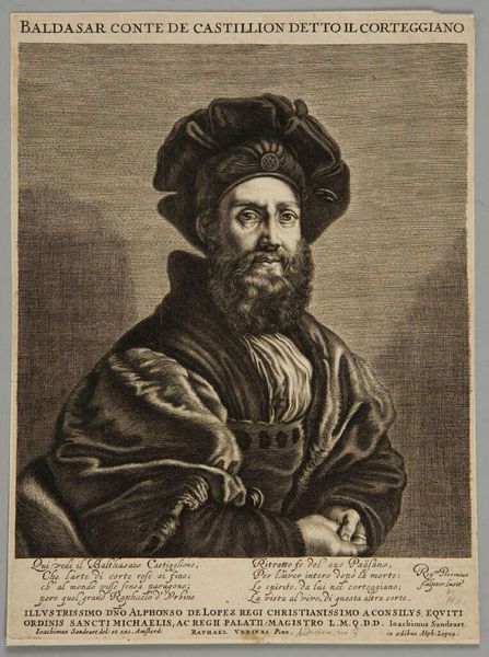
Editor: So, here we have "Portret van een heerser van het Mogoelrijk," or Portrait of a Ruler of the Mughal Empire, an engraving from between 1670 and 1713 by Pieter Schenk. I’m struck by the detailed textures achieved through engraving; it’s mesmerizing! How do you interpret this portrait from a formalist perspective? Curator: Note how the artist uses line and contrast to construct a hierarchy within the image. The ruler's ornate headdress, meticulously rendered with a profusion of pearls and feathers, immediately draws the eye. Observe the sharp, precise lines used to define the jewels, in stark contrast to the softer, more diffused lines suggesting the texture of his beard. What does this deliberate contrast communicate, structurally speaking? Editor: I guess it highlights the ruler’s wealth and status through the intense detailing, versus a more casual depiction of his beard and hair. Is the very clear inscription part of the structural design as well? Curator: Precisely! The inclusion of Latin text situates the image within a specific intellectual and political framework. Notice the arrangement of the text below the figure. How does it serve to anchor the composition, balancing the visual weight of the elaborate headdress? The lettering and lines add an orderly visual balance. Editor: That makes sense; it creates a solid base, framing the portrait. I hadn't really considered how integral the lettering was to the overall balance. Curator: Further, consider the oval frame. The form suggests a sense of enclosure and highlights the sitter’s prominence while simultaneously restricting and containing. The sharp border emphasizes the constructed, curated nature of this presentation of power. Editor: It's fascinating to see how every element contributes to the overall structure and meaning, and even the containment adds to the impression of strength. I never really looked closely at that inscription before, seeing it as just text, but it adds so much more.
Comments
No comments
Be the first to comment and join the conversation on the ultimate creative platform.
More like this