painting, textile, acrylic-paint
#
painting
#
pattern
#
textile
#
acrylic-paint
#
geometric
#
abstraction
#
pop-art
#
line
Dimensions: 235.58 x 212.09 cm
Copyright: Gene Davis,Fair Use
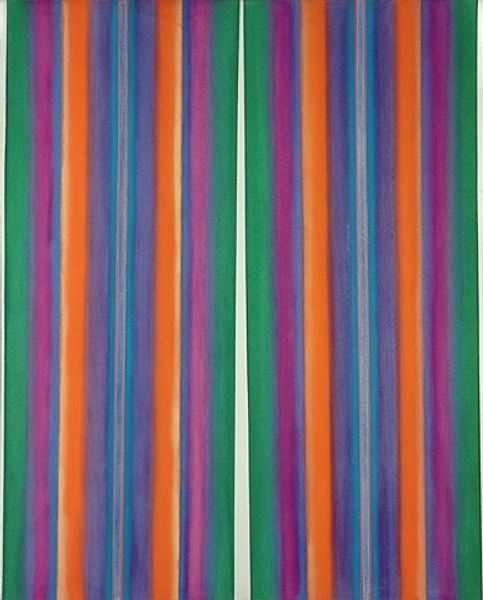
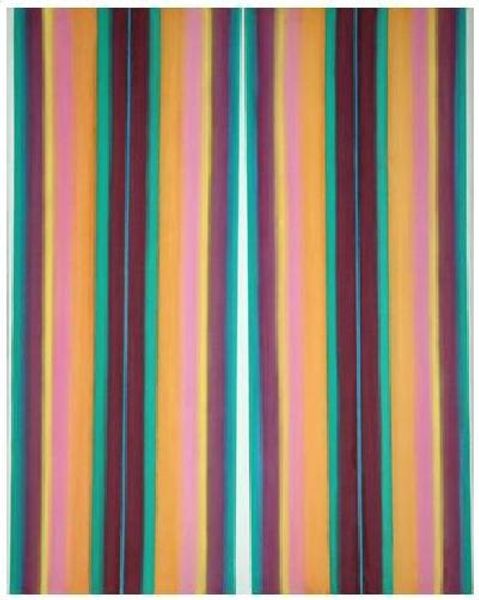
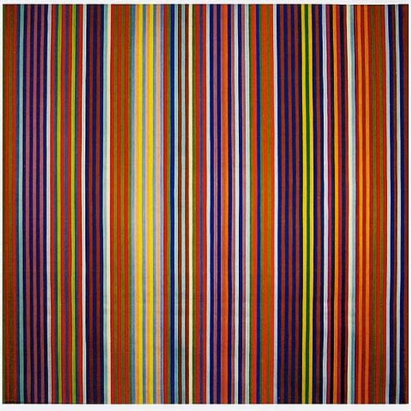
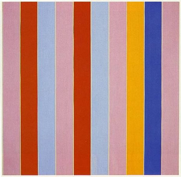
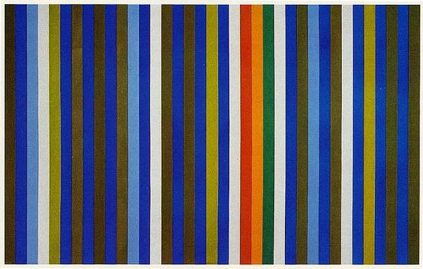
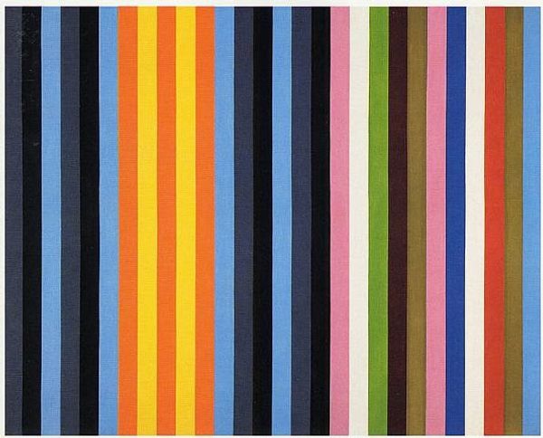
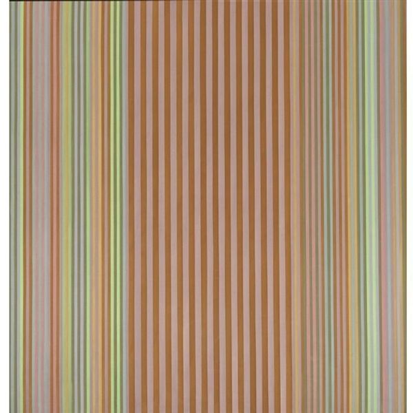
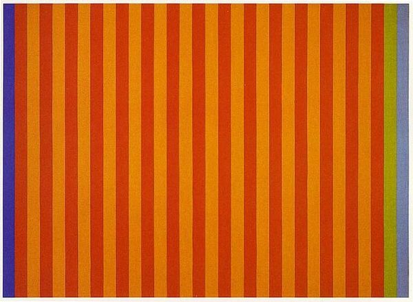
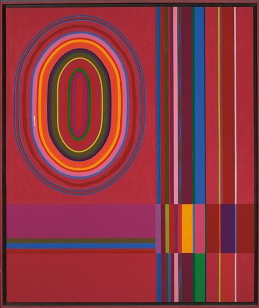
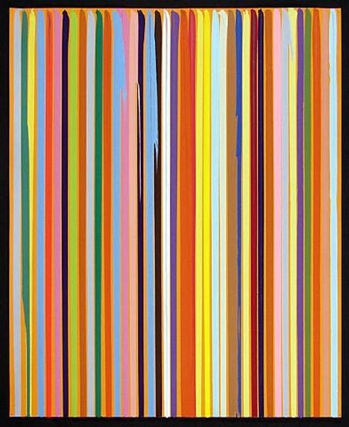
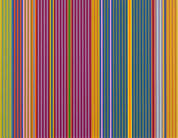
Curator: This artwork, “Blue Broad Jump,” created by Gene Davis in 1960, presents an immediate sensation of visual rhythm through its striped composition. What is your initial read? Editor: It strikes me as joyful, almost playful. The vertical bands of color vibrate against each other. I'm curious about the specific choices: the widths, the subtle shifts in hue. Curator: Davis was a central figure in the Washington Color School movement. His focus was primarily on the experiential and optical possibilities of color, rather than representation. Think about the cultural backdrop of the 1960s, the rise of pop art and a growing challenge to established norms, might offer us deeper meaning. Editor: Agreed. I see a kinship with the visual language of Pop Art, this embrace of repetition. Let's dig into that use of acrylic on canvas. Note how flat the colors are, denying depth and prioritizing surface and their spatial relationships, challenging the traditional hierarchy where form dictates color. The title, "Blue Broad Jump," is especially interesting. How does it reflect our social and political zeitgeist? Curator: Exactly. Considering that broad jump could be seen as a metaphor for overcoming obstacles, and looking at the period when Davis created "Blue Broad Jump", American society was undergoing a reckoning with civil rights. This juxtaposition of the geometric abstraction alongside the title, implies a possible subversion of dominant narratives through an intersectional, visual vocabulary of that era. Editor: That provides a compelling framework to read into this artwork. Looking closely at the application, you can almost chart a set of variations, not so obvious at first glance, to his choices of color arrangements and execution. Curator: That slight variance introduces a kind of instability. It’s never quite resolved; the colors vibrate against one another. Davis' focus remains on this kind of visual experience. How it operates independently from overt social narratives is important. Editor: But by focusing intently on those optical effects, those variations are unavoidable for a politically-minded reading. Curator: I see that and yet it seems limiting to see his work solely through that perspective. This abstract vocabulary provides a means to address it on the canvas. Editor: Yes, there’s always that ambiguity in art; which brings us both to these compelling interpretations. Thank you for your thoughts.
Comments
No comments
Be the first to comment and join the conversation on the ultimate creative platform.
