acrylic-paint, ink
#
abstract-expressionism
#
pattern
#
colour-field-painting
#
acrylic-paint
#
geometric pattern
#
ink
#
geometric
#
pop-art
#
line
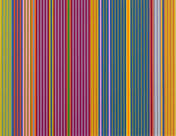
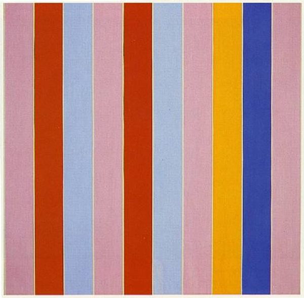
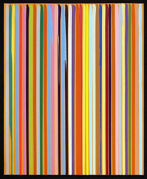
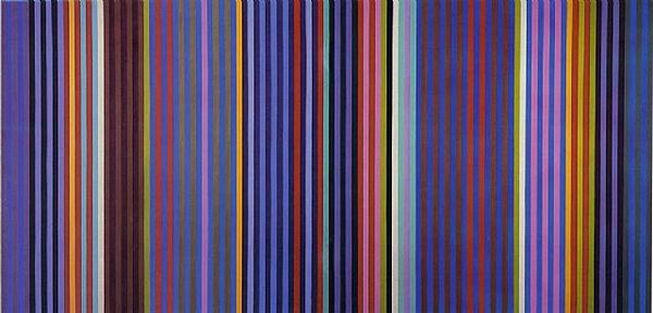
Copyright: Gene Davis,Fair Use
Curator: Immediately, I'm struck by the vibrant chromatic relationships in Gene Davis’s “Powwow,” created in 1969. It seems almost dizzying in its simultaneous harmony and discord. Editor: The use of color does have an energetic quality. Looking closely at "Powwow," I’m drawn to consider the application of acrylic. Each stripe possesses an almost uniform texture. Can we talk more about the process Davis used to achieve this level of consistency? Curator: Certainly. Davis's dedication to these vertical stripes became his signature style. Think of Barnett Newman’s zips, but multiplied. Semiotically, each line operates as a sign, a modular unit that contributes to a complex visual language. Davis was deeply invested in pure opticality, moving beyond conventional representation. Editor: Precisely. It’s crucial to understand that this was achieved through rigorous labor. Though visually simple, consider the precise, repetitive motions required to produce such uniform bands. Davis wasn't merely "expressing" himself; he was enacting a controlled system of production. What implications did this level of controlled work have for the status of painting as art, as compared to craft at the time? Curator: It brings up interesting questions. Did the systematization diminish its artistic value? I would argue the contrary. This kind of all-over composition, where no single area dominates, creates a democratic visual field. Think about Clement Greenberg’s idea of flatness – Davis takes it to an almost literal extreme, reinforcing the artwork's status as an object, denying any illusionistic depth. Editor: Yet there’s a haptic quality suggested by the slightly irregular edges of each stripe. It keeps the industrial quality at bay. It suggests a subtle human element in the actual making. How important was the specific brand or type of acrylic paint Davis used? Was this material readily available, and how might its qualities influenced the artwork's aesthetic impact? Curator: Those are all excellent questions, ones which perhaps suggest avenues for further research into the very concrete details of “Powwow.” The overall effect is certainly powerful—the vibrant colors, combined with the rigorous structure, create a dynamic visual experience. Editor: Ultimately, I am intrigued how, even through his methodical approach to material and means, Davis generates something so perceptually vibrant.
Comments
No comments
Be the first to comment and join the conversation on the ultimate creative platform.
More like this