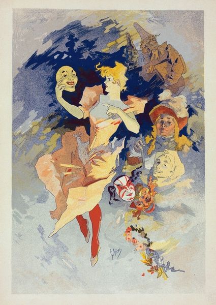
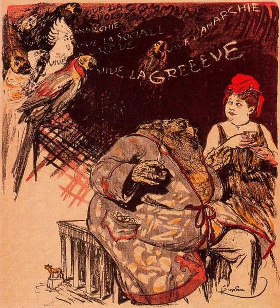
lithograph, print, poster
#
art-nouveau
#
lithograph
# print
#
figuration
#
cityscape
#
genre-painting
#
poster
Copyright: Public Domain: Artvee
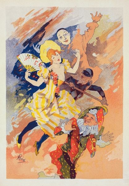
Editor: Here we have "Paris Illustré," a lithograph print and poster. It looks like a chaotic party scene, lots of movement and bright colors. The composition feels almost like a whirlwind. What do you see in this piece from a formalist perspective? Curator: Immediately, I'm struck by Chéret's manipulation of line and color to create a sense of dynamic energy. Notice how the figures are not rigidly defined, but rather suggested through fluid, almost sketch-like lines. This imbues the scene with a feeling of spontaneity and joyous abandon. Observe how the analogous color scheme—dominated by reds, oranges, and yellows—contributes to a unified visual field, despite the apparent chaos of the composition. The overlapping figures, devoid of clear spatial relationships, challenge traditional notions of perspective and depth. How do you perceive the interplay between the figures and the background in creating the overall dynamism? Editor: I see what you mean; it’s like the figures and the background blend into one another, creating a flat plane that pushes everything forward. It amplifies the energy, though it does make it somewhat difficult to read depth. Is that a common characteristic of lithographic posters from that time? Curator: Indeed. Consider the affordances of the medium itself: lithography lends itself to bold lines and flat areas of color. Chéret masterfully exploits these characteristics to produce an image that is both visually striking and commercially viable as a poster. We might note a strategic deployment of form. Notice the pyramidal composition anchors the bustling figures, preventing complete visual disintegration. Moreover, observe the contrasting linear quality between the poster's textual information and the figurative representation. Where do you believe is your eye drawn to first? Editor: I agree about the grounding pyramidal shape now that you point it out! The title "Paris Illustré" catches my eye first; the larger, bold text creates an inviting tone and provides a point of reference for everything. It's amazing how much can be conveyed through lines, color, and composition. I learned a great deal by seeing it this way. Curator: As did I. A refreshing formal interrogation has amplified the dynamic qualities this piece evokes.
Comments
No comments
Be the first to comment and join the conversation on the ultimate creative platform.
More like this