drawing, print, paper, ink, engraving
#
drawing
#
neoclacissism
# print
#
pen sketch
#
paper
#
ink
#
decorative-art
#
engraving
Copyright: Rijks Museum: Open Domain
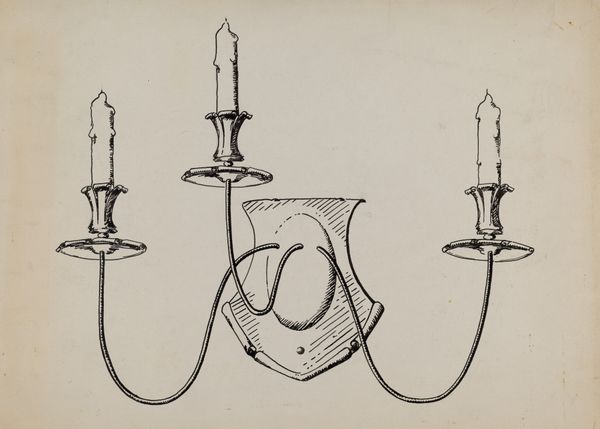
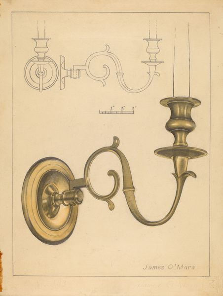
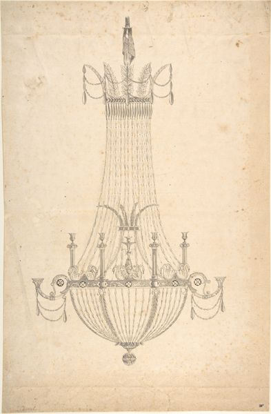
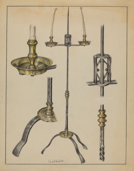
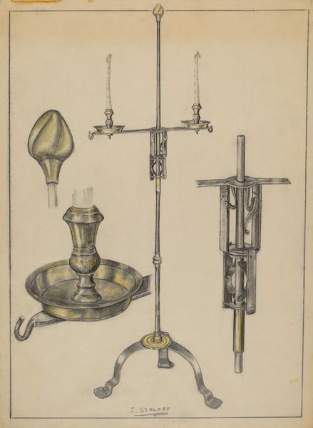
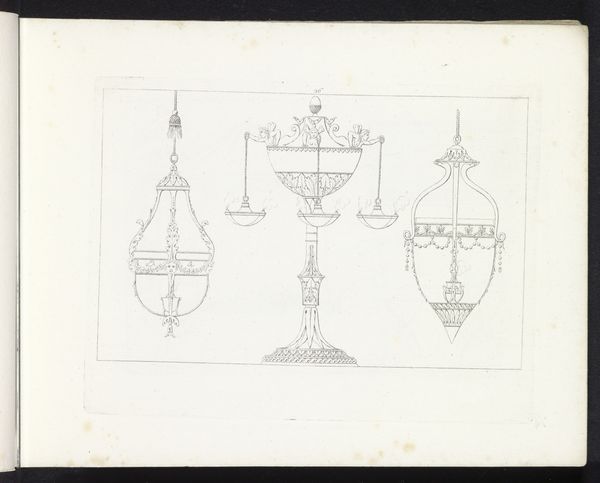
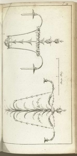
Curator: Take a moment to observe this print titled "Journal des Luxus und der Moden 1786, Band I, T. 22," dating from 1786, created by Friedrich Justin Bertuch. It’s an engraving featuring ink on paper. What is your first impression? Editor: Stark simplicity. Almost… diagrams for interior design, perhaps? The fine lines, rendered in pen, are so precise they feel more like technical drawings than decorative art, despite the subject matter. Curator: Indeed, these were published in a luxury and fashion journal. It speaks to the emergent Neoclassical style. Notice how the print renders three different designs for light fixtures: a chandelier, a wall sconce, and a pendant. Consider how such designs signal the symbolic shift toward clarity, order, and a revival of classical motifs after the excesses of the Rococo era. Editor: Right. And what I notice is the process, and specifically the labor implied in their production and then consumption. Each of these fixtures required not only the design itself, made into an engraved and published image, but a metal worker, probably bronze or ormolu based on what would be available at the time, who then could produce something identical. It’s not simply about aristocratic refinement, it’s a glimpse into specialized manufacturing practices becoming intertwined with fashion itself. Curator: It is fascinating how prints like these allowed the dissemination of style across regions, fostering cultural homogenization to a degree. These fixtures, rendered in ink, symbolize not just light but also power, aspiration, and connection to the past, where classical forms were reborn. Editor: But this journal also represents a moment when those connections – both literal trade routes for these chandeliers and cultural diffusion, made possible through reproducible media -- became sites of burgeoning industrial practice that often escaped scrutiny at the time. What materials are extracted, what labor is required and exploited in ways made invisible. This print isn’t neutral; it promotes an emerging, expanding capitalist world. Curator: Perhaps that’s why such close observation of visual artifacts becomes crucial. We discern what continuities, traumas, or hopes are echoed through these designed forms. Editor: Precisely. It also prompts a reevaluation of how design functioned – and functions – as a mediator between resources, craft, and aspirations. Thanks for drawing my eye deeper into the materiality beyond just the surface elegance of this piece.
Comments
No comments
Be the first to comment and join the conversation on the ultimate creative platform.
More like this