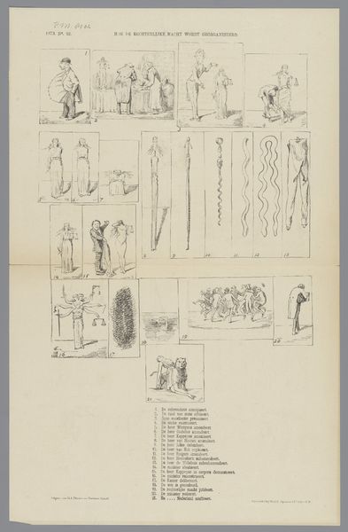
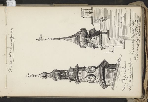
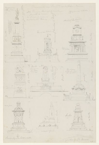
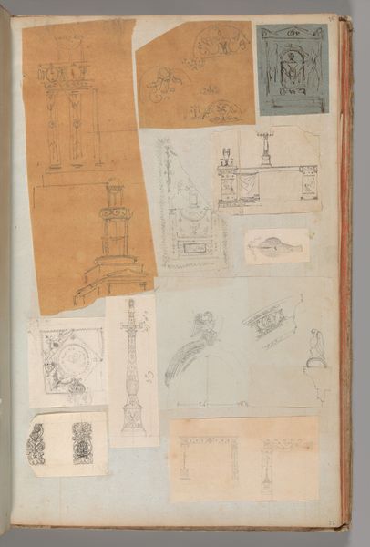
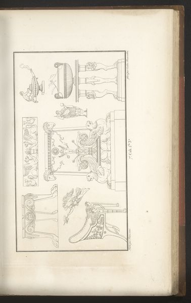
Spotprent over de wanstaltige ontwerpen voor een mounument voor de Nederlanders gesneuveld bij de Citadel van Antwerpen, 1873 1873
0:00
0:00
drawing, print, pen, engraving, architecture
#
drawing
#
comic strip sketch
#
statue
#
quirky sketch
#
allegory
# print
#
sketch book
#
personal sketchbook
#
idea generation sketch
#
sketchwork
#
sketchbook drawing
#
pen
#
history-painting
#
storyboard and sketchbook work
#
fashion sketch
#
sketchbook art
#
engraving
#
architecture
Dimensions: height 300 mm, width 425 mm
Copyright: Rijks Museum: Open Domain
Curator: This engraving from 1873 presents a series of satirical designs. It's titled "Spotprent over de wanstaltige ontwerpen voor een monument voor de Nederlanders gesneuveld bij de Citadel van Antwerpen," which translates to "Cartoon about the monstrous designs for a monument for the Dutch who fell at the Citadel of Antwerp." It comes to us from the hand of Johan Michaël Schmidt Crans. Editor: "Monstrous" is right. The initial impression is almost comical, a wild array of styles colliding in this single sheet. There's a tension between classical elements and the grotesque. Curator: It is fascinating how public monuments became stages for political debate in the 19th century. This print served as visual commentary. Think of how monuments materialize national narratives and historical memory—who gets remembered and how. This print critiques the aesthetic choices, suggesting deeper issues around how the Dutch chose to commemorate their fallen soldiers. Editor: Precisely. There’s also the symbolic language at play here. Observe the figures atop the columns, the various allegorical elements, lions, and obelisks—each carries meaning within a visual vocabulary designed to evoke specific emotions and ideas. Curator: And the architectural forms themselves, drawing on classical and neo-classical traditions, but, as you say, skewed, distorted. It's a purposeful manipulation. Crans' choice of rendering the designs with delicate lines contrasts with the harsh judgment conveyed by the print’s title. Editor: True, that tension really strengthens its message. The precise linework and carefully arranged compositions create a peculiar harmony despite their disparate nature. It elevates what could've been just simple mockery into astute aesthetic critique. Curator: So it prompts us to ask, what makes a monument "good" or "bad"? How does public art shape collective identity, and what happens when those aesthetic choices are contested? Editor: Indeed, what visual strategies shape understanding and even manipulate emotion, whether honoring heroes or skewering aesthetic failings, remains vital to recognize.
Comments
No comments
Be the first to comment and join the conversation on the ultimate creative platform.
More like this