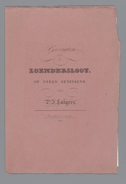
before 1828
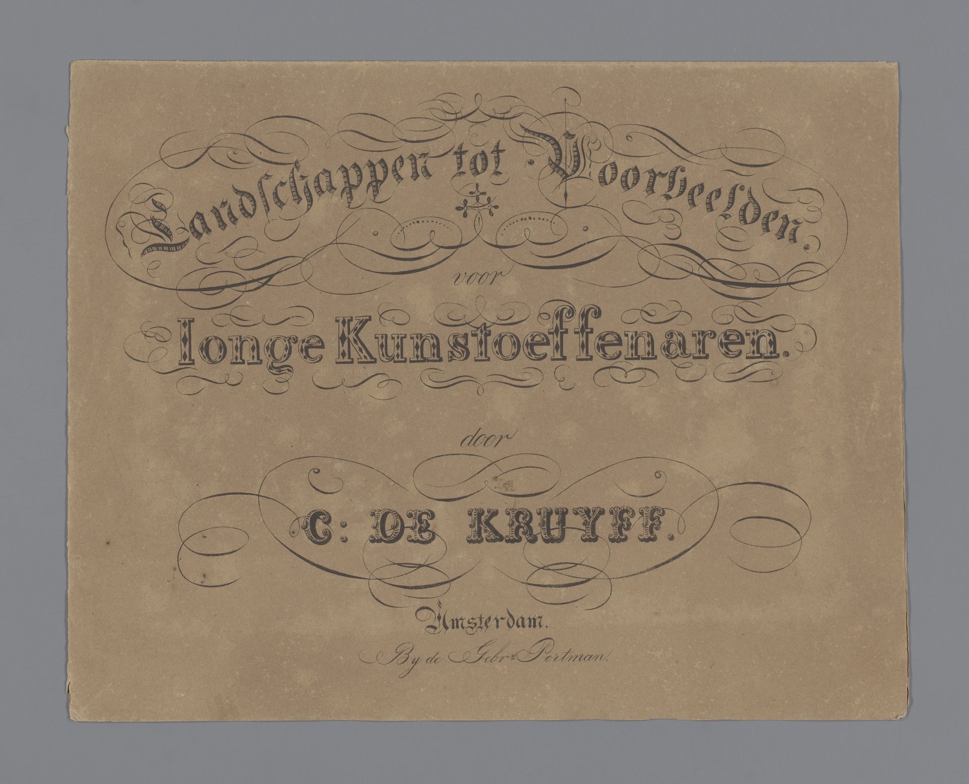
Omslag voor: landschappen tot voorbeelden voor jonge kunstoeffenaren
Cornelis de Kruyff
1774 - 1828Location
RijksmuseumListen to curator's interpretation
Curatorial notes
This is Cornelis de Kruyff’s title page, “Omslag voor: landschappen tot voorbeelden voor jonge kunstoeffenaren” held at the Rijksmuseum. Its formal qualities initially strike us through its stark simplicity, and monochrome palette. The use of typography takes centre stage; it's structured in distinct layers, each presenting a different textual element. The eye is drawn to the ornate script which is embellished with swirls which create a sense of movement and dynamism. This is counterbalanced by the block-like font used for the words "jonge kunstoeffenaren" which gives it a sense of grounding. De Kruyff’s structural composition creates a visual hierarchy that also reflects a didactic purpose. The title is presented as a carefully constructed lesson, in which the typographic choices serve as a set of instructions for aspiring artists. The visual elements are not merely decorative, but are signs of a broader cultural narrative about art education and the cultivation of artistic talent.