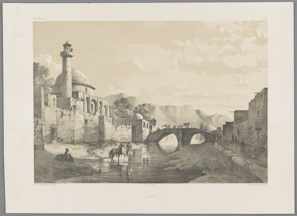
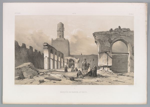
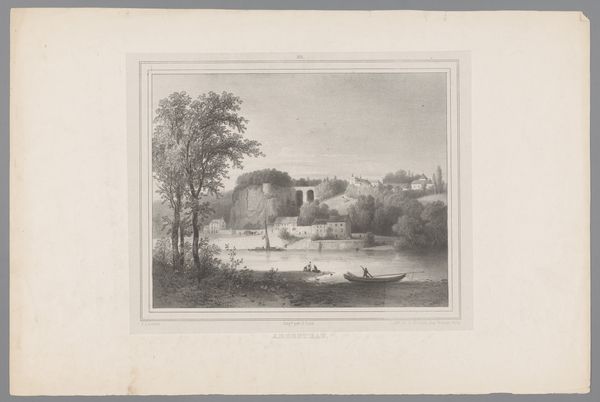
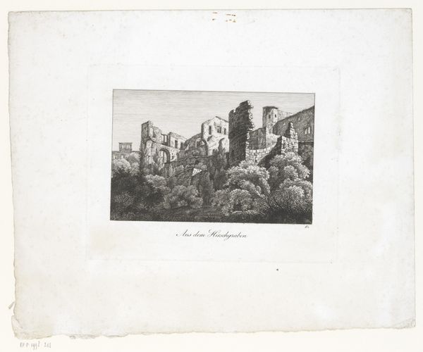
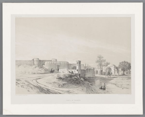
lithograph, print
#
lithograph
# print
#
landscape
#
romanticism
#
cityscape
Dimensions: height 244 mm, width 317 mm
Copyright: Rijks Museum: Open Domain
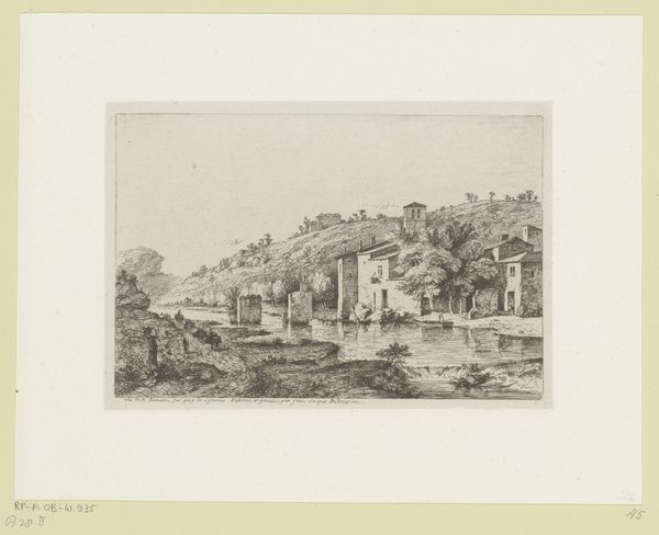
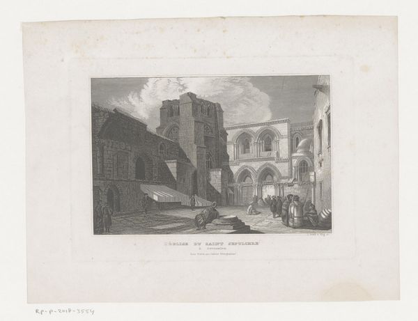
Editor: This is Théodore Fourmois' lithograph, "Binnenplaats van de Citadel van Antwerpen," made in 1833. It depicts the interior courtyard, and I am struck by the damage to the buildings. What can you tell me about the materiality and historical context that might have informed this work? Curator: Indeed. Notice the stark contrast created by the lithographic process itself – the sharp blacks against the lighter areas really highlight the distressed textures of the architecture. Consider how this print served as a reproducible image for wider consumption. Given the 1833 date, it's made shortly after the Siege of Antwerp. How might this historical trauma relate to Fourmois' choice of rendering? Editor: So, the visible damage...the print wasn’t just a depiction of a place, but almost a document of the siege and the raw materials and social circumstances affected during and immediately after the war? I also didn’t realize lithographs were reproducible. I see several prints now. Curator: Precisely! And that reproducibility is key. Prints like these circulated within a developing commercial art market. How do you think the *mass production* of such an image affected its value, both artistically and as a historical record of trauma? Did the printing make a heroic claim to historical accuracy? Editor: I guess making copies made it more of a commodity. Was he making a critique of the romanticizing of war or was it simply about generating images about this conflict for sale? That materialist point of view on art changes how I see Fourmois. Curator: It makes one consider the labor involved in creating the image itself, doesn't it? From the quarrying of the lithographic stone to its transfer through ink, and finally, to its consumption as a souvenir. It reveals the artist not as a solitary genius, but entangled in the economic realities of his time. It provides a wider angle on art making than the "romantic." Editor: Right, that's a different interpretation. I hadn't considered that it might just be romanticising of the printing. Thanks!
Comments
No comments
Be the first to comment and join the conversation on the ultimate creative platform.
More like this